This is Dustin Abbott’s final installment of his short article series about using Exposure to enhance his photos. Check out the first and second part if you haven’t seen them yet. Dustin, you have the floor.
—
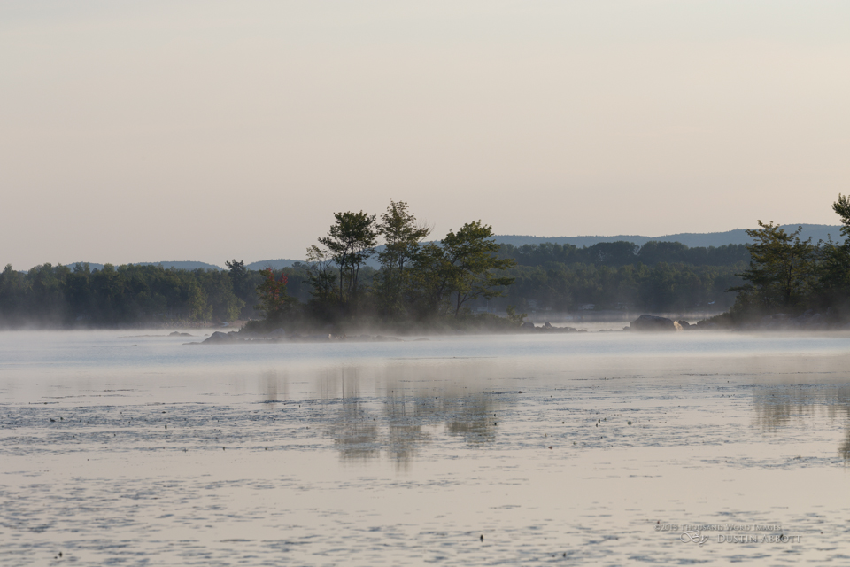
We established the importance of making your images stand out from the crowd in the first article of this series. In the second, I demonstrated how Exposure can help achieve this goal by subtly enhancing an image to help it reach its full potential. In this final installment, let’s look at it from a different perspective. What if your creative vision goes beyond subtle enhancements? It could even go beyond what can be captured by the camera. If that’s the case, Exposure is definitely your friend. Take this image, for example:
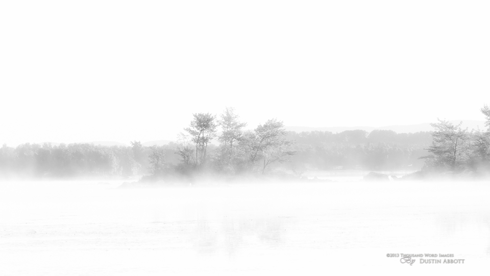
I shot this a few weeks ago at dawn, getting nice, muted pastel colors, a soft, rising mist, and still waters that gave a nice reflection. It’s a pretty shot, but I had a high-key, monochrome shot in mind. I thought this would make a dreamier and more artistically subtle image.
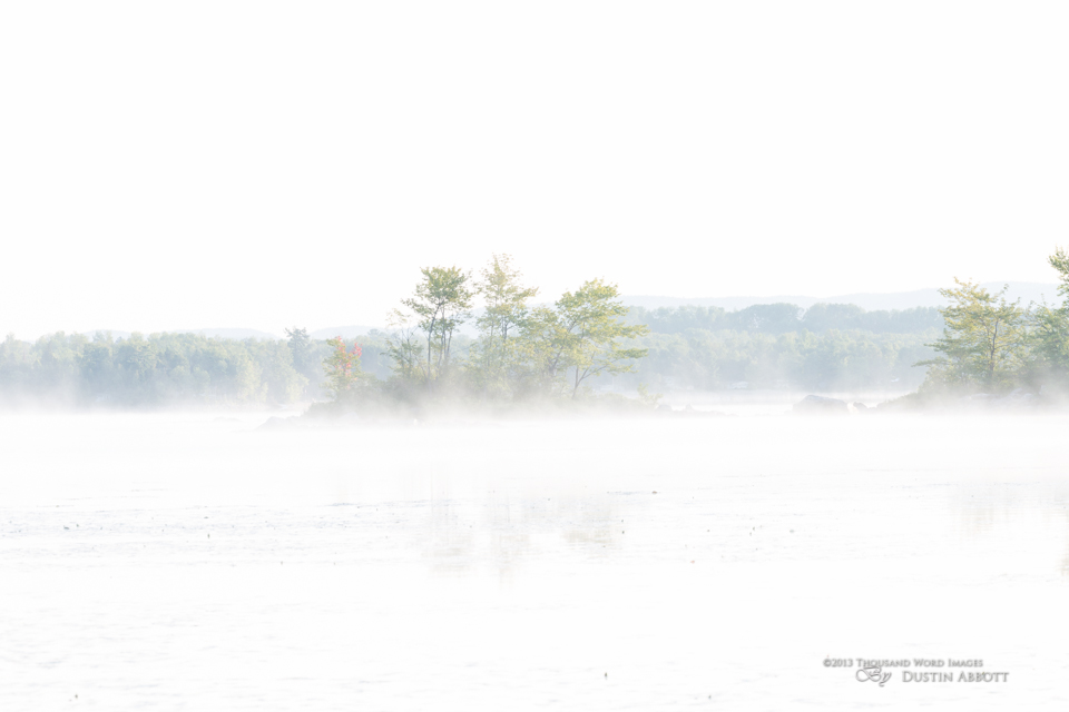
To accomplish this, I first chose a bracketed exposure that was overexposed by a few stops. You could accomplish this similarly with a RAW file by increasing the exposure. You may lose a little quality, but it works. That being said, here’s a tip: if you are in the field and have a great scene in front of you, take the time to bracket exposures. Even if you don’t do HDR, the different exposure options present amazingly different images.
My overexposed frame already gives a hint of where I want to go. The shadows are lifted, the mist becomes more apparent, and the water lilies in the foreground are less evident. My vision is for the island to rise out of the mist, and so I want the foreground and sky to vanish. I typically launch Exposure from Photoshop instead of Lightroom for one main reason: layers. I like the ability to mask a bit of the image, reduce opacity, or even change the blending mode after Exposure. In a word–control.
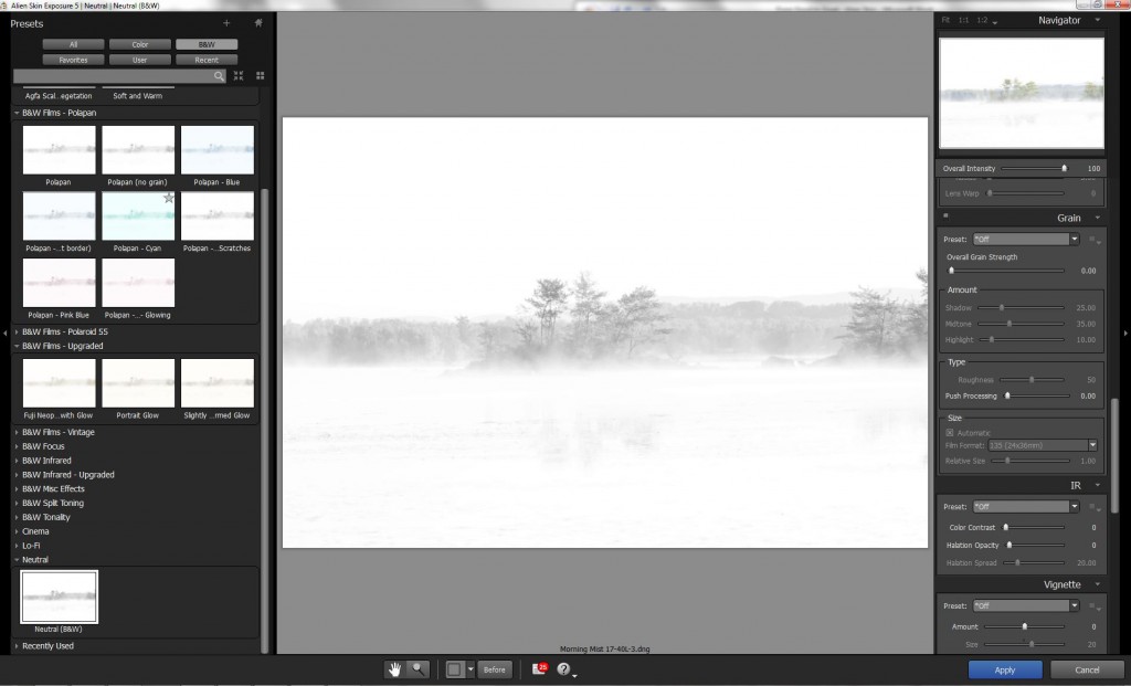
Exposure has a lot of presets, but for this tutorial I start with the “Neutral B&W” for demonstration purposes. My goals are to: 1) Get a great B&W mix 2) Increase the high key look through glow and sharpness 3) Enhance the dreamy, subtle look.
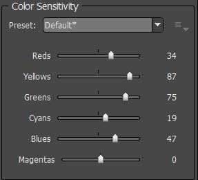
I dealt with the B&W mix with the Color Sensitivity sliders. I recommend playing with these on a regular basis because you will learn how to emphasize the important portions of an image when converting to monochrome. In this case, there were three important sliders. The Yellows and Greens were given high values, creating an infrared type look in the tree foliage. The Blues slider was adjusted to a mid-high value because it affected the far shoreline. These adjustments made the image brighter and more dreamlike. Below is what my final mix looked like.
I next dealt with the tone curve. In this case, I pulled down the shadows and midtones slightly, and then adjusted the highlights. Global contrast was left at zero. This helped the trees in the foreground to stand out a bit more, with slightly deeper shadow areas.
I then added some sharpness to give definition to the branches and leaves. In this case, I used a value of around 30 for the amount and 11 for the radius (I prefer a small radius value).
I made two more important steps in Exposure. In the IR panel, I added the “Glow Only-Medium” preset from the dropdown list. This helped emphasize the misty quality of the shot while simultaneously de-emphasizing the foreground and sky. A subtle reflection remains, but the water lilies are essentially gone. In the Vignette section, I added the “Subtle-White” preset to further de-emphasize the foreground and sky and to enhance the misty effect on the sides of the image. I applied my customized preset and brought the image back into Photoshop.
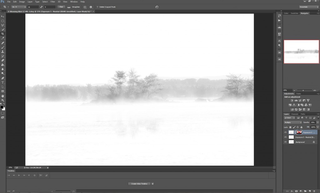
In Photoshop, I did one final step: I made a copy of the Exposure layer and then changed the blend mode to “Multiply.” This created more definition in the image, but the effect was too strong. I lowered the layer opacity to 35%. This had the unintended effect of adding some definition to the foreground, so I clicked the mask icon, and, using the brush tool set to black, I painted the mask to hide the effect at the top and the bottom of the image. Perfect!
I did one last thing: I cropped the image to a 16:9 widescreen ratio, eliminating wasted space and focusing on the great, dreamy center of the image. Voila! A stylish, high-key monochrome that I call “Glimpses.” It went from good…to great!
—
See more of Dustin’s work on his website, Flickr, 500px, and Facebook. He has a bunch available as stock on websites such as iStockphoto and Getty Images.
Try Exposure Today


