Tony shares his opinions on the new version of Exposure in the article below. Thanks Tony!
—-
Exposure 5 is smokin’! The presets are outstanding; they can be infinitely adjusted and can be saved as personalized presets. The UI is easily understandable and navigable. Experimentation is encouraged, in my opinion it’s essential, in order achieve fluid software operation which teaches you how to get to what works best for your shots.
Since a picture is worth a thousand words, here are several images that peek through the curtain of what is possible in Exposure 5. Skimming through the presets will give you a sense of what’s in there. All of the following images were optimized with Alien Skin’s new Exposure 5 in less than 5 minutes.
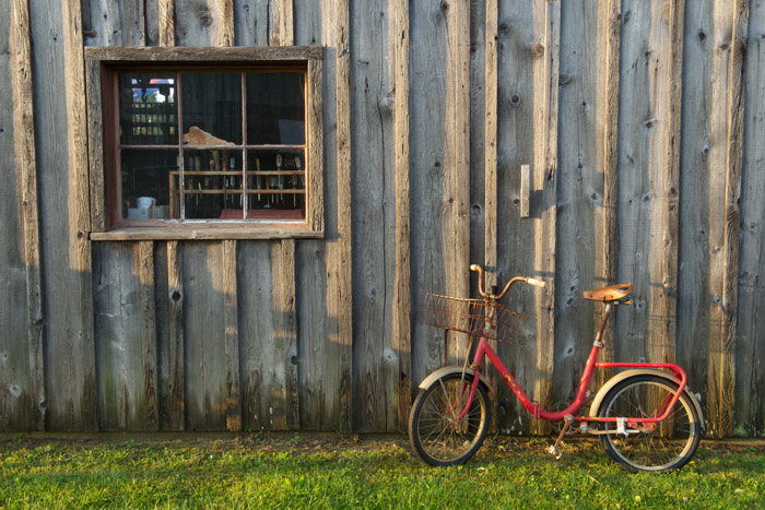
The RAW capture of the red bike photo was in the ballpark. The warm sunrise needed accentuation and the contrast needed to be increased. This would create a sense of depth in the boards on the side of the building.
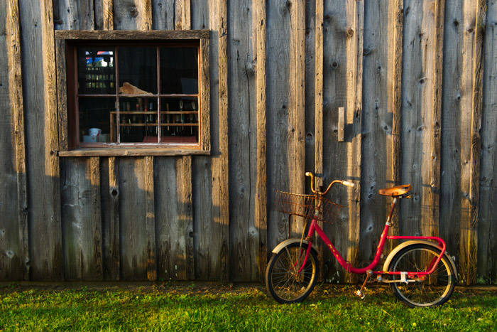
Here’s my Exposure 5 workflow:
- Color preset: Color increased – warm
- Contrast added in the Tone Curve panel.
- Overall intensity parameter set to 90% to pull back on the contrast.

In this close up of old gears, I wanted to make a slightly toned, black and white interpretation.

- In the Black and White “films,” after clicking through a few of the least grainy presets, I chose Kodak Panatomic. You can always shut off the grain with the global switch on the grain tab.
- For the warm tone I wanted, I chose split toning and modified the color slider for an amber tonality.
- I adjusted the strength to taste.
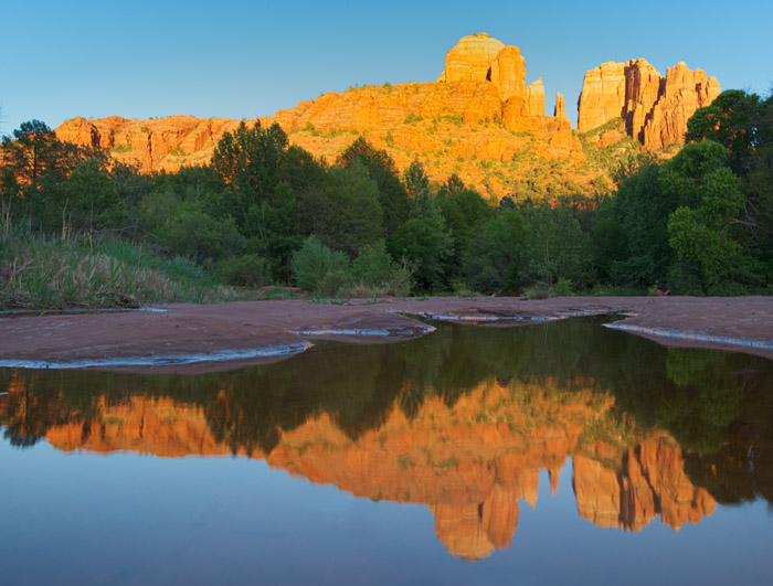
The Cathedral Rock in Sedona seemed to ask for a slightly oversaturated, Velvia look. The amber, green, and blue colors in the scene are coincidentally the prime strong colors of Velvia 50/100/100F films.
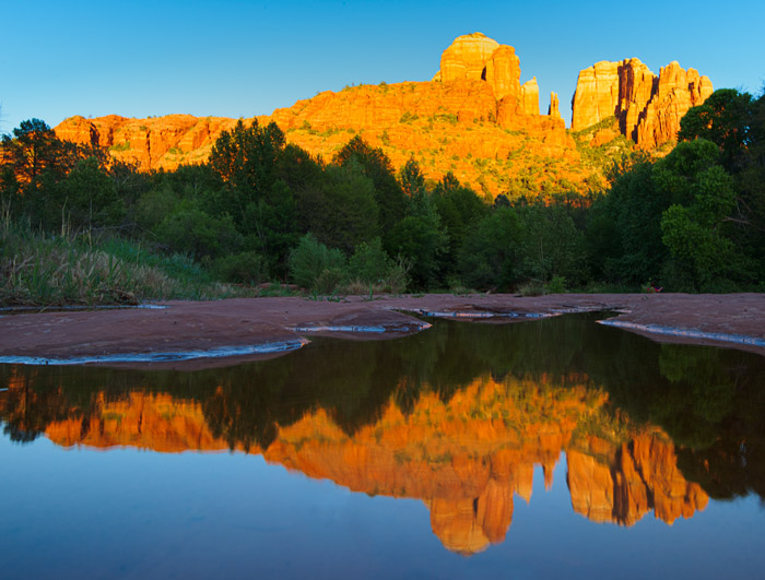
After looking through all of the presets, I found what I was looking for:
- In the Color Cross Processing presets. “Slide film saturated” gave me strong, bold color and contrast, but not too contrasty. Too much would block up the greens in the shade.
- I slightly increased contrast.
- Lowered the “overall intensity” to 66%.

A lighthouse shot through an iron fence was a classic frequently photographed subject. Unfortunately, this shot is starting to get a bit overdone. This time, I’ll use Exposure 5 for a different interpretation.
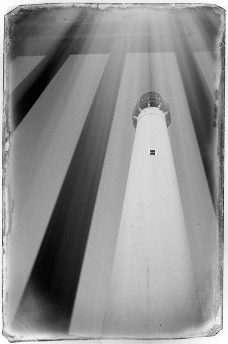
- Under B&W miscellaneous effects, I chose the Dust and Scratches – Kodak Tri-X 400 preset. One of the light leak presets looked like rays entering the frame from the top which nicely complimented the subject.
- The preset pretty much got it, but then I opted to lower the opacity so the top of the frame wasn’t washed out.
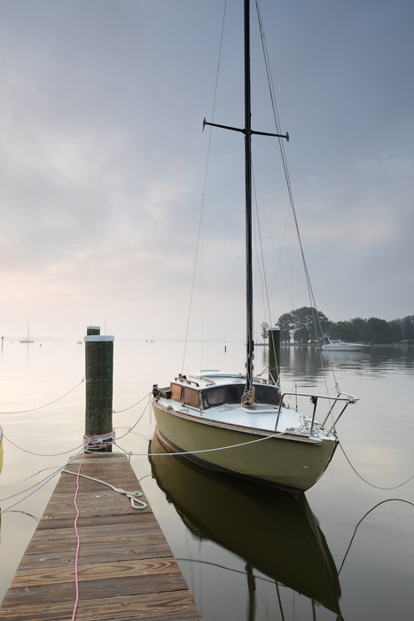
This old sailboat was shot in soft dawn-light conditions and had enough negative space to create a wide open palette.
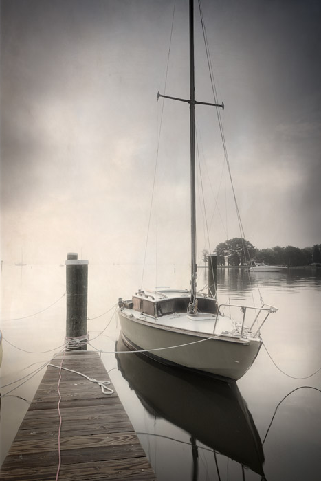
I thought I’d try out an infrared preset. The first preset in the window, Infrared, Bright Glow, gave me exactly the look I wanted. I continued to run through the remainder of the presets, but I settled on my first selection.
The vignetting options in Exposure are totally unique. Rather than the even and static vignettes produced in other software, Exposure’s can have lumpy distortion. The vignettes work for color and black and white images, with larger and smaller lumps. Running the risk of not being taken seriously at this point, I’ll let the photo do the talking. Notice the uneven and much more compelling vignette on the after image. I have been waiting for an organic vignetting tool forever. Thanks Alien Skin for Exposure 5!
As you can see here, this is the tip of the iceberg of what is possible in Exposure-5-land!
—-
Tony Sweet is a Nikon Legend Behind the Lens and is CEO of Tony Sweet Photography, Inc., based in Eldersburg, MD. tonysweet.com
Try Exposure Today





So, it would appear to me, that even though there are some great options to use with Exposure 5, I think other than the scratchy film presets, everything shown can just as easily be accomplished using Lightroom. Anytime I’m considering new software it needs to be able to do things other software cannot! Might be a good topic for future blogs!
~Ed
Hi Eddie,
One thing that I will point out that is far better than Lightroom is our grain production. It is one of my favorite features. It produces more realistic grain than any other product I have personally used. While there are things that you can do in Lightroom to produce similar images, Exposure was designed to take a lot of the hard work out and speed up your workflow, but it is not a full featured imaging tool like Lightroom. I totally understand how you could feel the way you do, but I thought I would point out a couple differences, though there are several.
Best regards,
Robert Lounsberry