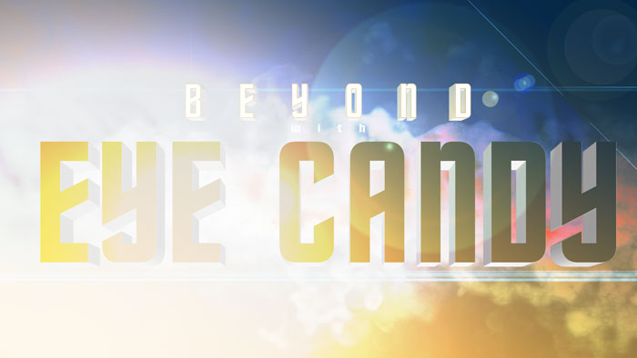
The goal of this project is to create a good-looking graphic from scratch. I recommend that you start things like this with a goal in mind. I can’t tell you how many times I’ve sat at the computer staring at a blank Photoshop canvas filled with grey and white squares. That doesn’t get your creative juices flowing, so first find something that inspires you. Then you can work with a linear goal, which saves you hours of fiddling.
My inspiration for this piece came from the trailer for Star Trek Beyond. Proudly, we’re all nerds here at Alien Skin, so I don’t hesitate to claim that Picard is a better Captain than Kirk. I know how brave such a statement can be… With that out of the way, let’s make stuff!
Step 1 – Simple Gradient
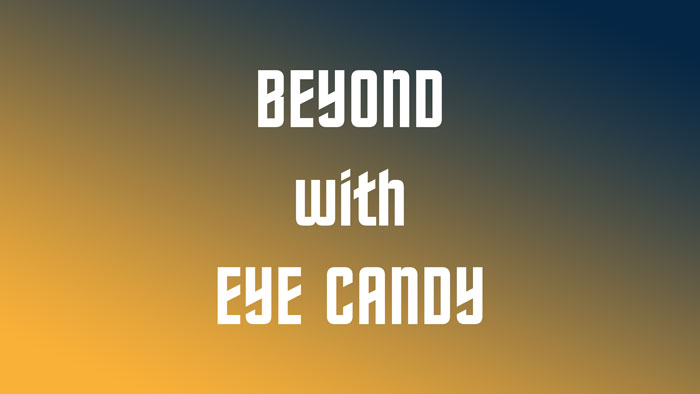
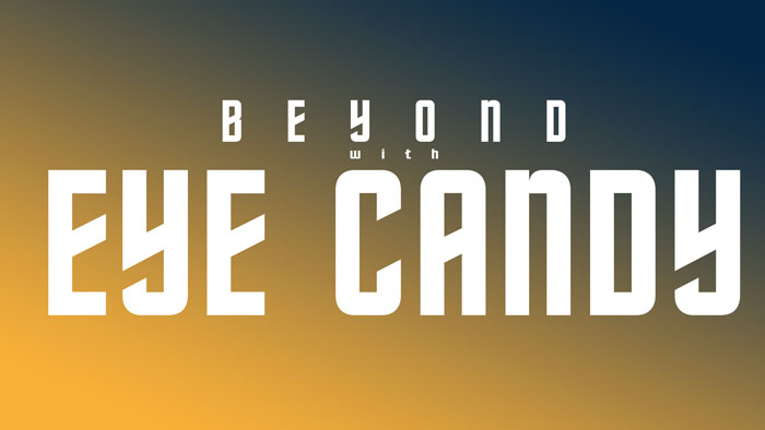
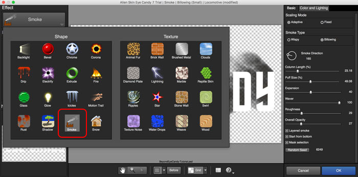
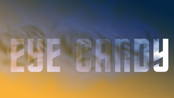
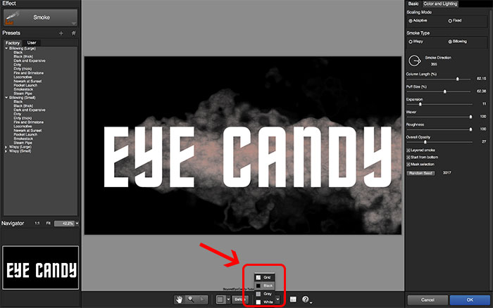
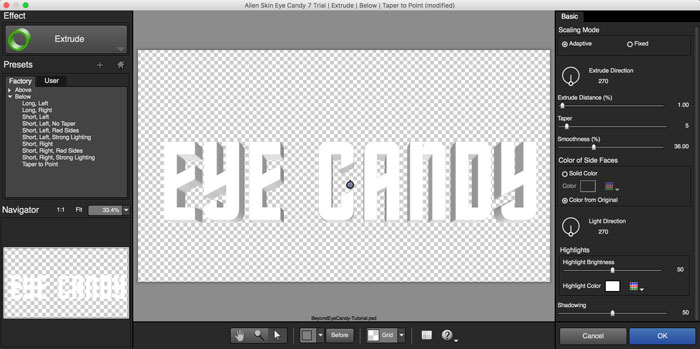
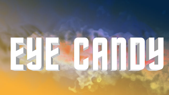
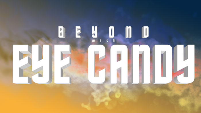
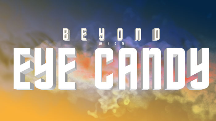
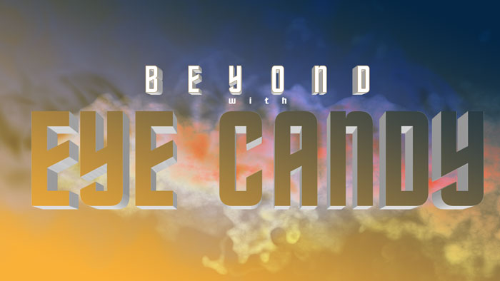
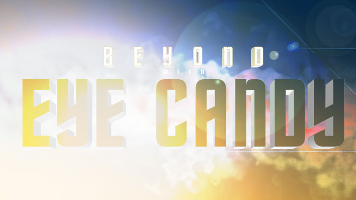
We will start with a new RGB image in Adobe Photoshop. I’ll add a new layer (⌘⇧N) Next, we need to setup our text elements. With the Text Tool (T), I’ll add three separate text layers using Final Frontier font, one for each message. Separating the messages into different layers makes adjusting the lettering behavior easier. It will add a few layers to the file, but if you keep them properly named, you shouldn’t have an issue with complexity. The Character panel (Window>Character) is where you can make adjustments to font size, tracking (distance from letter to letter – not to be confused with kerning, which is the process of adjusting the spacing between characters in a proportional font), and vertical scale. The standard behavior of font placement isn’t very inspiring. This is what the messaging looks like before it has a defined hierarchy. A few simple adjustments on the Character panel can help strengthen the graphic message. Plus, it’s fun to play around with! Now that we have our text elements ready to go. Let’s add some smoke effects with Eye Candy 7. I plan to build up the effect using multiple layers, so I’ll do some prep work beforehand by converting the EYE CANDY layer into a smart object (Layer>Smart Objects>Convert to Smart Object). This handy trick allows you to make changes to the original text layer and any effects from Eye Candy will automatically update. I’ll use Eye Candy’s Smoke filter (Filter>Alien Skin>Eye Candy 7). In the Smoke filter, I started with Wispy (Large)>Expanding Breeze. Then I dialed in a few parameters to make it behave in a way that’s pleasing to my eye. I want to develop an atmospheric look, so I’ll make the smoke direction horizontal to the left. Compositionally, I want the graphic to read from left to right, so anything that doesn’t read in that direction is used sparingly. The smoke color is changed to work with the background (#80A8F3). The layer in Photoshop is set to Hard Light mode. Now let’s duplicate the EYE CANDY layer (⌘+J)[Ctrl+J] and double-click the smart filter in the layers panel to reopen the Eye Candy app. I’ll choose the dark, cloudy preset Billowing (Large)>Newark at Sunset. This time, I’ll set the direction to the right. I’ll turn on the Layered Smoke checkbox, which makes the effect much more prominent. The smoke color is changed to bright white (#000000). The layer is set to Vivid Light mode. Adjust the canvas settings on the bottom toolbar in Eye Candy when an effect is hard to see on the standard grey and white transparent grid. We’ll duplicate the EYE CANDY layer one more time (⌘+J)[Ctrl+J]. I’ll open the Eye Candy plug-in again and change the effect to Extrude. I’ll use the preset Below>Short Left (No Taper) as a start. I’ll make the direction directly down (270°) with a tiny extrude Distance of 1 and a Taper at 5. This layer is set to Normal blend mode. Let’s apply a similar Extrude effect to the BEYOND layer. In the Layers panel, I’ll right-click on the smart filter, copy the filter, and then paste the filter on the BEYOND layer. Then I’ll open Eye Candy by double-clicking the smart filter in the Layers panel. Because the size of the elements in this layer are smaller, I’ll use half of the Extrude Distance that was applied to the EYE CANDY layer. The letters are small enough that the edge between the text and the extrude effect is blending together. Let’s fix that with a simple stroke effect. Duplicate the BEYOND layer (⌘+J)[Ctrl+J]. Delete the smart filter (Layer>Smart Filter>Clear Smart Filters). Then add a stroke effect (Layer>Layer Style>Stroke) positioned inside at just 1 or 2 pixels. Color (#A28153). I want to create a knockout effect to the EYE CANDY letters. For this, we’ll need to apply a layer mask of the letters to a folder. I’ll select all of the EYE CANDY layers in the layers panel in order to group them together (⌘+G)[Ctrl+G]. Select the outlines of the letters by ⌘+click on the EYE CANDY layer thumbnail. Then select the folder and mask the selection (Layer>Layer Mask>Hide Selection). Star Trek Beyond is an Abrams film, so we have to do it justice by adding some lens flares in Photoshop. The process of creating them is simple. Make a new layer (⌘⇧N)[Ctrl Alt N] and fill the layer (Shift+Delete) with 50% grey. Set the layer to Hard light blend mode. Adding a single movie prime lens flare effect below the lettering punches up the graphic’s depth. A second lens flare layer is placed above the lettering adds detail to the knockout lettering. The layer is set to Vivid Light mode. Add a few more lens flare embellishments, such as blue horizontal bars. The easiest way to make them is with the Brush tool (B). Make a new layer (⌘⇧N)[Ctrl Alt N]. With color (#00afeb) set at 50% brush hardness, hold Shift and drag horizontally across the image. I keep a single stroke per layer because that lets me adjust each layer opacity independently. It’s easy to duplicate (⌘+J)[Ctrl+J] and move (V) the layers. I hope that you’ve enjoyed the tutorial. Eye Candy 7’s smoke and extrude effects made this fun little project possible. There are tons of possibilities of using Eye Candy, so take a look through our video tutorials and example images. If you don’t have Eye Candy 7, you can give it a try with the fully-functional free trial, here.
Step 2 – Text Layers
Step 3 – Smoke Effects
Step 4 – Extrude Effects
Step 5 – Flare and More Flare
Then run the Lens Flare filter (Filter>Render>Lens Flare). There are a couple of different types of flares to choose from, so let’s add a few different layers of them to blend the look together. I’ll add one below the lettering.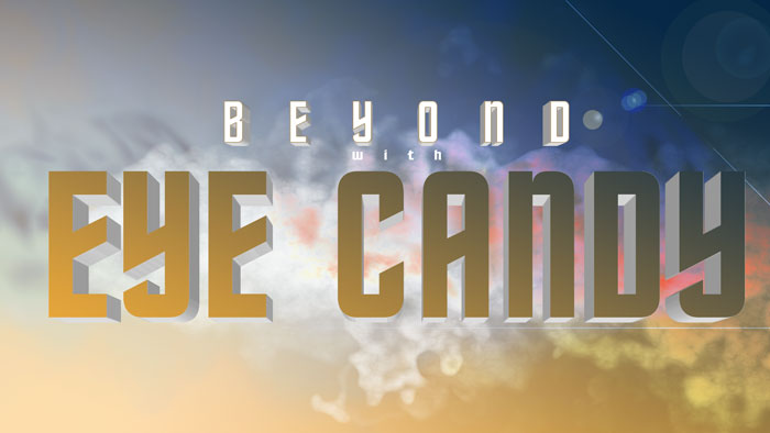
Try Exposure Today






I have tried to duplicate as above on the same screen while eye candy is open, but it does not work, what should I click on . It appears that I would be able to stay in eye candy and add various designs without getting out each design then go back which is not working that good. Also on various designs I’m getting a black outline and unevnness.
Hi Ben — Thanks for commenting. In Photoshop, before you run Eye Candy, make sure that you have the correct layer selected. I suspect that’s what you’re experiencing. The effects in the Shape categories need a selection to work from.
I recommend that you take a look at our Getting Started video, which has lots of great info about using Eye Candy. Yes, you will need to apply each effect you create, which renders the effect into an image format that Photoshop can see. You can run Eye Candy multiple times to add additional effects.
When creating effects with Eye Candy, I find it easier to start the design process with one of the preset looks. I then make adjustments until it looks the way that I want it to. You might want to try doing that.