Professional photographer Patrick Shipstad is based in Los Angeles. He shoots creative portraits, as well as celebrity, beauty, fashion, commercial and product photography. He has worked with NBC Universal, Disney, Buena Vista Television, DirecTV, Samsung, Lensbaby, Jones Of New York, Seagrams, and MTV books. He needed a creative photo editor for a recent project of his. He wanted to apply a vintage photo effect to complete his final image inspired by the book Miss Peregrine’s Home for Peculiar Children. In the article below, he shares why he chose to use Exposure X2 to help craft this unique project.
—
I think one of the most important aspects of a successful photo is what happens before you ever click the shutter. Pre-visualization is a technique for planning complex scenes before shooting. It allows you much more control over staging and art direction options. Planning what you want the photo to look like can happen quickly, or it can develop over time where you build on your original concept, adding or subtracting elements before finally deciding on exactly what to shoot. Then after you’ve ironed out what you want the photo to look like, you actually work backwards, by reverse engineering image’s elements and deciding what you’ll need to pull it off in terms of gear, location, talent, and post-processing software.
For my shot The Big Bow, that’s exactly what I did. I knew that after I took the care to capture the elements for the shot, Exposure was going to be the tool to transform this photo exactly how I envisioned it.
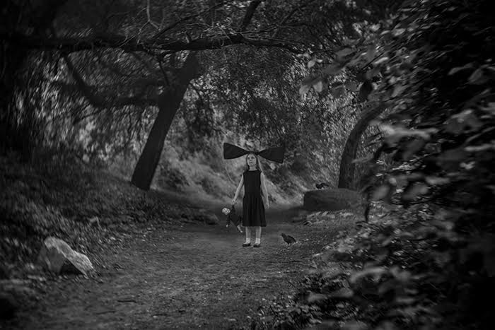
Inspired by Ransom Riggs’ dark fantasy best seller, I had the idea of a little girl with a huge hair bow, as wide as she is tall, walking through the forest. The rest of the story doesn’t need to be spelled out any more, because to me it’s best to simply give the “idea of a story,” and let the viewer fill in the rest with their imagination.
In pre-visualizing the final shot, I knew I wanted it to have an old-world feel, inspired by the antique look of a Petzval lens and wet plate processing. Knowing my tools, I knew immediately that the Lensbaby Twist 60 and Alien Skin’s Exposure would be two key elements in getting me the look I was after. The Twist 60 is like a 60mm Petzval lens in that it gives a swirly bokeh that works great with detailed backgrounds (like a forest), and Exposure is unmatched for its film simulation and the control it gives you to customize the looks. I knew it had everything I need to take my composite photo into the vintage, wet-plate feel I wanted.
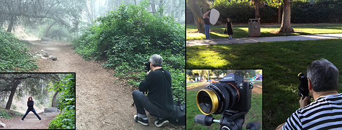
I shot my background plate with a stand-in on a foggy morning in the Angeles Forest in California. Weeks later, I photographed the young model at a park near my house. I shot all the elements using the Lensbaby Twist 60 and my Sony A7RII with the camera set to ISO 200 f/4 1/60th on a tripod. For a more detailed breakdown of the shooting details, check out this article on DIYPhotography.net.
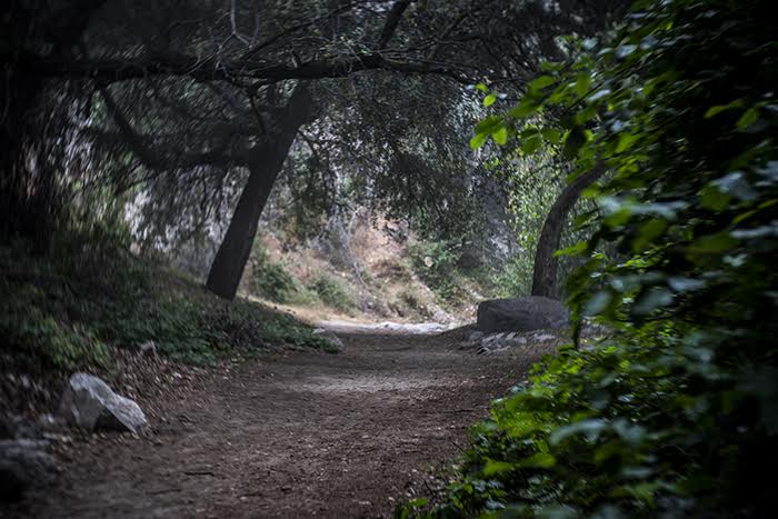
After compositing the model into the background, the secret sauce to this look was to jump into Exposure to add tone, vignetting, light leaks, film noise, etc. I first converted the file to black and white with Exposure’s “Kodak Technical Pan – Technidol” preset in the B&W Films category. The B&W presets alone in Exposure are a mind-blowing achievement in film simulation. You really can just convert your images with one click to recreate a specific film look or feel. Exposure does most of the work for you. Nevertheless, you can then edit and customize these presets to your heart’s content. You can even save them out as custom presets of your own, which is exactly what I did.
Next, I added the preset “High Key – Soft Glow & Lens Blur”. The Wet Plate film process adds a warmth to the tonal range, and an expansion in the mid-grays. Then I used the “Platinum Warm” Split Toning preset on the Color panel. This added a subtle brown to the mid-tones and gave a golden glow on the highlights, simulating the tones of a Wet Plate process. I dialed the color because I wanted more of a chocolate brown, and set it at moderate strength. Next, to drive home that vintage film look, I went to the Overlays panel. After experimenting with the many light leak selections, I chose “Surround 10” preset because the effect surrounded the image. I wanted gentle light leaks, so I lowered the strength until they were very subtle.
Still working with Overlays, I added the “Dust 2” texture map with an extremely low opacity. This was just to add a bit of aging from a scanned film look and feel. The Paper, Image Wash, and Scratches textures offer convincing effects as well. As a bonus, you can easily protect parts of the image to keep it free from the texture effects. For example, if you like a certain texture preset but there is a scratch or piece of dust on your subject’s face, you can keep the effect off of that area.
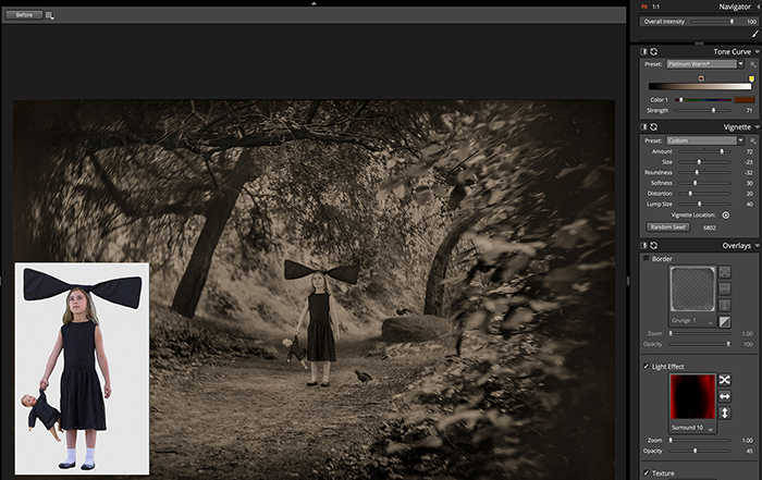
Finally, I added a custom vignette. I like the organic lumpiness of Exposure’s vignetting, it has much more of an analog feel to it, like something made in the darkroom. Since there was so much random foliage on the edges of the shot, the “Large Lumps” preset paired nicely. Once again, I had all the controls at my fingertips to tweak the effect to my liking. I adjusted the center of the vignette, tuned the distortion, and adjusted the roundness and the edge transition. I then saved all these customized parameters as my own unique preset so I can apply it to other images with a single click.
The amount of control and the options that are available in Exposure all at once are impressive to say the least. I didn’t have to go through a bunch of software programs in my workflow, one for this look then over to another for more options. Every element I wanted to adjust was easily available and logically laid out, allowing me to experiment until I got the exact look I was after.
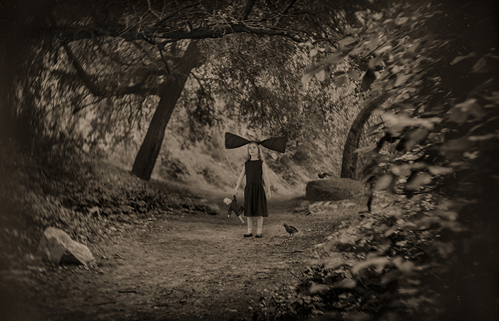
In the end, the final shot looks exactly like what I had in mind when I imagined the idea in the first place. The more I use Exposure, the more I realize how powerful it is. It can handle just about any film effect I can think of. Just clicking through the library of presets alone is inspiring enough, but if you want to dig in and customize a look, it’s easy to get exactly what you need. You may even get inspired to give your photos a look you hadn’t imagined.
—
See more from Patrick on his website or follow him on Instagram. If you haven’t used Exposure, download the free 30 day trial.
Try Exposure Today


