Commercial portrait and wedding photographer Miguel Quiles has been refining his skills for over 15 years. As a self-taught photographer, Miguel’s goal is to share his experience and knowledge with new and upcoming photographers. He is a Sony Artisan, a contributor for Rangefinder Magazine, and he teaches at Adorama and on AdoramaTV. In the article below, Miguel explains how he gets perfect skin using Exposure for his portrait editing.
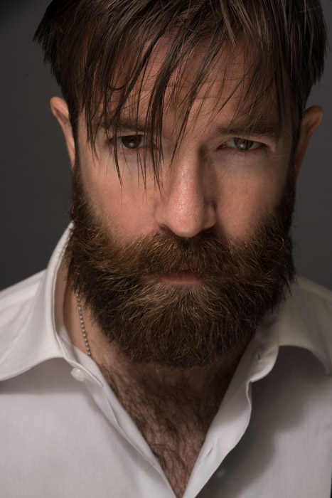
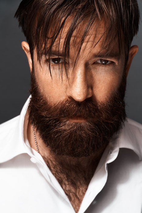
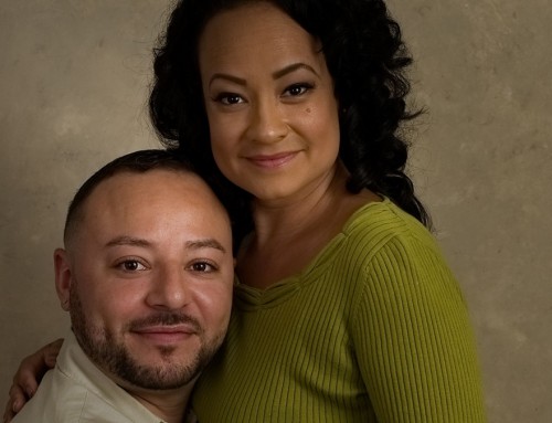
Original Image
One of the biggest challenges people face in portrait editing is achieving high quality, natural skin in their images. At times the methods and techniques available to get these results can be daunting, but they don’t have to be! For the last few years, I’ve been using Exposure to get beautiful results, and in this article, I want to share some of the things I’ve learned that can help you do the same.
Determining your Direction for Portrait Editing
The very first step I take in my process is to evaluate the image. Understand that anything and everything in a portrait can be modified. This includes the hue, saturation, luminosity, sharpness, and texture of the skin. Once you’ve studied your image and identified which areas need work, you can now begin to apply the powerful tools built into Exposure to fix those areas.
Apply Coloring Scheme
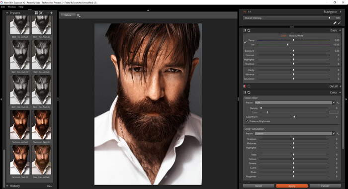
When I begin my retouch in Exposure, I typically start first by selecting my preset. This gives me the basis for the overall look I’m going for. Some presets will give you the perfect skin tone you envision with just a single click. Presets like Fuji Astia 100F, Kodak Kodachrome 25, and Kodak Portra 160NC are some of my go-to presets when retouching portraits as they provide a beautiful, natural skin tone in most situations.
So, what happens if you select a preset and it turns your subject’s skin tone into something less desirable? Fortunately, you have many options. I tend to start in the Basic panel after selecting my preset and make some small tweaks to the Temp and Tint sliders. Note that if you move the Temp slider to the left it’ll cool the overall image (make it more blue), and moving it to the right warms it up (making it more yellow/orange). Once you’ve tweaked those you can refine things by adjusting the Tint slider. This will add more green or magenta to your image. I typically adjust the Temp slider +/-10, while the Tint slider can go +/-20 depending on the image. These values of course will vary depending on your image and which preset you select, but they are a good starting point for most of my own portraits.
You can also make targeted adjustments to your skin tones by adjusting the saturation values under the Color panel. Since most skin tones reside in the red & yellow channels, you can further adjust your image by adjusting the red and yellow slider until you achieve the hues you’re looking for. Keep in mind as you adjust these colors that in most cases you want your skin tones to look natural, so extreme adjustments in either the Basic or Color panels should be modified carefully to avoid making the person(s) in your portrait look like they are from another planet.
Portrait Retouching in Exposure
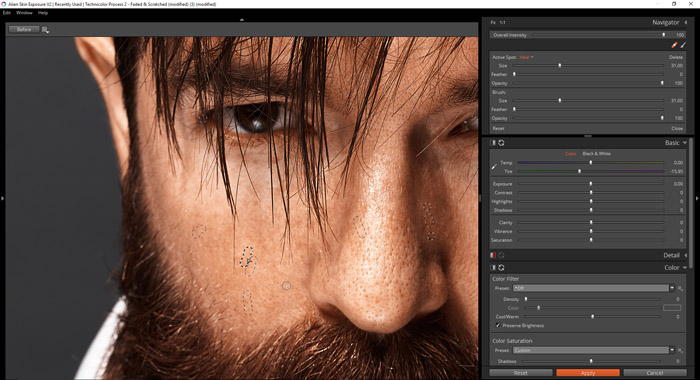
Once you’ve got the hue & saturation taken care of in your image, you can now use Exposure’s spot healing tools to quickly remove blemishes, stray hairs, or anything that is visually distracting in your portraits. By clicking on the Spot Healing tool (F4) you will open the panel. There you can adjust your brush’s size, feather, and opacity to clean up your image.
While this tool is quite powerful, you must use it with great care. Often portraits photographers will use this tool in excess, taking their image into the realm of digital art (sometimes even cartoonish looks) before they even realize it.
One of the key things to keep in mind when working with your portraits is to know what to remove completely and what to minimize in an image. Some things like pimples, stray hairs, fuzz, and the like you may consider removing completely to achieve a quality result. Other things like wrinkles, smile lines, crow’s feet, and the whites of the eyes are areas that I tend to lower the opacity settings on my brush so that it doesn’t completely remove those areas of detail. This will reduce the emphasis on those areas while still making your subject look like they are in a photograph and not in an animation.
This process takes time, so I would recommend zooming in and out of the image every so often to evaluate your image to make sure it looks great. While it seems like a small step, it’s quite important. Often when viewing an image at full screen you won’t notice any issues, but when you view it in thumbnail size (zoomed out) you may notice something on your image that isn’t noticeable up close. Since most images are viewed online first in a smaller size, you’ll want to view your image at that size throughout your process to catch anything that would keep someone from wanting to click and view the full-size image.
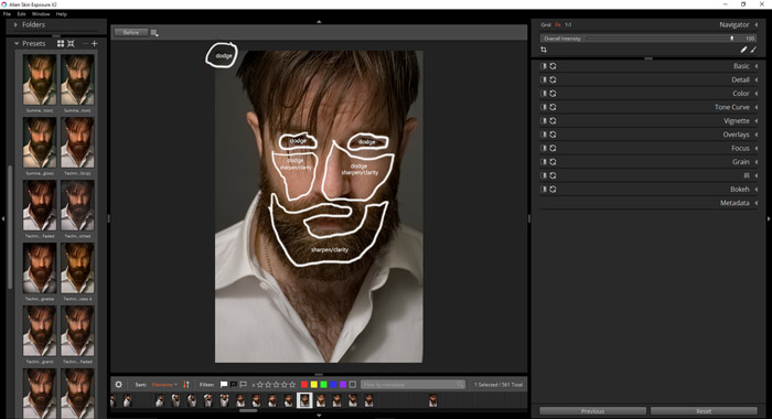
Moving over to the brush tool, you can use one of the most powerful skin retouching tools available, Dodge & Burn. This brush allows you to selectively brighten (dodge) or darken (burn) areas of your image to achieve consistency throughout your image. I use these tools to brighten highlights in certain areas like the forehead, cheeks, and even in their hair, while darkening other areas throughout the image so that there is a more even luminosity throughout the important areas of the image. Depending on where you’re working on your image, you’ll want to reduce the flow of your brush so that the changes are a bit more gradual.
This same brush tool also has other handy tools that allow you to enhance the iris, whiten teeth, and soften skin in your portraits.
As I mentioned before, don’t go overboard with these powerful tools. One of the biggest mistakes I see for example is when I see perfectly white eyes around the iris. If you don’t want to make someone look like a lizard person, follow my advice and keep adjustments to that area to a minimum. That way they won’t be a distraction to the overall portrait.
The last part in my skin retouching process is to sharpen and add grain to the overall image. Let’s begin with sharpening.
Gently Sharpening
This is a crucial step in getting awesome-looking skin in your portraits, and like every other step going too far can have disastrous results. Over-sharpening is one of the things I see most with novice retouchers, which draws attention to any imperfections in skin texture. Fortunately, Exposure has a powerful sharpening tool that can be customized to get a great result!
Under the Focus panel you can manually adjust the amount, radius, and threshold of sharpening. Rather than manually adjusting these settings right away I tend to select Sharpen – Low Radius – 25 in the Focus panel presets and then adjust those values to taste. Depending on the look I’m going for I reduce the Amount and Radius until the image is only slightly sharpened. In this way, it brings out more detail in the image without going into “HDR” type territory. Once you’ve tweaked these settings, the last step is applying grain to your image.
Adding Grain
This is the “secret sauce” in my portrait editing workflow, as the idea of adding grain to a portrait is foreign to most people. Back in the days of film, every roll had its own unique quality of grain that made portraits have a beautiful look that you just don’t see when shooting with a digital camera. You have presets available in Exposure that will add some of the most popular styles to your image, all of which can be customized for your portraits.
In my own images, I often use the preset “Regular Grain 25%” and adjust the shadow, midtone, highlight, and roughness sliders until I get the look I’m aiming for. Test out the various sliders available and if you go too far, simply press the reset button on the Grain panel to bring things back to their starting point.
These are just some of the many features available in Exposure that I use daily for achieving professional results. When I began using Exposure, I watched some of their tutorials on YouTube to help me better understand visually how everything worked and would highly recommend watching those as a follow-up to this article. With practice, you’ll achieve professional, repeatable results that will get you noticed!
—
Thanks for sharing, Miguel! See more from him on his website or follow him on Facebook, Instagram, Twitter, and YouTube.
Try Exposure Today


Good article! :)
I would love to read something similar about landscape editing! ;)
Hi Carl! Thanks for the feedback. Landscape workflow, huh? I’ll see what I can do. ;-)
Hi Jimmy
I listened and viewed all of your instructions.
The above one is very helpful because it explains so much to me!!
Thank you very much.
I hope you have more of those examples in the future !!
Regards,
Theo Smeets, Maastricht, Holland.
Hi Theo,
Thanks for the comment! I’ll make sure and pass your compliments over to Miguel Quiles. He was responsible for all the solid advice in the article.
Excellent advice! I especially appreciate the cautions about overuse of a tool. Thanks,
Fantabulous thanks
Great tips! Portrait editing is the most challenging step for me in creating images. I am using the free trial version of Exposure X3 right now, and I love it. I will be purchasing the software soon.