Thank you to everyone who supported our photo makeover project by spreading the word and submitting photos. There were lots of excellent RAW images shared with us. As a quick recap of the project, we invited everyone to submit a RAW, unprocessed image for a chance to have it edited by portrait and landscape superstar photographer Andrea Livieri. In the article below, Andrea shares his full start-to-finish editing workflow on one of the submitted photos. Thanks for being part of this photo makeover Andrea, Carl, and everyone else who submitted!
Andrea’s Analysis and Advice
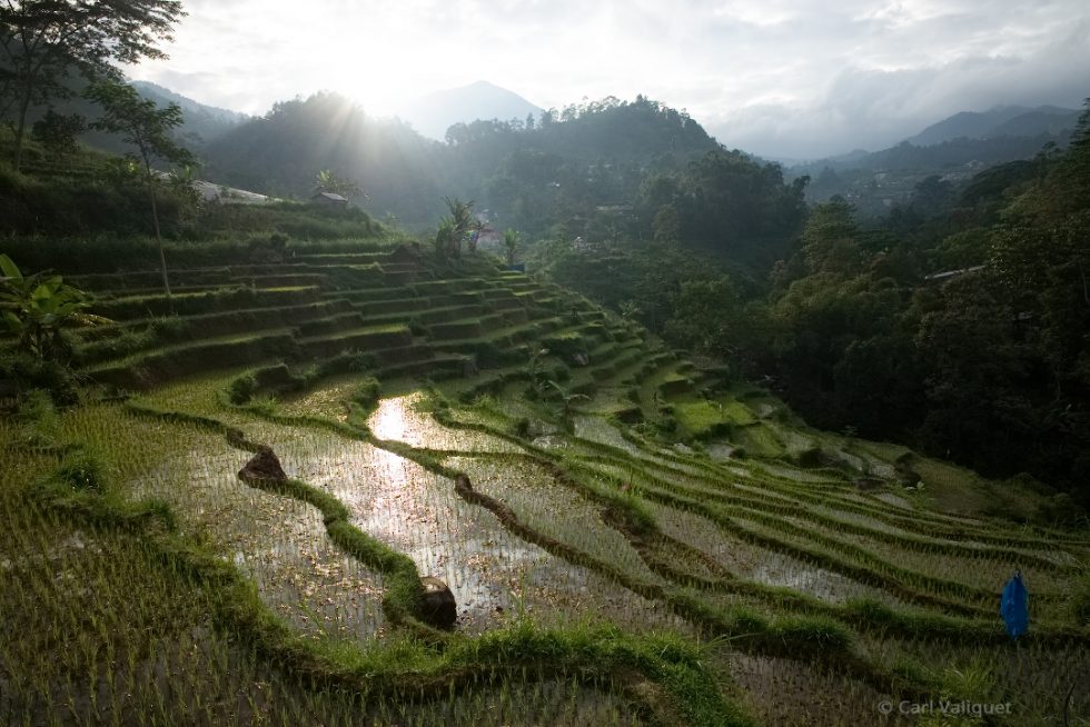
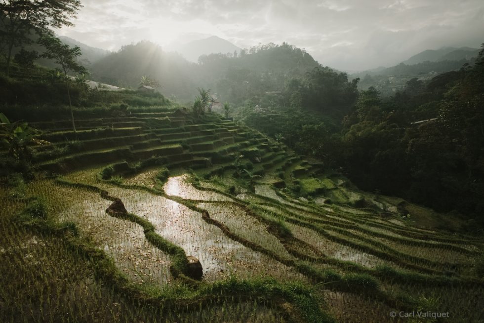
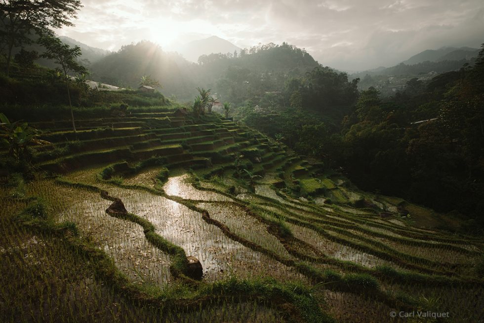
I chose to edit photographer Carl Valiquet’s DNG image. It was captured using a Leica M 240 camera, and an Elmarit-M f/2.8 21mm ASPH lens.
What first drew me to this photo was its excellent composition. All of the main elements in the image have a pleasing balance. I like the angled crescent shapes in the foreground. They create clear leading lines that direct the viewer’s eye into the center of the photo. These features of the image give it a strong presence. Additionally, the balanced composition and features give lots of opportunities to enhance the image with editing.
When shooting in a backlit situation like this, it’s important to consider how much detail the camera can capture before you take the shot. The shadows are exposed well in this photo, but the highlights don’t have as much crisp detail as they could. Shooting bracketed exposures, or using gradient filters would ensure that the camera can capture a higher amount of detail.
One thing to be aware of when you recover areas of missing details in a shot, like the sky in this photo, is that it’s critical that you don’t try to bring back all of that detail. Having some areas without detail in your image is okay. This is especially true it there is a bright highlight in a sun flare like this photo has. Recovering all the details can lead to the image’s tones reading muddy.
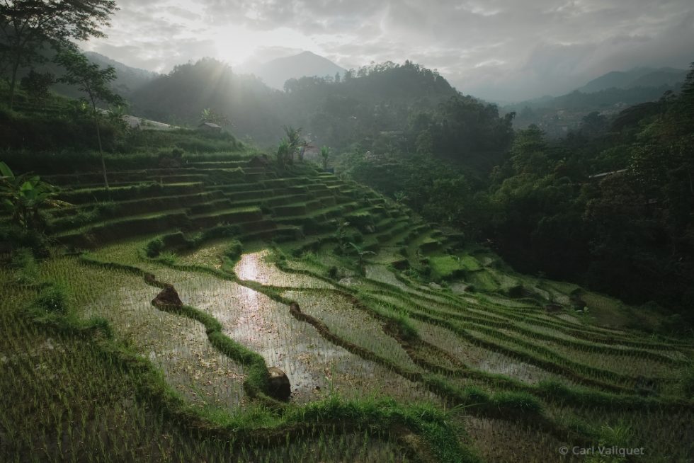
As I began editing this RAW photo, the first thing that I thought to use was Exposure’s layers functionality. Layers give me a lot of flexibility to make adjustments to each aspect of the effects I apply. Because this isn’t one of my images, I knew I would likely do more adjusting of each element of the look, so I wanted to build in as much flexibility as I could.
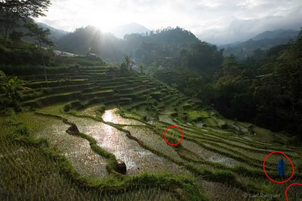
- The first thing I did was to remove distracting objects in the photo with the spot heal tool. There is a blue flag in the lower right corner that had to go. Also, on the Tone Curve panel, I raised the black point to give the image a faded feel, I decreased the white point to dial back the intense bright white glow on the sun, and I added a gentle ‘S’ curve to contrast.
- Next, I applied burning to the right corner of the sky using the Brush tool. I also increased clarity and added contrast to this layer. The combination of clarity and contrast gave a nice pop to clouds.
- I added additional burning effects to the lower left and the lower right. These effects were applied in their own layers so I can manipulate them independently. The detail in both lower corners was a little too strong, so I brought the brightness down to help direct the viewer’s eye to the leading lines in the foreground.
- I then applied a Kodachrome 35mm (1936-1962) preset to the entire photo. The Kodachrome preset warmed up the color temperature, and it also enhanced the photo with some additional mood.
- Next I added dodging effects to a few areas in the foreground. This was to help create more separation from the background. It also enhanced the leading lines on the left and balanced the highlights in the trees on the right.
- I applied a second preset, Kodak Portra 160NC at a low opacity. This added a controlled, balanced contrast across the whole image and further enhanced the mood.
- I added some detailed dodge effects to the green in the leading lines. There were harsh shadows in a few spots. Removing those dark areas makes the leading lines read more clear.
- In a new layer, I brought the mid tones down a touch to add a bit more density.
- The region near the sun was a bit dull, so I used a local adjustment layer to pop up the sun and rebalance the zone where the sun shines brightly in the shot. I did this by raising the Whites slider and by lowering the Shadows slider.
- Next, I did a little burning to a bright section in the foreground of the shot. This was to remove a distracting bright area on the bottom edge of the photo.
- In the next layer, I used the HSL panel controls to make the yellows more orange. I also increased the color saturation in those tones. This helped make the foreground more warm.
- I added a second layer for the sun. I moved the white point left on the Tone Curve, and I dimmed the mid tones slightly.
- I added red coloring to the highlights using the Tone Curve. I increased the mid tones on the red curve slightly, and then I brought down the red channel highlights. On the blue channel curve, I slightly raised the mid tones and highlights.
- I applied dodging to tame the reflection highlights. They easily overpowered the sun in the shot.
- I also added a vignette. When I apply vignettes in Exposure, I like to turn the Amount slider very high so I can see the vignette effects easily. After that I will make adjustments to blend the vignette with the image, and then I decrease the amount until it looks right to my eye.
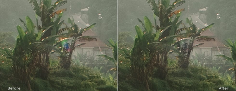
Lens flare before and after viewed at 200% magnification.
- I added a layer to fix the lens flare. I needed to desaturate that small area significantly to blend it with the rest of the photo. This also makes the tones blend with the background.
I love working with moody landscape scenes, and this backlit shot is very nice to work with. Since it’s not one of my own images, I can’t use the same creative process that I do on my own work. I had to experiment because I didn’t know where to take the photo with editing. This is where Exposure excels. Experimenting with Exposure’s presets enable me to visualize what mood goes well with the image. This is one of the many aspects of the software that makes Exposure stand out as my go-to creative tool.
Try Exposure Today





Dear Andrea Livieri,
I thank you so much for choosing my image for the makeover. First think I must do is go out a buy a graduating filter. As i learned through the years working with film — it is better to work on the image before clicking on the shutter then try and fix it up later. Second, I must say that I am pleasantly surprised by the end result. Your work on this image is subtle and moody. Your usage of Kodachrome (one of my favourite films) and Portra is just great. I have learned a lot from the description of your workflow; especially your usage of Exposure’s layers functionality that I do not use. Thanks again.
Thank you Mr. Jimmy Beech.
Carl Valiquet
Thanks for submitting your RAW image, Carl! It’s a really pretty photo. Once Andrea worked his magic on it in Exposure, the captured scene really came alive with a nice mood.
Hi Carl,
It has been a pleasure to edit your photo. You have a great taste on framing and composing an image. I’m really glad you like my editing and I hope it was helpful. The raw file already was pretty good and I’ve done just some subtle adjustments to make it pop as it deserved.
A soft graduated filter can be a good investment and a very useful tool to improve your images in those kind of light conditions.
p.s. Thank you Jimmy for the really good teamwork!
All the best
Andrea
Thanks for everything, Andrea. You rock!
I really enjoyed this step-by-step walk-through. I hope we’ll see more in the future!