My curiosity for people helps me get to know my portrait subjects personally. Building this strong connection with them translates into photos that have an authentic, natural feel. My fondness for creative environments has led me to take on an ongoing project named ‘Creative Workspaces,’ where I profile artists of various disciplines in their studios. The article below discusses how Exposure’s presets help my photos tell a complete story about my subjects and their creative environment.
Shake any Fujifilm photographer awake at 3 a.m. and ask him or her why they choose to shoot with Fuji, and they will invariably respond dreamily, “The colors… Oh the Fuji colors…” But there’s more to it than just “color,” isn’t there? I’d like to talk with you about how I see the role of color (and sometimes, its absence) in photography, and why I use Exposure in all my work. This isn’t about workflow per se. Let’s discuss, instead, the “why” of Exposure in the digital darkroom. I’ll share examples from two recent shoots from an ongoing personal project as well, shot on the Fujifilm GFX 50S medium format, along with the “why” behind my choices of film emulation for each of them.
As photographers, we constantly strive to express not merely how it looked, but how it felt. A slow shutter speed can help us communicate the blur of constant motion on a Manhattan street corner, or the sense of peace on a still pond. We use light to emphasize the lines of wisdom on an elderly face, or to wrap a bride in the glow of love. Our color palette is just as powerful a tool in this expression, and this is where Exposure comes in.
Think about the last lens you purchased. You probably solicited opinions online, such as fellow photographers on FujiLove’s page. You searched by lens on 500px. You read reviews. You watched YouTube videos. You got a sense of who was using the lens most, and under what circumstances it shone. In other words, you did serious research. Exposure’s emulations are a lot like that: you’ll see familiar names, and you’ll also be introduced to new ones. Go deeper with an emulation that catches your eye and look it up: What time frame was it in use? Is it strongly identified with a particular style of photography? Is there a Simon & Garfunkel song about it?
Do you know one of the most important tools we have as visual creators? The power of daydreaming. Now there are fancy terms for this, such as previsualization — we used to just call this “being prepared” — having a mental sketch of what we hope to create. I believe this process extends past the shoot itself, right into the digital darkroom, and for me, Exposure is essential to it.
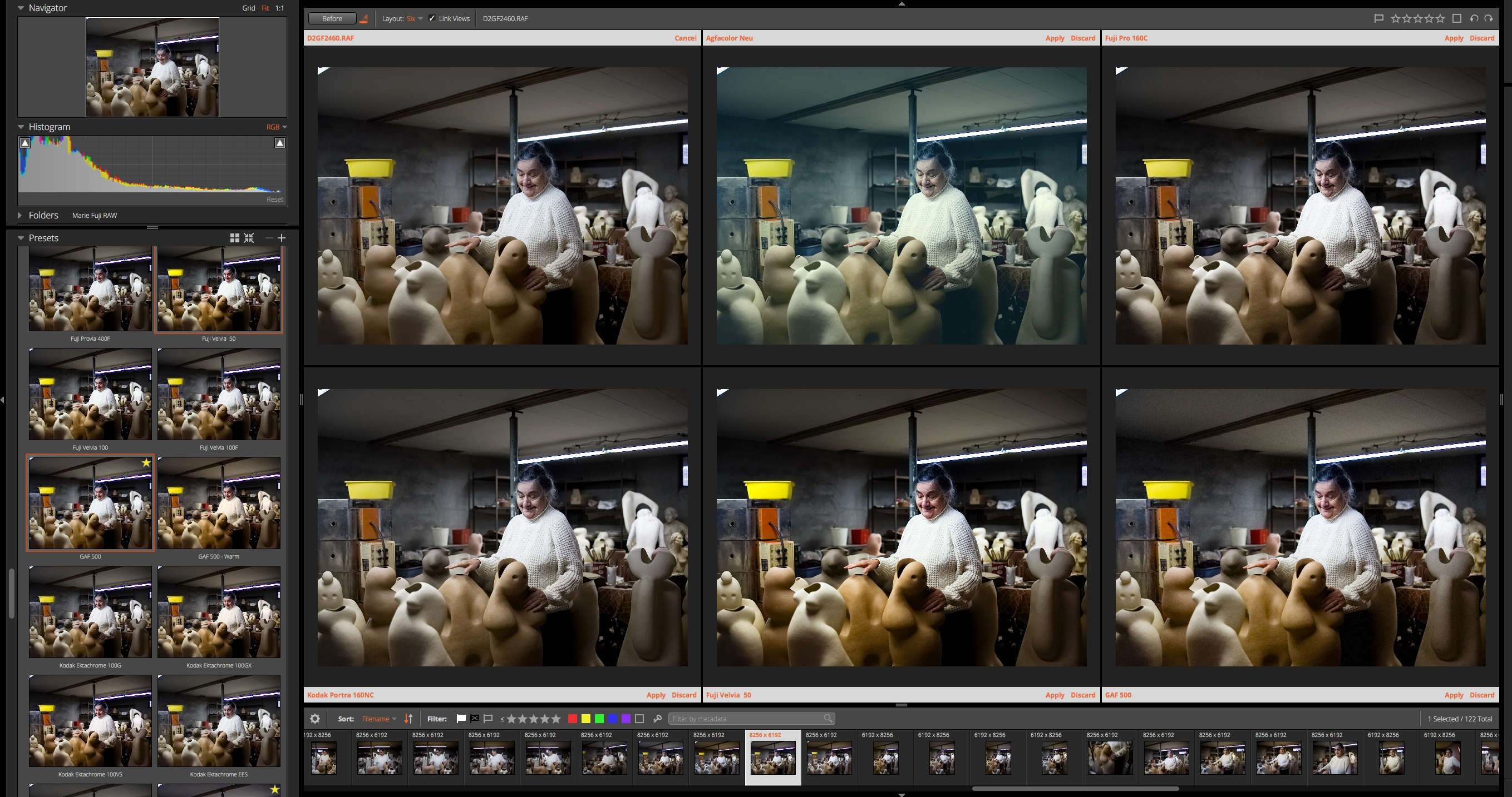
Before I make my selects, before I begin adjusting any sliders, I take a little walk through the possibilities that the software offers me. It soon becomes clear that certain stocks just weren’t meant for certain images, and that’s fine. Inevitably, a few candidates emerge, the ones that I recognize as how it felt. I’m a big fan of Exposure’s “Audition Presets” feature, which allows me to compare up to six emulations of the same image against each other, helping me narrow down to my final choice.
-
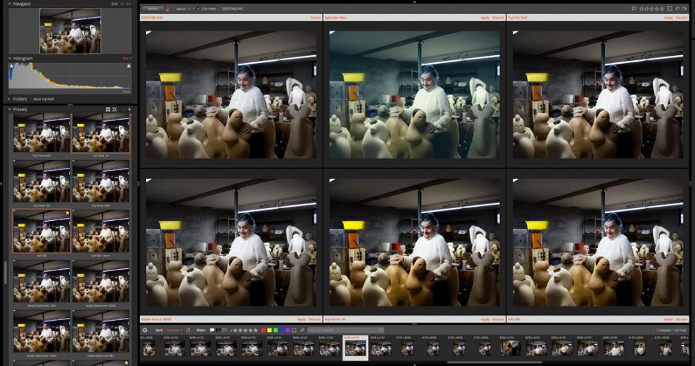
Click image to view larger
And while I have returned to certain emulations many times (and reference them in my Favorites collection), by no means do I limit myself to them or feel as though I “have” to use them to maintain a consistent style. Photographic style includes many things: how you approach your subject, lighting, composition, lens choice, as well as the color or black & white palette. Your style can be expressed in many palettes, each one appropriate to its subject. I don’t shoot every subject with one formula, and I’m sure you don’t either. The many options in Exposure widen my view of the possibilities. From there, I have complete freedom to add, change, or remove grain; change tonal values; adjust the colors of the shadows and highlights; etc. With the recently-release Complete Workflow Update, the program, and how I use it, has only gained in flexibility and precision in both artistic (fine color detailing) and practical (keywording and metadata) features.
Now let’s look at a couple of examples of shoots from a project I’m working on, an editorial series on artists in their workspaces. As I’m based in the Hudson Valley area of upstate New York, I’ve been able to reach out to many working artists in the thriving creative communities that the region is famous for.
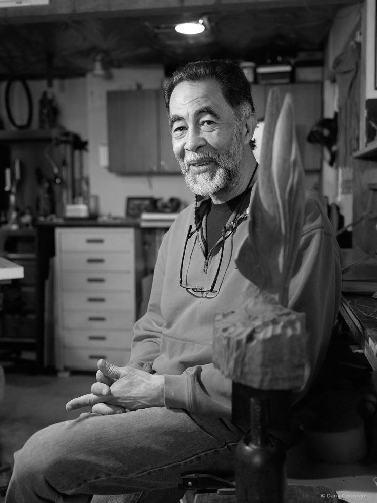
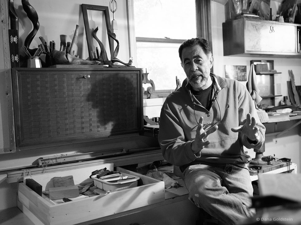
The minute I walked into metal and woodwork artist Randolph SanMillan’s basement studio, I knew that I wanted my final images to be in black & white. The strategically- but dimly-lit space created expressive shadows on the varied surfaces of SanMillan’s pieces, and the bronze pieces in particular glowed. I set my Fujifilm GFX 50S to Acros simulation, to help me concentrate on only the play of shadow and light in the EVF. Though I shoot in RAW, I find the Fujifilm simulations very helpful guides as I’m working. As we shot, we had a wonderful discussion of how he created his artwork, his influences, and what he intended to communicate with the pieces.

Later as I began my “daydreaming” in Exposure, I thought about the straightforward yet profound man of strong convictions I had just met. I’m a very big fan of French photographer Robert Doisneau (1912-1994), who photographed the daily laborers of modest means with whom he shared both social background and philosophy. In particular, his work in the now-demolished Parisian market district of Le Halles is a touchstone of ordinary people presented with dignity and grace. I wanted my images of SanMillan to share this quality.
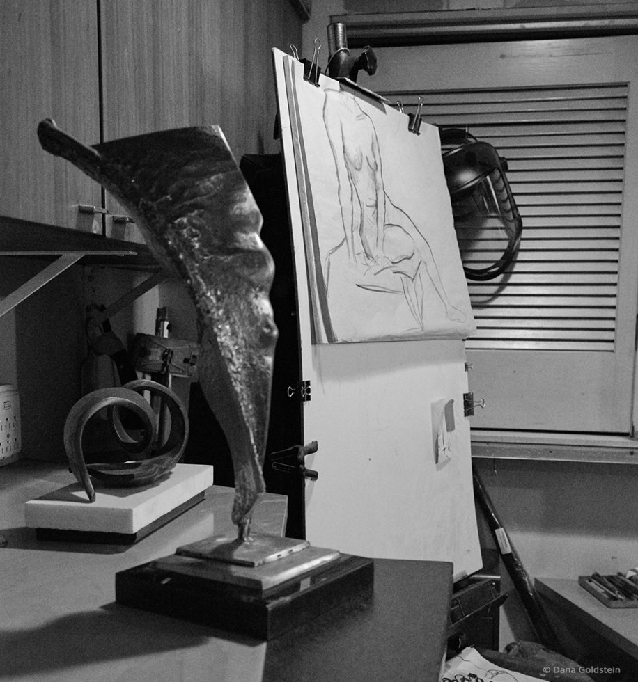
While I’ve often used Exposure’s Pantomic-X black & white emulation, this time I was looking for something with a bit of a glow to the highlights, a fine grain, and a more cinematic feel. Scrolling, I landed on T-Max 100, and there it was: how it felt. The heroic, silvery quality that T-Max provides is an important part of why I consider this set of final images so successful.
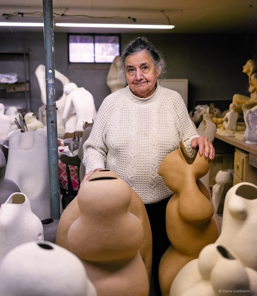
As I pulled away from the home and studio of ceramist and sculptor Marie Mastronardo, I wasn’t sure that I’d quite nailed it. At age 86, she lives in what she concedes is a “half-finished” home that she has shared since the early 1970’s with the enormous artistic output of six decades. She had recently enjoyed a major retrospective of her career, which included an association with the renowned Art Students League in New York during the 1950’s.
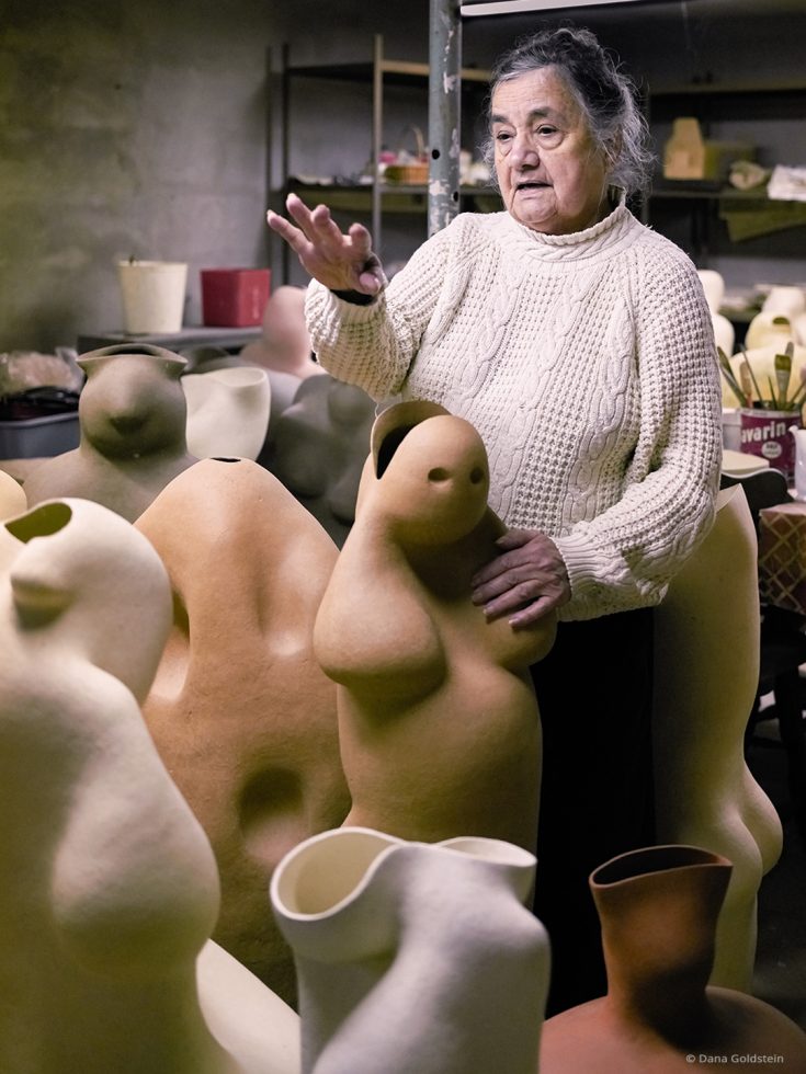
The pieces that had returned to her cement studio were everywhere. Windowless and fluorescent-lit, the studio did not lend itself to photography, or to showing individual pieces effectively. Yet, as we spoke, I saw a life at the center of the art world, when New York had become the haven for a generation of European artists escaping the Nazis. Despite the cement and cold light inside, how it felt was warm and soothing: she was surrounded by the figures she had created and the memories of what had led to them.
This time, my “daydreaming” turned to a photographer of artists: Alexander Liberman (1912-1999), the artistic director of Vogue and later, over all of Condé Nast publications. His seminal volume The Artist in His Studio visits the preserved homes and studios of the Impressionists, as well as artists working into the 1950’s and ’60’s. Shot over decades, the images reflect the artists as individuals comfortably at home in their creative environments, much as Marie is in hers. In Mastronardo’s images, I wanted to emphasize the textures and warm base colors of her clays, and the wisdom in her expression, which my GFX 50S had captured in medium format detail and tonal range.
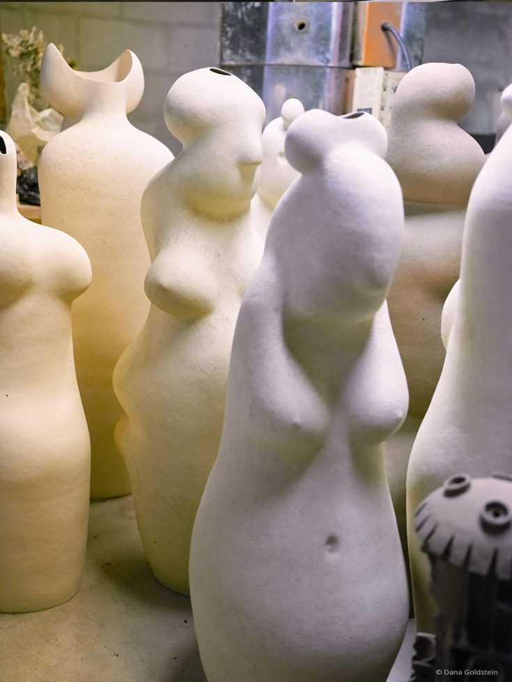
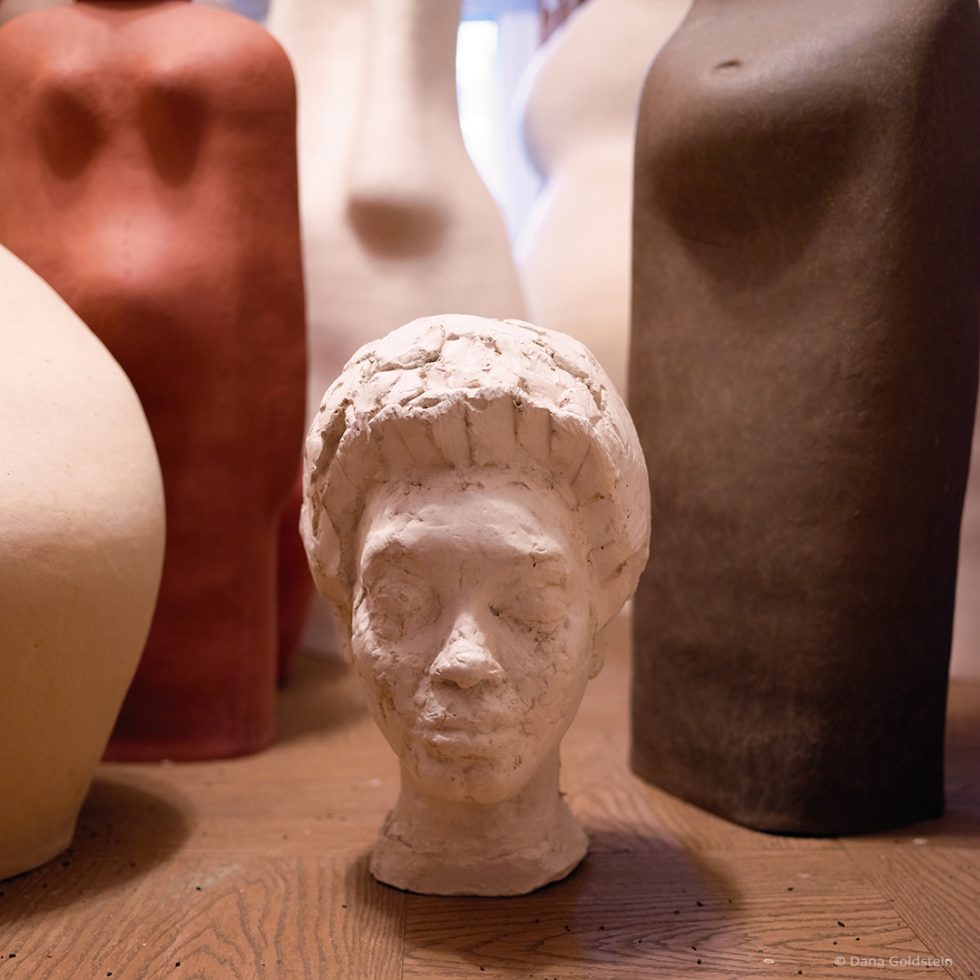
To my surprise, the Exposure emulation that suited this perfectly was one I’d never given a second thought: Ansco’s GAF 500. A color slide film known for extremely large and colorful grain, it was considered a rough, poor stepchild to the more finely grained films being used for 1960’s fashion work. This changed when French photographer Sarah Moon (b. 1941) began using it for such clients as Cacharel and the Pirelli Tires calendar. Its preternatural warmth gave her work an ethereal quality. Applied to my images, GAF 500 brought out the warm tones of the sculptures while not “colorizing” the cement studio surrounding them. The contrast of warm and cool was preserved. I removed the famous GAF grain, however, in order to keep the detail in the finished artwork. It was the right choice for this shoot, and Exposure’s grain engine made it possible to style it to my needs. The final images express both the artist, and the art.
I hope these examples encourage you to explore Exposure for yourself — for the first time, or with new eyes. Embrace the history of our amazing medium, and let this program help you fulfill your goal: to express how it felt.
Try Exposure Today