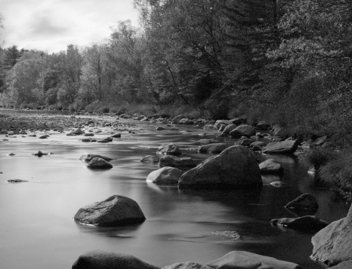
Adding more depth to flat photos is a common post-processing goal. This tutorial guides you through adding punch to flat photos with adjustments to clarity, contrast, and vibrance. Learn tips on when to use each technique, how much to apply, and more.
Photos: David Shoukry
Transcript
What makes a photo look flat?
Unprocessed RAW photos can sometimes have a neutral look and low contrast. The image data is compressed into the midtones, leaving little detail in the shadows and highlights. We call this “flat.” Flat photos can easily be enhanced with post-processing to give them more punch.
Contrast
Contrast is the difference between the light and dark values in the image. In many cases, a simple contrast boost will add the necessary pop to a flat-looking photo. Contrast is usually a better choice for adding punch to portraits than Clarity.
Increased contrast will widen the dynamic range of the photo. This stretches the tones in the histogram left and right. Decreasing contrast will flatten the image and smash the tones to the center. [show] When making contrast adjustments, try to make the tonal range span the entire histogram.
How much contrast?
Increasing contrast makes colors appear more saturated and will emphasize grain in highlight and shadow areas. Too much contrast can cause a loss in image detail. When overdone, the brighter tones appear blown-out even if the image is properly exposed. The same issue can happen in the dark areas of an image with too much contrast, where shadows become uniformly black.
The Dynamic Contrast slider in Exposure applies contrast adjustments without affecting color tone values. When making adjustments to images with people, use the Dynamic Contrast slider to keep skin tones looking natural.
if you tend to go overboard with adjustments, look for a good value of contrast and then reduce by up to half.
Clarity
The Clarity slider adjusts edge contrast. It impacts the middle tones of the image most. Clarity is a great way to give flat images more punch and impact. Its effects are similar to sharpening, but it will also enhance textures and small details. There are several editing situations where you’d boost clarity instead of contrast, such as black and white conversions, photos of buildings, landscapes, and animals. Adding clarity can emphasize wrinkles, color variations, and skin texture, so subtle amounts of clarity generally work better for photos of people. Negative values of clarity will soften the photo.
How much Clarity?
Clarity is a great option to counter unwanted softness. Too much clarity can make photos appear overworked. Lines and shadows will be harsh and unrealistic. White areas will look overly smooth and the shadows will contain noticeable noise. Strong clarity effects on skin tones are easy to spot. Skin is a good place to evaluate the amount of clarity applied to an image. As you add clarity, stop when you notice halos or blooming along edges.
Vibrance
Vibrance controls saturation, but it only affects pixels with lower saturation in the image. It’s a more sophisticated version of the Saturation slider and works wonders on flat images. Vibrance makes an image more bright and colorful without oversaturating areas that already have bright colors.. It is also useful for protecting skin tones, so you can make a quick vibrance boost and people still look like people.
How much vibrance?
Vibrance is more forgiving than Saturation, but too much is still too much. In general, if you ever drag a slider all the way in one direction it’s probably too far. It’s best to boost vibrance to the point where an image is more clear and colorful without looking obviously processed.

