Joseph Francis is a freelance visual effects supervisor based in Los Angeles. He has had a long career in the 3D field. I asked him to share a little about himself as well as give our blog readers a little insight into his use of Eye Candy. The rest of this article is from him. Thanks, Joseph.
—
I started my career in New York City at R/Greenberg Associates. It’s an interactive agency now, but at the time it was the design firm behind many famous movie title sequences. While in New York, I had the opportunity to work with Ryszard Horowitz. He’s a noted photographer and artist that specializes in creative photo composite work. It stimulated my interest in the subject.
I moved to Los Angeles when R/GA opened a west coast office. I was the acting Creative Director. In 1996, I left to supervise computer animation for the feature film, Independence Day. Since then, I’ve remained a freelancer. I have contributed work to companies such as Pacific Title & Art Studio, yU+Co, and Imaginary Forces.
In 2005, I took up photography in a more serious way. I’m particularly interested in digital photo composite work. Rather than create the expected digital composite work that might come from someone with a background in visual effects–like robots or dinosaurs, I want to incorporate subtle digital assets into my photography. These assets could be anything such as a realistic but virtual drawing room in a French chateau, an elaborate gown, or the perfect white birch tree in the snow. I’d rather people wonder whom my seamstress is than estimate how long it took my dragon to render.
(For example, check out the image below. Hiromi Paper Dress)

Selected by Alessia Glaviano, Photo Editor of Vogue Italia and L’Uomo Vogue, for
publication on Vogue Italia PhotoVogue.
As a 3D artist, most of my work is built from the ground up. 3D work can be divided into 3 basic phases: modeling, layout, and rendering. The modeling and layout components happen inside of the 3D program. Rendering uses textures that are created for use in the scene. These textures come in many different styles and types. For this article, I’ll show you how I build some of mine.
A good 3D artwork is only as strong as it’s weakest link. If one of the components isn’t great, it will detract from the image’s overall impact. With this in mind, I spend a lot of time in Photoshop in order to make my texture maps look just right.
Below are some of the steps I go through when I’m creating a texture.
In the above image, I used Eye Candy’s Texture Noise – Dots preset. The automatic tiling option makes my work easy. This makes the texture seamlessly wrap around the object I’ve built in 3D. I use this toggle all of the time.
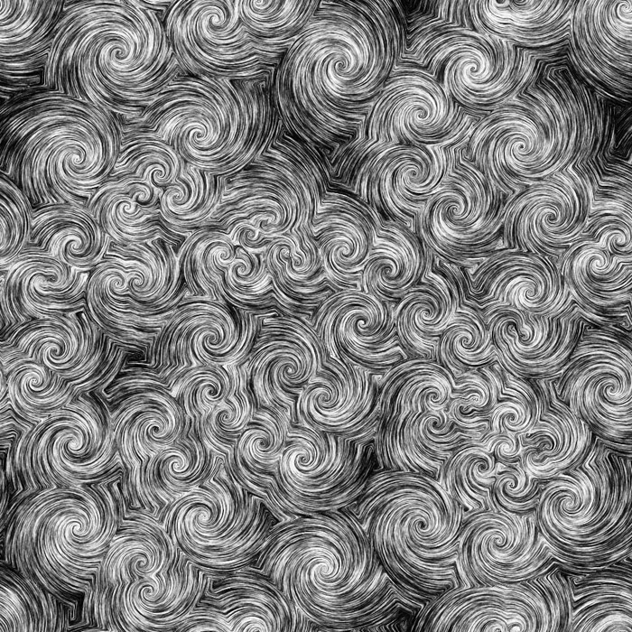
This image was made with the Swirl effect at 80% opacity. I added additional contrast in Photoshop. The swirls are quite nice! They look like illustrated water or clouds in a children’s book.
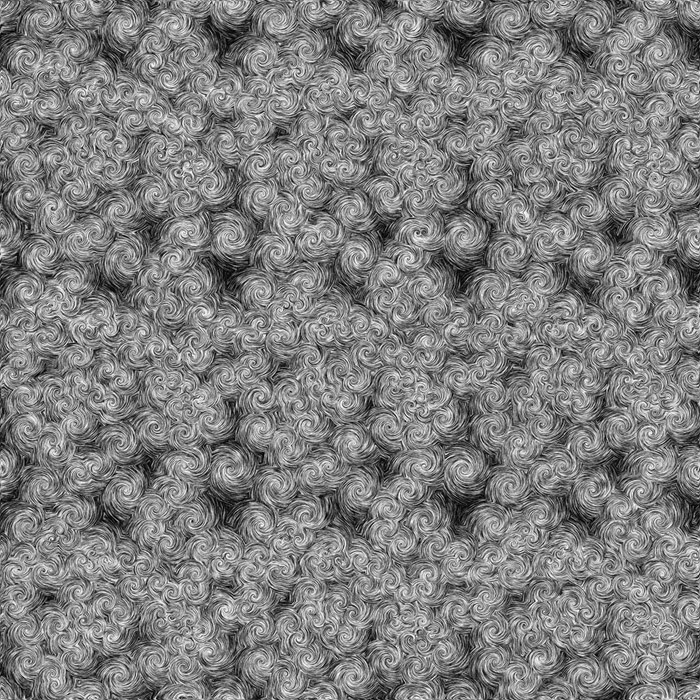
Here’s a tip: I tiled the spots into a 3×3 grid before mixing in the swirl. Once combined, I extracted the center tile. Mixing effects like this can cause edging artifacts.
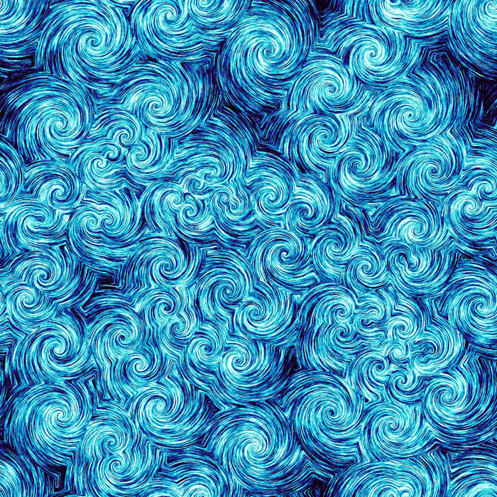 I used a gradient to map the color in Photoshop. This gave me additional control with blending modes. I like how it turned out, it looks like clouds or water. I’m not sure what, but I like how it turned out.
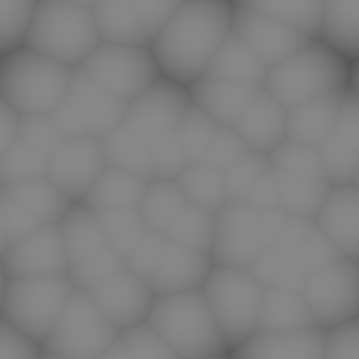
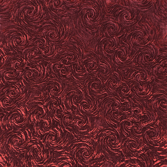 I used a simple displacement map to make the texture stand out in 3D. Displacement maps assign a Z-axis value to tones in a B&W image. This technique gives surfaces a sense of depth and detail. In this shot, the texture looks hand-carved.
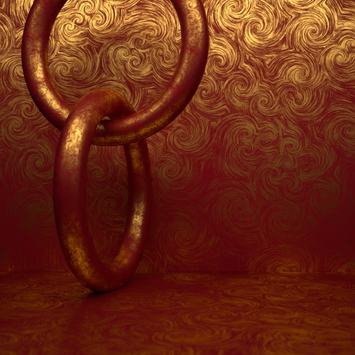 I can use the same texture as a beautiful, highly-decorative virtual material. This is an example shot of this in a rendering. Currently, Maxwell Renderer is my weapon of choice.
—-
To see more of Joseph’s work, visit his website. http://www.digitalartform.com
Try Exposure Today




just some fun stuff with eyecandy. love the filters! now my art really pops!
just some fun stuff with eyecandy. love the filters! now my art really pops! hear is a jpg..if it loads up.
and one more