Picking up where we left off yesterday, Dustin Abbott will take us step-by-step through his workflow using Exposure. If you missed yesterday’s post, take a look, here.
—
My first suggestion to make a great shot is to start with a good image and then add extra degrees of nuance to help it transcend the “good photo” status. The second suggestion, covered in another article, is to use post processing to create a stylistically different image that reflects your own personal vision and stands out in today’s overcrowded marketplace.
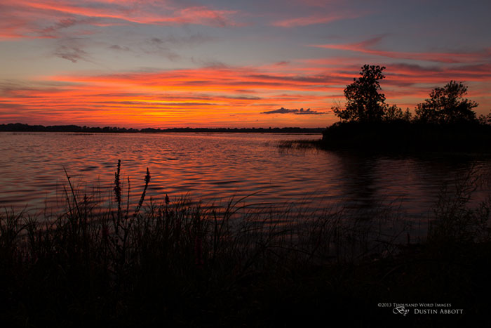 In this image, I captured a beautiful sunset. This is a “good” picture. It has pretty colors, pleasing mood, sharp detail, and good composition. The horizon is a little off, and it was purposefully underexposed in order to highlight the sky and create silhouettes. Good, but not great. Our goal is to add a little more zing and nuance while retaining the overall feel and natural quality to the photo.
One of the reasons I chose this particular composition is the beautiful wildflowers in the foreground. My eyes could take in more dynamic range than my camera’s sensor. So, planning for this, I bracketed a few exposures. I carefully aligned the images and used a mask for the brighter exposure. For masking and selections help, watch the videos Jimmy made to illustrate the process.
In this case, I don’t want the sky to be affected by the brighter image/layer. I used a reverse layer mask, or one that appears solid black. For this, I held Alt/Option while I clicked on the create mask button at the bottom of the layers panel in Photoshop. Next, using the brush tool
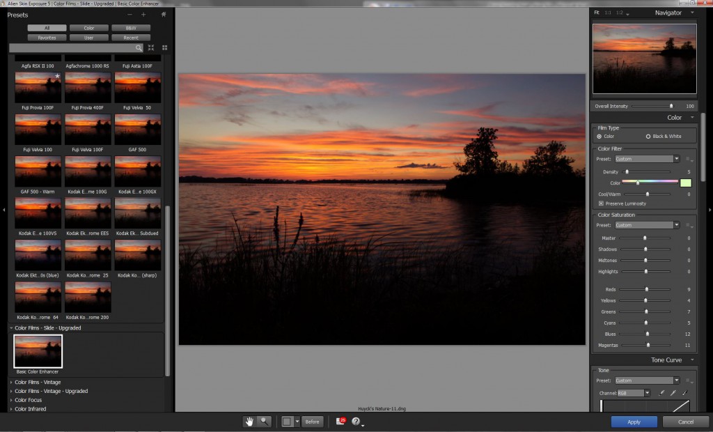
Next, while the colors in the image are beautiful, they are a little muted because of the underexposure. My goal was to restore the fiery color that my eyes saw at capture. I moved into Exposure. One nice thing about Exposure 5 is the thumbnail previews on the left. You can see what each preset will look like when applied to your shot. It’s easy to find a “look” that aligns with what you have in mind.
Sometimes what looks good in a thumbnail is less appealing in the full preview window, but don’t worry, the effect is not rendered until you click “Apply.” It may be that the effect does everything you want, but there is a wide range of ways to tweak the preset for a custom application. I typically will make tweaks to the saturation. I may also make slight changes to the tone curve, sharpness, and sometimes add a bit of glow through the IR panel.
For this image, I chose a preset from the “Color Films – Slide” group. Slide film presets often feature deep, contrasty color that works well with this type of image. I was drawn to a Kodak Ektachrome preset because it enhanced the blues in a very pleasing way. I dialed down the overall intensity a bit, tweaked the saturation where I wanted, and added a hint of sharpness. Nice!
Back in Lightroom, I straightened the horizon and added metadata. Now I have a finished image that has gone from good to great. The foreground is not lost now; the color of the lone wildflower mirrors the color in the beautiful sky. I retained the silhouettes and added a little more visual interest. Most importantly, it reflects my creative vision, capturing what I saw when I was shooting. There is more visual punch, too, which helps the image stand out.
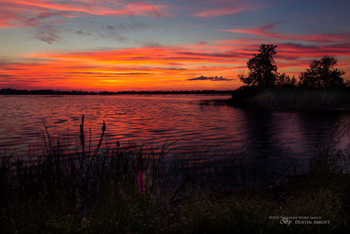 These adjustments just might make the difference between an also-ran and a sale. Exposure is a great tool for making your images go from good to great. Up next, we will see how to create a unique image through more dramatic use of presets in Exposure and set your work apart even further.
—
See more of Dustin’s work on his website, Flickr, 500px, and Facebook. He has a bunch available as stock on websites such as iStockphoto and Getty Images.
Try Exposure Today




[…] Dustin Abbott’s From Good to Great Part 2: […]