Here is an article by Marilyn Sholin about using Snap Art for portraits.
—
Watercolor is an extremely expressive medium. It takes a lot of tedious control and expert coloring skills to make an attractive picture, even with software. Portraits with watercolor are particularly challenging because the detailing and the paint effect must be kept in a harmonious balance. Without balance, the painting will be lifeless and flat.
Snap Art 3 makes it easy.
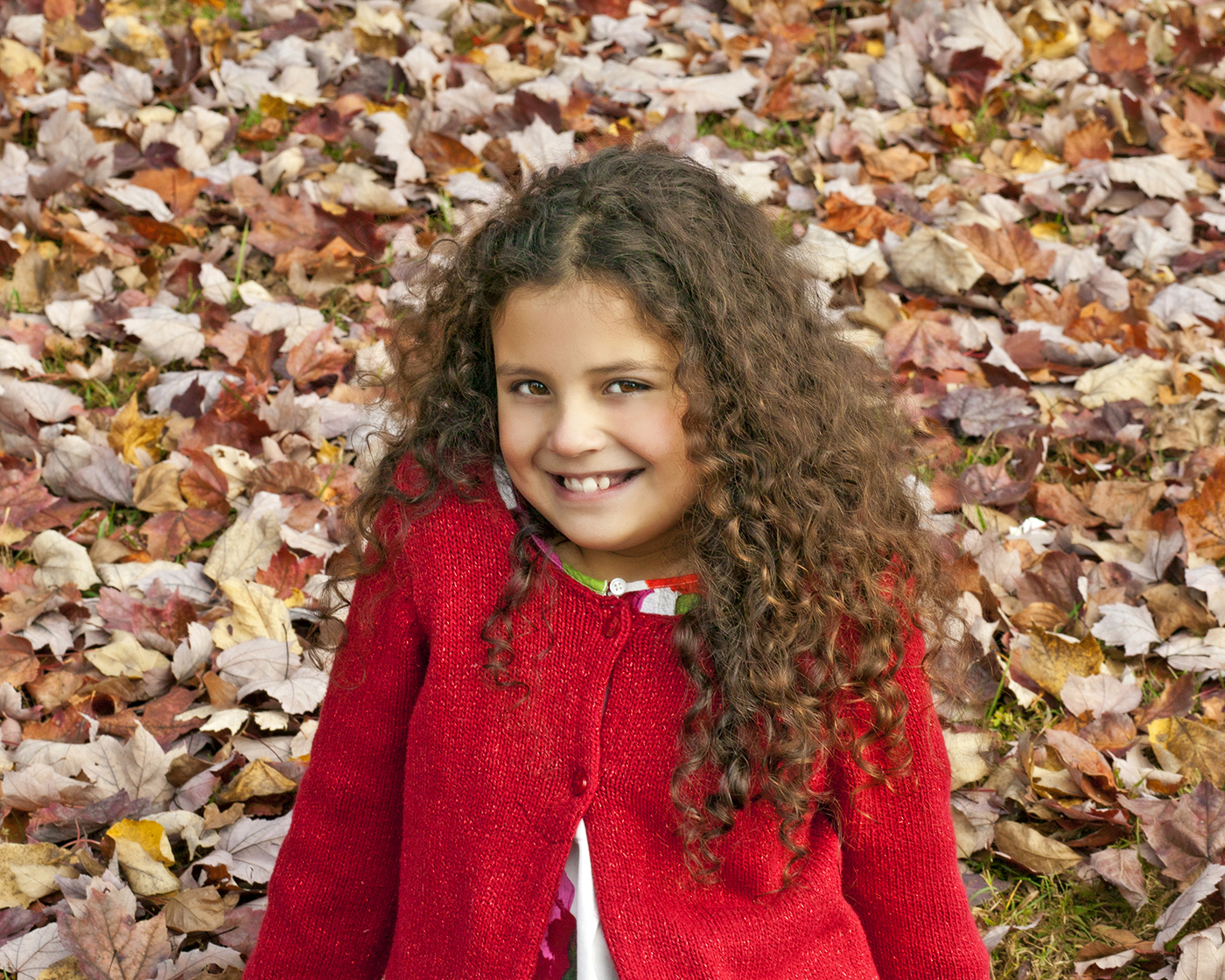
I’ll start with a shot from a fall portrait session. I chose this image because the browns from the leaves contrast nicely with the reds in her dress and hair. This will be a great-looking watercolor when we’re done.
Process:
Open the image in Snap Art 3. If you haven’t used it before, watch the Getting Started video.
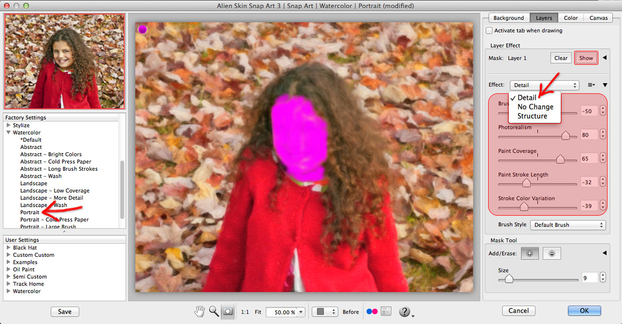
Under Watercolor, I’ll choose the Portrait preset. I’m happy with the rendering of the paint effect so I’ll leave the controls on the Background tab alone. I want to add some detail to the face; the controls for this are on the Layers tab.
Next, we’re going to add a detail mask. Check out this tutorial video that explains the layer mask process.
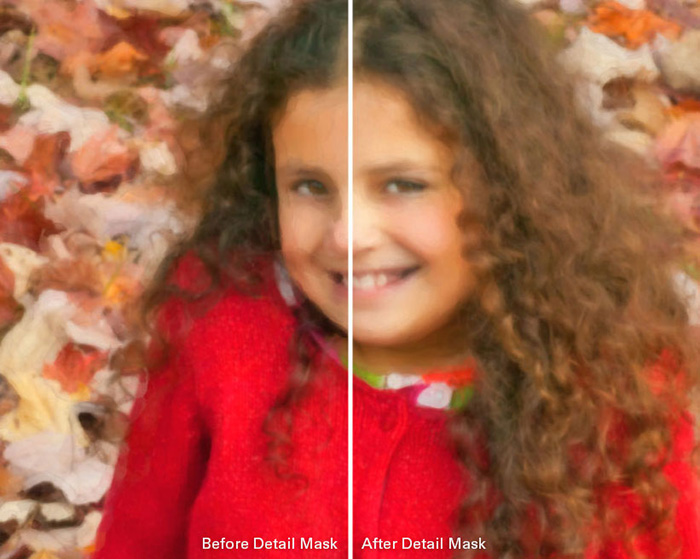
To set the layer effect parameters, I’ll choose Detail from the Effect pickbox. After the mask is made, you can customize it with the Effect sliders. Use the Show button, at the top of the Layers tab, to view the mask as you paint it on. This mask will give us tighter paint strokes and more photorealism to the watercolor effect.
Usually I print on canvas or another medium with texture. Because of this, I’ll turn off the paper texture in Snap Art. On the Canvas tab, choose No Texture from the pickbox. You can learn more about canvas and lighting controls in this video.
Press OK and Snap Art will render out the watercolor effect on a new layer in Photoshop. This makes it super-easy to make some final tweaks.
I’d like to reintroduce more of her facial features and hair texture. I’ll do this with a layer mask and some brushing.

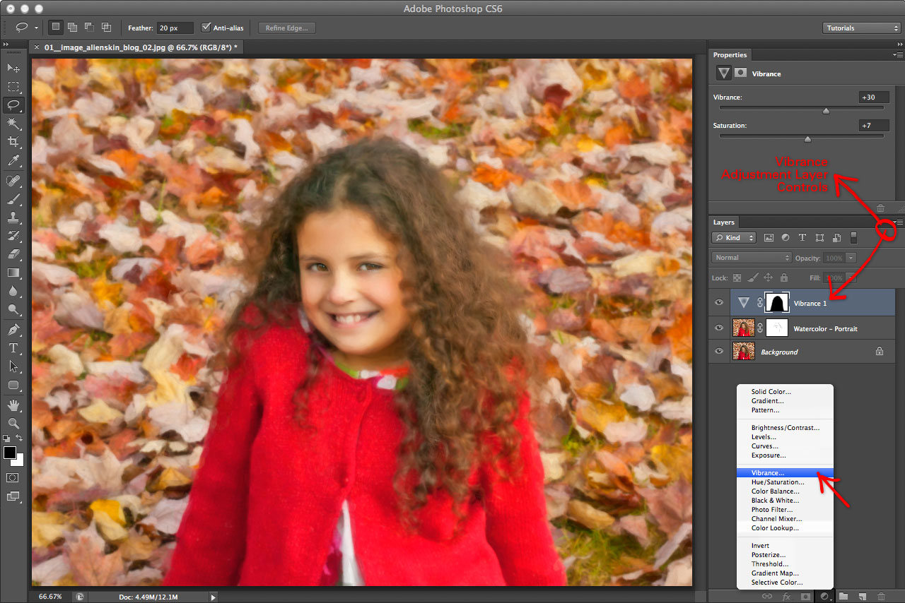
As a last step I want to make the color of the leaves more vibrant. I’ll use the Lasso tool (L) with the selection edge feathered 20px. Then, make a quick selection of the leaves around her. I don’t want to change how she looks, just the leaves.
With the selection made, I’ll add a Vibrance adjustment layer. This will turn our selection into a mask and give us sliders for color vibrance and saturation. Vibrance is a smart-tool that increases the intensity of the muted colors in your image leaving the well-saturated colors alone. I’ll add a touch of both to intensify the leaf colors.
We’re all done! Remember to save all of your work so that you can revisit each step later.
Here is the final image ready for the print lab. I use Millers Professional Imaging but MPIX is the consumer side of Millers. I trust Millers color accuracy and quality.
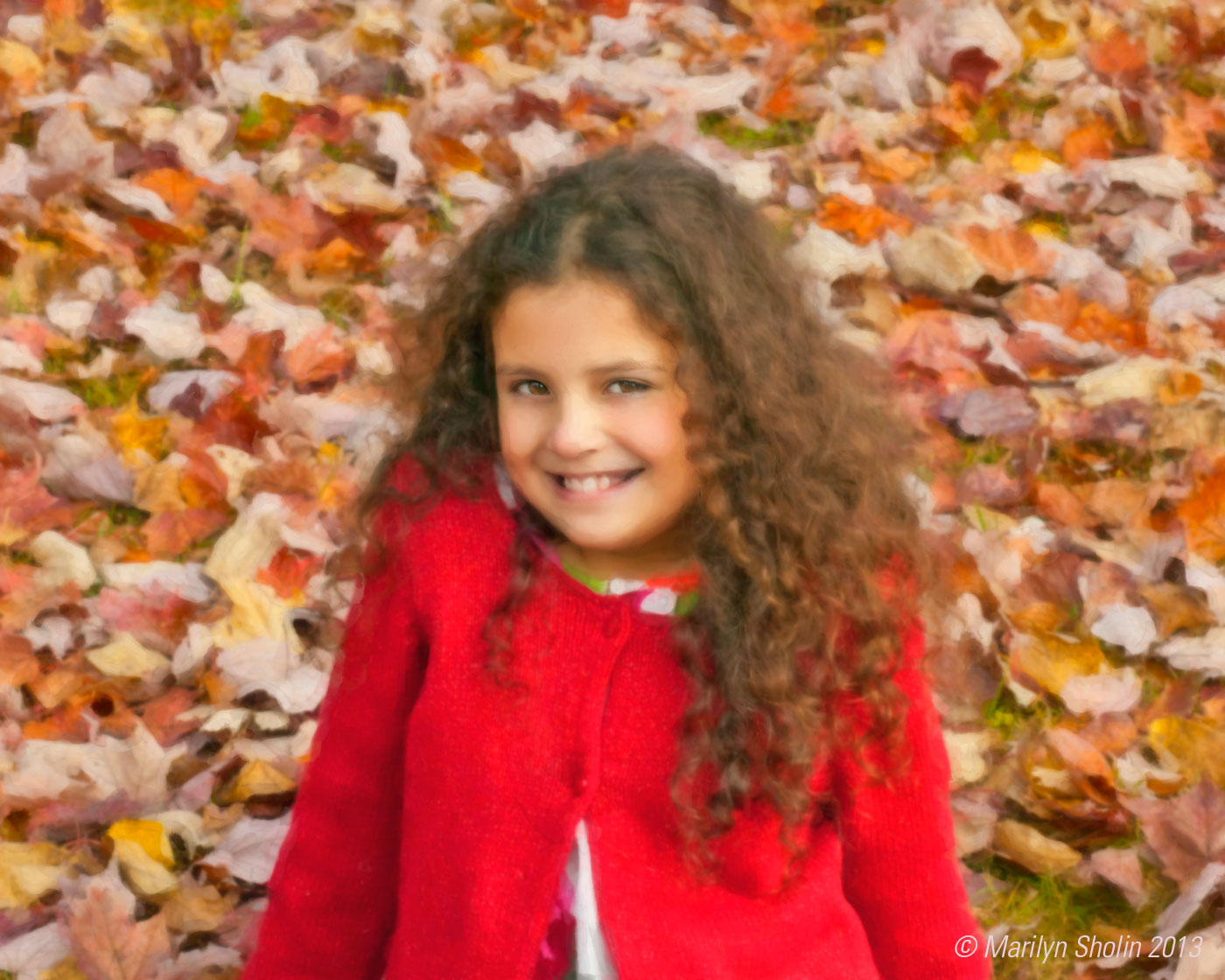 This has come a long way from the original portrait with a few quick and easy steps made with Snap Art 3. It’s so easy to use. I recommend fiddling with sliders to see what you can get. Also, take advantage of layer masks. I do some extra work in Photoshop with layer masking for complete control of the art. I’m a control freak!
Visit my Digital Paint Shop for more products and tutorials. There are lots of freebies to download too.
Check out some of my fine art pieces on Fine Art America.
For more information, more lessons, and more fun, find me on Facebook, on PIXIQ, and on my blog.
Try Exposure Today



awesome trick ! thanks Marilyn
I like it I will try it.
I have used eyecandy 3,4 and 5 in photoshop cs3and I like the effects I could create.I’m going to try the 7.the think is that the eye candy software that I ha I can’t is tall in Window 7 and I’m using PhotoshopCs5 now.