Regular readers of the blog may remember us introducing the work of Lara Jade a few months back. With the release of Exposure 6, Lara was kind enough to put together a quick post discussing how she uses the software when retouching photos to get that signature look that is gracing the covers of fashion magazines worldwide. I’ll hand to over to Lara from here so she can give us the scoop:
“I briefly mentioned Exposure on some of my Facebook posts earlier this year. Since then, a lot of people have been asking me about my use of Exposure as part of my workflow when retouching photos. Some people who may feel familiar with my work might be thinking – “why would Lara even need to use this program when she has retouchers do the work for her?” Well the main thing is – I don’t always have the opportunity to work with retouchers. For personal work or shoots without large budgets I nearly always have to do the post-processing work myself. I also think it’s very important that I am aware of techniques so that I know what’s possible when giving my retoucher specific directions for retouching photos. They of course appreciate the in-depth notes and the fact I understand what’s possible! Believe me when I first discovered Exposure five years ago it opened my eyes to new color processes and quickened my workflow pretty much overnight!
I’ve had many comments/emails from people that want to know EXACTLY how I use it when retouching photos. Well here’s my steps and on one of my images I took at my most recent workshop in California.
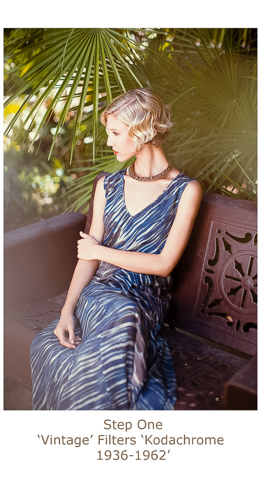
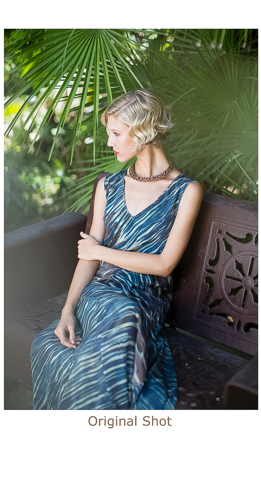 To start, I opened the original image as a TIF file in Exposure 6 and started experimenting with different filters to give me an idea quickly of what color tone works best. Sometimes I have an idea beforehand, sometimes it comes to me when retouching photos. On this occasion, I chose the ‘Vintage’ filter set and the specific ‘Kodachrome 1936-1962’ preset.
Next, I removed all settings the filter comes with (in the navigator) except for ‘BASIC, COLOR & TONE CURVE’. The reason I do this is because these options give me the most control for what I specifically need. There are overlay/texture/grain and sharpen options but I prefer to do this manually and only handle color and tone within Exposure 6.
From there, in the BASIC panel, I added more contrast and power in the highlights and saturation to make colors pop. In the ‘TONE CURVE’ section I added more HIGHLIGHTS overall. In the Curves themselves, I selected the RED curve and added more reds into the highlights and removed them from the midtones slightly. On the GREEN curve I removed greens from the shadows. This is purely because I am not a fan of realistic green tones in my images, I prefer them to be more yellow. On the BLUE curve I removed blues from the shadows as I wanted reds in shadows on the chair and I added more blue in mid tones to enhance the tones in the dress.
Next, in the ‘COLOR’ section I removed saturation from the greens – again because I feel the green overpowers this shot and I prefer a yellow / warmer tone in greens – just a personal preference! I changed the INTENSITY of the filter to 50% and clicked OK to apply the settings to my image within Photoshop.
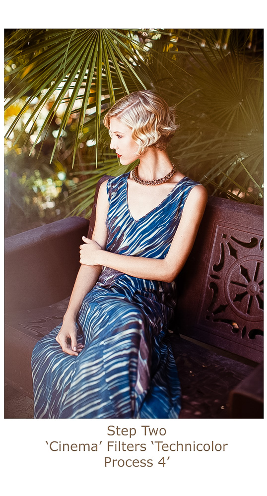
Here, I feel like the image overall needs a little more work. When I saw this image in camera I imagined it a bit more timeless (less saturated and more red). Often I will add 2-3 rounds of Exposure 6 to get the color just right if it doesn’t work immediately. I re-opened the image into Exposure 6. Flicking through the filters I came across the ‘Cinema filters’ and settled on the specific filter ‘Technicolor Process 4’ as it removed more of the green tone and added more of a red tone overall.
Finally, I adjusted the ‘Technicolor Process 4’ filter by again removing all filter options but ‘BASIC, COLOR & TONE CURVE’. In the CURVES section I added more green to the highlights and a touch more blue for the contrast & dress. I changed the INTENSITY of the filter to 65% and clicked ok to load the image into Photoshop.
The best tip I have when working with this program is to NOT rely on the program to give you exactly what you want straight away. Tweak the filters as much as possible by using the sliders – I often work on TOP of the process by adding further Exposure 6 filters or manually using curves or selective color within Photoshop itself.
Feel free to post your results with Exposure below or on my Facebook page!”
Big thanks as always to Lara for sharing her amazing work. We look forward to sharing more in the future!
Photo Credits – Madison at Vision / Styling by Marissa Adele / Hair and Make Up by Jennifer Hanching
Try Exposure Today


Have loved Lara Jade’s work ever since seeing her on Creative Live with Sue Bryce! Enjoyed this “how to”.
Thank you Lara for a great post! I’ve been using Exposure 6 ever since Felix Kunze & Pratik Naik’s Creative Live workshop featuring it, and I love it — I’ve used Nik and VSCO, and I’ve found Exposure to be far more powerful and versatile, as well as so true to the original films. Your work gets better all the time; you’re really growing into a beautiful style that is instantly recognizable!