When I need to make my photos less generic and more specific to me, Exposure’s suite of black and white filters are often my first port of call.
From the days of Ansel Adams onwards, black and white photographers have been cut a lot more expressive slack than colour workers. The bizarre contrasts evident in some of Adam’s work are no more representative of how things look in nature than a tobacco-coloured sky, yet there is little tolerance of colour manipulation, especially in landscape photography. There seems to be an expectation that black and white workers are more than mere recorders, that they will put their personal stamp on a scene. There is an understanding that black and white photographers aren’t simply novices who haven’t yet learned the language of colour.
One of the reasons that black and white is such a powerful expressive medium is because, unlike colour, it is not literal: there is a quality of “otherness” that results when a scene is rendered in black and white that creates some personal space. Photographs have the potential to be about the subject – and us – rather than merely of it. In the context of landscape photography, the sky sets the emotional tone of the image : compare the mood of ‘Paps of Jura, from Craighouse, Scotland’ with ‘Over Sorvagsfjordur’ towards Tindholmur, Vagar, the Faroe Islands. Both the type of clouds and the position of the horizon in these shots has a major bearing on the vibe they give out: in the first, the landscape is dwarfed by the high, towering white clouds that draw the eye ever upwards. There’s a note of optimism in it. In the second, the sky is diminished and threatening, directing the viewer into the dark middle distance and foreground. If you pick up a sense of menace you’d be right; this is a beach where pilot whales are driven ashore and slaughtered in the shallow water by the islanders.
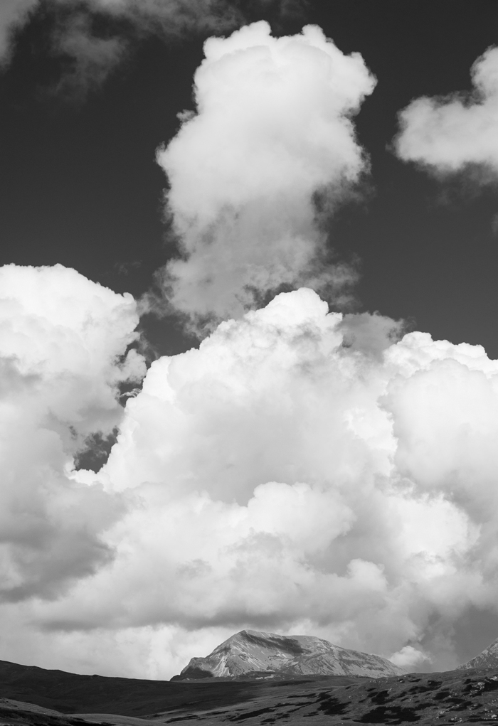
‘Paps of Jura, from Craighouse, Scotland’ As my starting point, I used the B&W Infrared Kodak HIE preset for this which not only makes the blue sky very dark but also lightens the green vegetation. I made sure Halation was off.
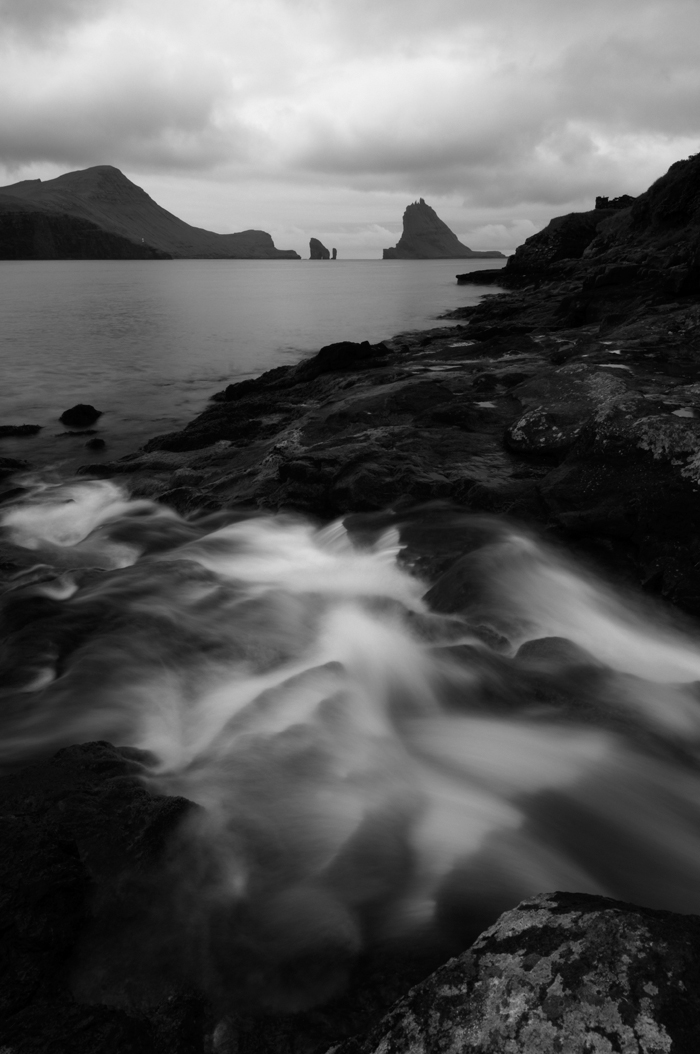
Over Sorvagsfjordur towards Tindholmur, Vagar, the Faroe Islands.’ A more conventional monochrome treatment sufficed here so I opted for B&W Films, Kodak Tri-X 400 but dialed back the grain as well as increasing the contrast.
While white skies are unpopular with colour photographers, they can work well in black and white photographs because of their ambiguity: they are neither threatening nor exciting. They introduce a sense of tranquility which, with the right subject – such as ‘Twin birch trees, Senja, Norway’ and ‘Saligo Bay, Islay, Scotland’ makes for a “restful” image.
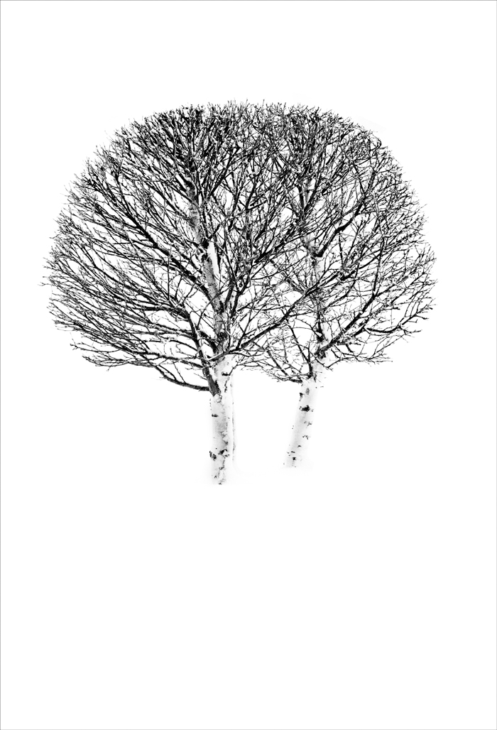
‘Twin birch trees, Senja, Norway.’ I needed the snow to blow out completely here so tweaked the top end of the Tone Curve in the Kodak HIE B&W Infrared preset. In color photography, Color>Noon Day Sun is very good for this job.
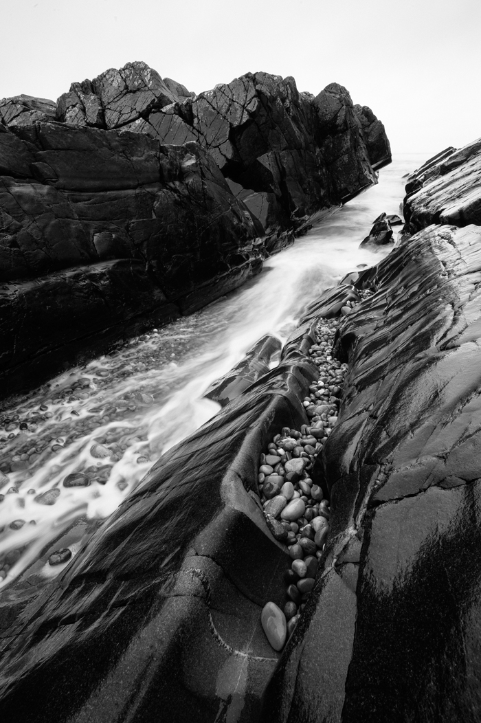
‘Saligo Bay, Islay, Scotland.’ I was after a more classic monochrome look for this shot and while the Tri-X look is great for making gloomy dusks look grungy and a bit menacing, I preferred the look of the Ilford Delta 150 preset for this seascape shot on an overcast winter afternoon.
Black and white work clearly needs the photographer to tap into their feelings about a place or subject then to find the right sort of conversion to convey that. I really value not only the range of black and white filters that Alien Skin Exposure presents us with, but the degree to which they can be edited. For example, I’m a great fan of some of the Vintage filters but not necessarily the grain or “damage” that comes with them. Not a problem: they’re editable.
It’s worth applying a bit of logic to the black and white filters that you use so that they match the nature of the subject matter. For example, if you’re shooting an image whose themes are contemporary, a Calotype filter with edge effect doesn’t say “modern.” A clean, crisp, high contrast approach might be more appropriate. But if your photo has themes of permanence – rocky sea shores, mountain skylines or anything else with a “deep past” then these retro filters can harmonize well with the subject matter, as in ‘Mountains behind Tungeneset, Senja, Norway’ and ‘Abhainn Coire MhicNobaill, Torridon, Scotland.’
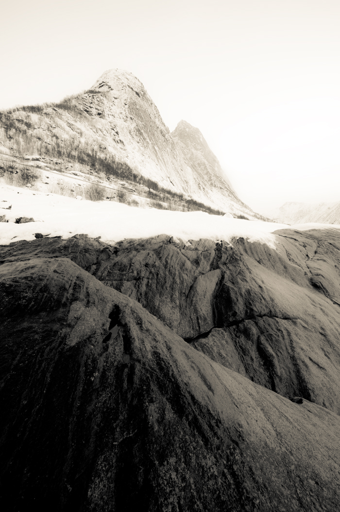
‘Mountains behind Tungeneset, Senja, Norway.’ The Platinum (cool) preset, under B&W Split Toning, is a favourite when I want to evoke the feeling of the past as the look reminds me of early photographs from the Haydn Expedition. I sometimes “tame” the cast a little, as I did here.
‘Abhainn Coire MhicNobaill, Torridon, Scotland.’ This is a scene that has changed little in the last 1,000 years or more, so I went for the timeless look given by the Daguerreotype – Sepia filter, using the Default Color Sensitivity Preset. Having battled with the grain of 35mm film for many years, I remain nervous about adding any more than I need for a particular look.
The sense of “otherness,” of being removed from our normal experience of the world I mentioned earlier, is heightened when a tint is introduced. We’re familiar with various sepia tints, found in a number of the Vintage filters but it’s worth exploring Misc. Effects and Split Toning too. One of these seemed appropriate with the image of the ‘Cementerio de la Carriona, Northern Spain’ where, from certain angles, the whole skyline is filled with marble angels and crosses, in a slightly spooky way. Similarly, the treatment of the single tree, ‘Kilmagad Wood, Scotlandwell, Fife’ has the feeling for me of a long forgotten memory from childhood.
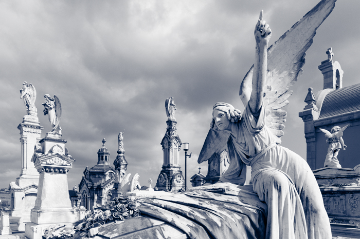
‘Cementerio de la Carriona, Northern Spain’. The Polapan – Blue preset took me into the right area in respect of general tonality and contrast and I simply restrained the blue a bit.
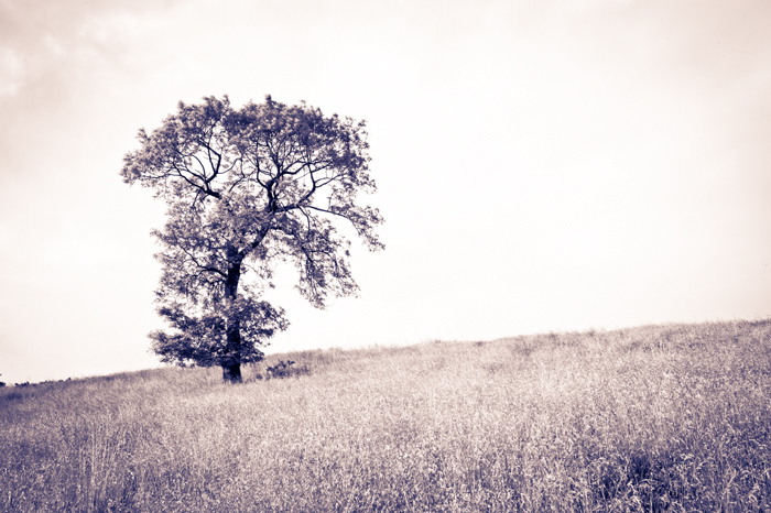
‘Kilmagad Wood, Scotlandwell, Fife’ Some tweaking of the B&W Split Toning – Warm Brown was needed to get a look that I liked for this solitary ash tree. There is no right and wrong about how these filters are applied, just a tuning in to your reaction until you feel in your gut that it’s working for you. Just hope others like it too!
Finally, a word of caution when working with black and white filters. Sometimes it’s very tempting to let the blacks in your photo go solid (0) to create a really high contrast image. And on screen that might be desirable. But bear in mind that if you want to print the image, blocked up black areas can look awful. To avoid this, set your black point no lower than 5 (you can double check this with Levels in PS) to retain shadow detail. Otherwise, assuming you’re editing on a calibrated screen, what you’ll is (almost) what you’ll get.
—
If you’re interested in more of my ramblings, my new e-book, You are not a Photocopier: from snapper to artist in six lessons is available from my website: