Learn from master retoucher, photographer, educator, and Sony Artisan Jeremy Chan’s color grading workflow. In the article below, Jeremy discusses how and why he uses color when enhancing his photos in Exposure. Altering and intensifying the colors in his images is a major part of his post-processing workflow. Read on for a lesson in color grading in Exposure.
–
As photographers, color grading is a crucial part of what we do. It’s everywhere in the process of creating images. It includes pivotal creative decisions such as the wardrobe selection, the scene background, and whether or not to incorporate lighting gels for more punch. For this article, let’s focus on post processing, which can make a huge difference in the final look of your photos.
What is Color Grading?
Color grading is the process of altering and enhancing the color an image. It is one of the most important elements of my post processing workflow.
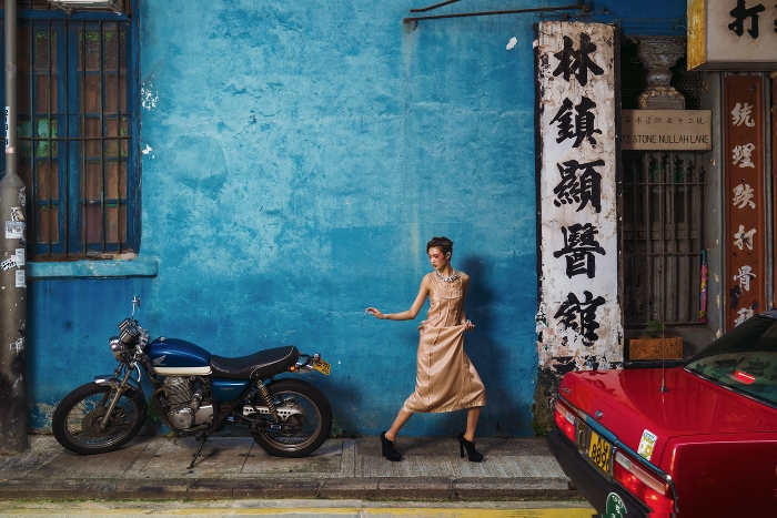
When working on a color editing session in Exposure I make adjustments to the saturation levels in the shadows, midtones, and highlight areas. Additionally, Exposure provides me controls for each color saturation level separately, so I can dial each color in one at a time.
When to use color grading on your images
The color of your photos is the first thing people notice. It doesn’t matter if they are viewing your images on social media or in print. This is your only chance to define the first impression of your work. It’s not found in the perfect skin retouching workflow, or the exposure, or the sharpness of your lens. Editing is when the image can be made to come alive. This is particularly the case when you don’t have as much creative control over the shoot specifics, such as when documenting an event, but it can be used for any type of shooting.
Tips for better color grading
Manipulating color is one way to set the photo’s mood. There are several tools in Exposure that make this process easy. I can apply a color cast to the entire image using the Color Filter feature. I can adjust the applied color density and I can dial it in to find the perfect shade. When using Color Filters, a useful tool is the Preserve Brightness checkbox, which keeps the applied color filter from affecting the image’s exposure.
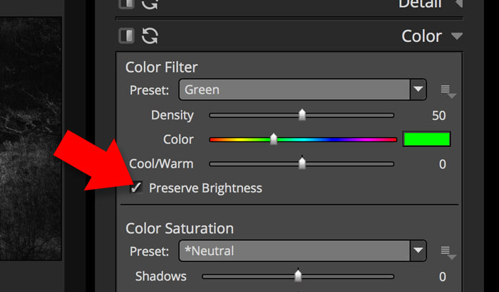
When checked, the Preserve Brightness checkbox keeps the Color Filter from affecting the image’s brightness. The control is found on Exposure’s Color panel.
Another way to add coloring effects to your images in Exposure is by using the overlays. The texture overlays have organic character, which can give an analog feel to the shot. Also, incorporating a subtle texture into the added colors will help them blend with the original image.
When adding color grading to your photos, first stop and think about your end goal for the image. Imagine how to mix what’s captured in the original image. Below are a few suggestions about how to incorporate color theory into your grading workflow:

Bold red tones can be added to suggest feelings of energy, war, strength, passion, and love.
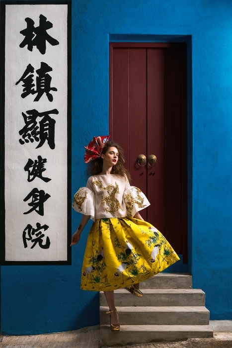
Apply blue to invoke feelings of trust, loyalty, wisdom, confidence, truth, and faith.
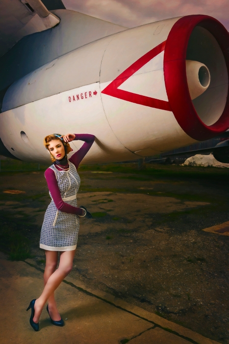
The color purple suggests royalty, nobility, luxury, grandeur, and ambition.
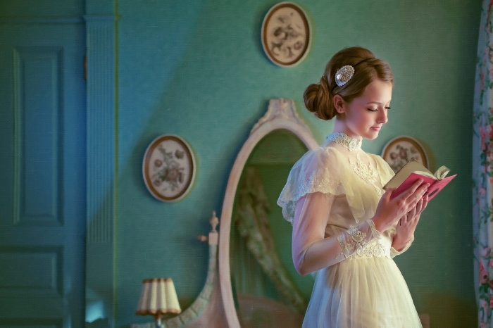
Use green to suggest feelings of harmony, freshness, fertility, and safety.
All colors play a role in the theory of mixing colors and the visual effects of specific color combinations.
- Black: mysterious, fear, unknown, usually with a negative connotation.
- White: light, goodness, innocence, purity, success.
- Yellow: Conflicting associations. It could mean positivity, clarity, energy, optimism, and joy, but it can also be used to emote cowardice and deceit.
- Orange: enthusiasm, happiness, creativity, attraction, success, and encouragement.
Color combinations
Complementary colors are those placed opposite of the color wheel. They are colors that cancel each other’s hue to produce an achromatic (black, white, and grey) light mixture. When using complementary colors, adjacent tones will appear dynamic and brighter to the eye. For example, red-purple is the complement of yellow-green, and orange-red is the complement of blue-green. This has practical applications, such as the traditional orange coloring of life vests because of the sharp contrast of it to the color of the ocean. Learn which colors accent each other by studying the color wheel.
So what does this mean? It means that color combinations can be especially dynamic when used together, because they strengthen each other’s intensity. For example, a tiny bit of orange really pops in a blue (and vice versa) because your eye wants to see that color. I find Exposure’s Split Toning feature useful for this. I can apply two simultaneous color overlays to the image, but only in the tones I designate. For example, I can add blue to the shadows, and its complementary shade of orange to the highlights.
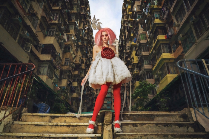
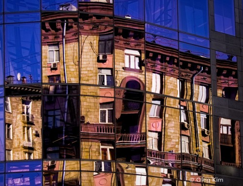
Notice how the strong color contrast between the yellow on the buildings and the color blue of the sky immediately draws the eye into the center of the photo.
Tints, Tones, and Shades:
In most cases, it’s hard to replace the color within the photographs, but we can definitely change the tints, tones or shades to create the mood or increase the story factor within the photograph. One thing to note is that the mixing of two colors will produce a slightly darker, less saturated new color. Because of that, you may also want to increase the exposure to compensate.
In closing, color grading is one of the most important things that I do to my photos in post-processing. There are lots of ways to manipulate the colors of your images in Exposure. I suggest that every photographer learn about color theory and study a color wheel. And challenge yourself as an artist to try new processes and new workflows. I believe this self-enrichment practice will make you a better photographer.
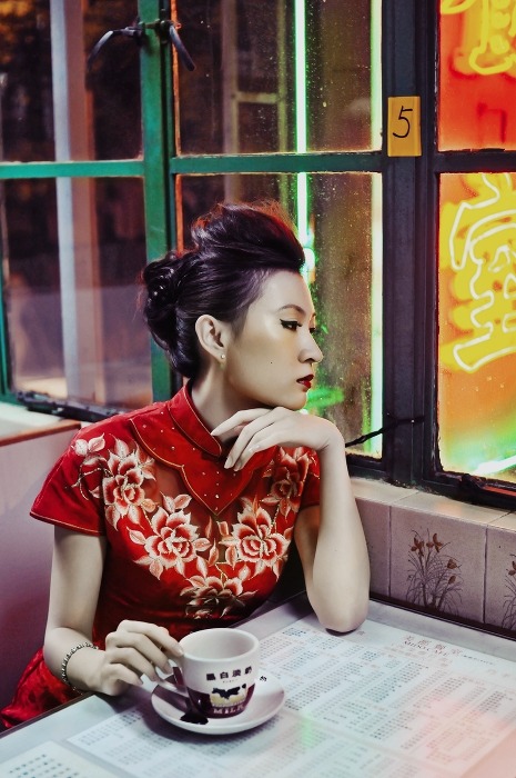
You can add many layers of color effects to your images using Exposure’s layers panel. The photo above uses a split-complementary scheme with strong visual contrast.
–
Thanks for the lesson in color grading, Jeremy!
If you’d like to learn more about Jeremy and see more of his work, check him out on Facebook.
Try Exposure Today



I’m looking to create the ‘orange and teal’ color I used often in Lightroom (easily done in lr). I can’t quite seem to pull it off in x2.
Any tips?
Hi Paddy,
Thanks for commenting! I like that look myself. You can make an orange and teal look in Exposure. Here’s how:
On the Basic panel, add contrast, clarity, and vibrance.
Next, use the Color Saturation controls on the Color panel. You want to add saturation to the greens and blues.
Then, use the Split Toning controls on the Tone Curve panel. Apply an orange/peach color to the highlight areas and a teal/baby blue on the shadows at moderate strength.
Next, edit the Blue and Green channel curves with the Tone controls. Raise the blackpoint and lower the whitepoint on Green channel curve, then raise the blackpoint on Blue channel curve.
This should get you in the ballpark of an orange/teal preset. Looks like this is subjective, so the exact numbers will vary depending on your eye and artistic interpretation. Here is a version I made.
To install the preset, just double click on the file, and it will automatically install via our settings router tool.
I have imported the version you made into Exposure X
I can see the file in the Alien Skin\Exposure x\Exposure folder
But I can’t see it when I open Exposure X and look for it
It’s not listed anywhere in the presets
Am I missing a step ?
Thanks
Luc
Hi Luc – Yes, that preset was made to work with Exposure X2, which is why you’re not seeing it when using Exposure X. Here is a version of the preset that has been made for Exposure X.
Jimmy Beech, this is the most helpful and well-done page and is the most helpful for me in coping with yet another new software. Most important to say; your speaking voice and Modus Operandi is as good as it gets. Thanks!
Some good information from Jeremy. I think the examples with the originals alongside would have also been a good way to show the difference Jeremy is describing. But still a good article!
Thank you Jimmy~
Great Article, love your work, Jeremy!
Hello! I really appreciate this post. I did have a question though… how do you boost color without messing with the skin tones? Do you usually mask the person’s skin out?
Hi Laurence – give the vibrance slider a try. It controls the intensity of the more subtle or muted colors in the image, without adjusting colors that are already strong, so it’s a good choice for adjusting skin tones.
Hi Jimmy,
How do I achieve the look of Brandon Woelfel?
http://www.brandonwoelfel.com
Thanks
Michael
Thanks for commenting, Michael. I would take a look through the Faded presets in Exposure. One of the common themes in that group of presets is lifting of the black values. Faded blacks are common in Brandon’s work. Also, check out our Creating an Orange and Teal Look video, which could get you on the right track for adding color casts.
This is great but I’d love to see the original images before the work is done. Is there any way to see this so we can see the effect? Thanks!
Hi Phil,
Thanks. I’ll reach out to Jeremy and see what images he has available.
If I wanted to color grade a background, do I use a brush and then go to the color filter panel and paint it on?
Thanks for commenting, Jeff. You may want to apply the color filter adjustment in a new layer. Then use the brush tool and the gradients to control the application of the effect. Check out our Local Adjustments video, it demonstrates the process.