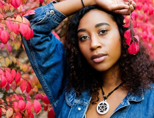
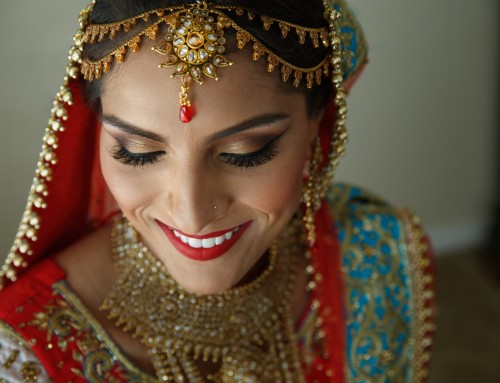
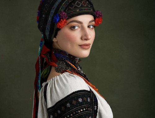
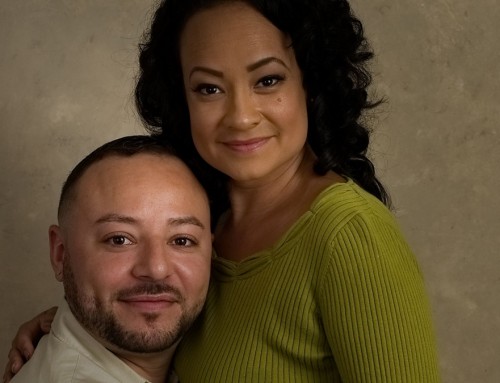
Balanced, even skin tones are a great way to make your subjects look their best. As photographers, we don’t want to change the reality of the people we capture in photos, but we do want to show their best side. We made this video to demonstrate methods for perfecting skin in portraits using Exposure.
Watch the video to learn techniques for correcting skin texture and evening out complexion. We demonstrate how to control where adjustments apply using layer masking, and we give advice on how to customize layer effects for the photo. Learn how to balance edits to reduce texture without making skin looking plastic, how to balance out splotchy areas, and more.
Try Exposure Today


Hi Jimmy,
Do you know if Exposure has plans to implement a utility to blend multiple exposures? That would be an asset for landscape photographers to deal with wide dynamic ranges and do focus stacking.
Thank you! :)
Thanks for commenting and for your suggestions, Eddie. We have focus stacking and layer blending on our list of features we’d like to add to Exposure.
J’ai le dernier corel PSP j’ai beaucoup plus de possibilité et en Français svp
Merci d’avoir commenté. Les produits Corel ne sont pas officiellement pris en charge par nos plug-ins, mais de nombreux clients les utilisent. Laissez-nous vous contacter avec notre équipe d’assistance à ce sujet. Voici un lien pour ouvrir un ticket.
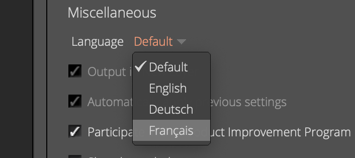
Dans Exposition, vous pouvez définir la langue dans le panneau Préférences.
I’m on the fence about this, while more customization is good, I have a feeling this is a “in-progress” update, it just feels incomplete and half-way there.
We use badge layout for apps on design approvals (visual projects), so the image being displayed is important. Old layout “feels like” it had larger images,
maybe because the images were cropped more loosely so it’s easier to tell which project it was at quick glance. Now the image is cropped closer, making it
Harder to scan thru at quick glance. I find myself needing to click into the project more often than usual. Which makes the whole user experience less
efficient.
I have a couple suggestions that might make it work better:
1. Increase the height of the window the cover image is being displayed.
2. Let us to choose which image to be displayed as “cover” (like how Pinterest handles cover images of each board, was hoping for this for a long time)
3. Let us adjust which part of the image to show and how tight or loose the crop is (with a fixed window, let us move the image around and maybe enlarge or
shrink it to control what shows thru the window. Pinterest does a limited form of this, which is very useful in making the cover image relevant)
4. Allow Cover Image to be ordered in different hierarchy (currently every element can be ordered differently except the Cover Image, it seems to be stuck
in the 2nd spot, would like the option to set it on another spot in the layout. This one seems like an easy fix, since you guys allow that for every other element already)
Thanks for the comments, Indira. We love to hear feedback from our users, and we want to make sure we understand exactly what you’re hoping for. Let’s get you in contact with our support team for a more detailed conversation. It’s helpful for us if you send screenshots that show examples of the issue, or even examples of other products and how they’d like to see it. Here is a link to open a ticket. Thanks!