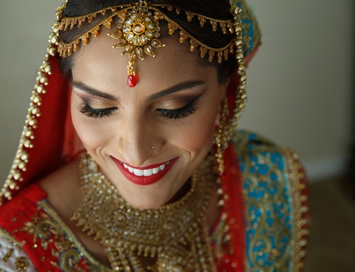
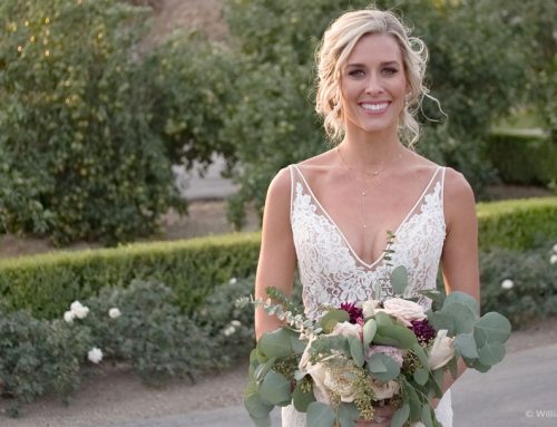
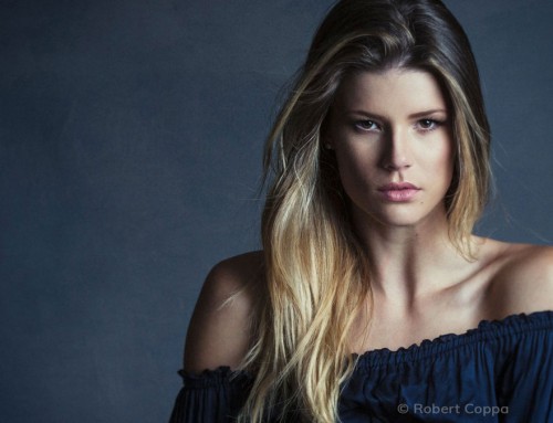
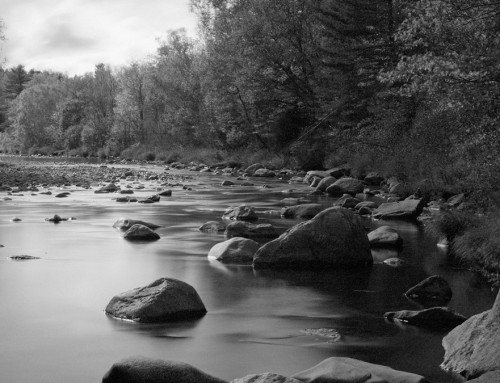
Learn how to color grade images in Exposure. Using complementary colors combines hues on the opposite ends of the color wheel to produce a high contrast and vibrant result. In this video we show you how to create an orange and teal look, make refinements, and more.
Photos: Jason Bone, Robert Coppa, Alexander Heinrichs, Jenna Barrett
Transcript
Complementary grading is a coloring method used to enhance the mood in a scene. It introduces toning from opposite ends of the color wheel. Orange and teal is a popular example, which accentuates skin tones with contrast to help them pop from the background. Magenta and green or purple and yellow are similar combinations.
Whenever building a custom look, find inspiring examples of the effects you want to achieve. Then, use Exposure’s comparison views to fine-tune the adjustments you make. This will help balance the effects.
We will create an orange and teal look in this video. Images with natural blue and orange colors will clearly show the effects of this color grading combination.
It’s recommended that you use RAW photos when creating a custom look. They provide the most latitude for making adjustments without a noticeable loss in image quality.
Creating an Orange and Teal look
Exposure’s Advanced Color Editor makes creating an orange and teal look simple. Set the ‘Convert from color’ selection with the hue eyedropper. Look for an area in the image with a blue tone to sample from. Expand the amount of blue hues included in the selection, and set the feathering to have a gentile fade. Hold Shift to apply the same feathering adjustment to both sides.
Then set the ‘to color’ with the controls on the right. Narrow the color selection and point it to more of a cyan or teal tone. Also tighten up the feathering amount.
For more details about using the controls on this panel for selecting color ranges, check out the Color Masking Deep Dive video on our website.
With the teal effect applied, press the plus button and then follow the same procedure with an orange tone. The skin can make a good middle tone to sample from. The ‘Convert from color’ selection and feathering will need to be expanded wide.
Then narrow the ‘to color’ hue, reduce the fade, and point it to a red/orange tone.
After setting the colors, use the side by side view to set the tones to align with the example images you found. Hold Shift to move all the stops together simultaneously.
As a final step, save the effect as a custom preset, which allows you to use the color grading again in the future.


