Hobbyist photographers routinely surprise me by the high level of work they produce. Frank Bramkamp, for example, creates great-looking photo composites. Intrigued by a couple of his recent accomplishments, he and I started chatting. As it turns out, his work has been featured on creativeLIVE, Xrite, Synology, and it can be seen in Practical Photoshop magazine.
During our correspondence, Frank spoke from his wealth of knowledge on the subject of photo compositing. He not only knows how to take a good picture, but he knows how to manipulate what he captures, thereby creating something completely different. His ace in the hole: Exposure 5.
I asked Frank to share some of the details of his compositing workflow. Below are a bunch of practical tidbits from him. Thanks, Frank!
—
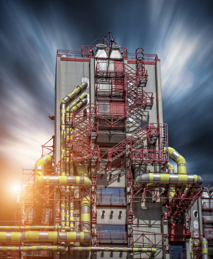
Long-exposure times can add more dynamic feel to the sky in an image. This can help accentuate architectural photos. A long exposed sky provides distinct advantages for manipulation in Photoshop because they respond relatively quickly within many different workflows. I prefer mixed dark blue skies that have some light and some darker clouds.
I am a hobbyist photographer from Aachen, Germany, near the border of the Netherlands and Belgium. By profession, I’m an aerospace engineer. My day-to-day is steeped in science much more than artistry, so photography is one of my creative outlets. I’ve always enjoyed cameras, processing film and prints, and the technical aspects of the art, as well as traveling the globe. When traipsing around a foreign place, I mainly shoot with a Canon G9 because it’s so convenient. Also, packing light is a necessity.
I focus on landscape, architectural, and travel photography for the most part. A few years back, I started into digital post-processing, which led me to discovering the art of compositing. I find it a great workflow to impart my own vision onto a captured scene.
What is most important to me is that any composite scene is first most believable, so that it conveys a story. My ultimate goal is to integrate the images well enough that you can’t tell it’s a composite. I feel that the viewer can’t truly appreciate the image with distractions from technical oddities, so I work hard to remove them from the composites I create.
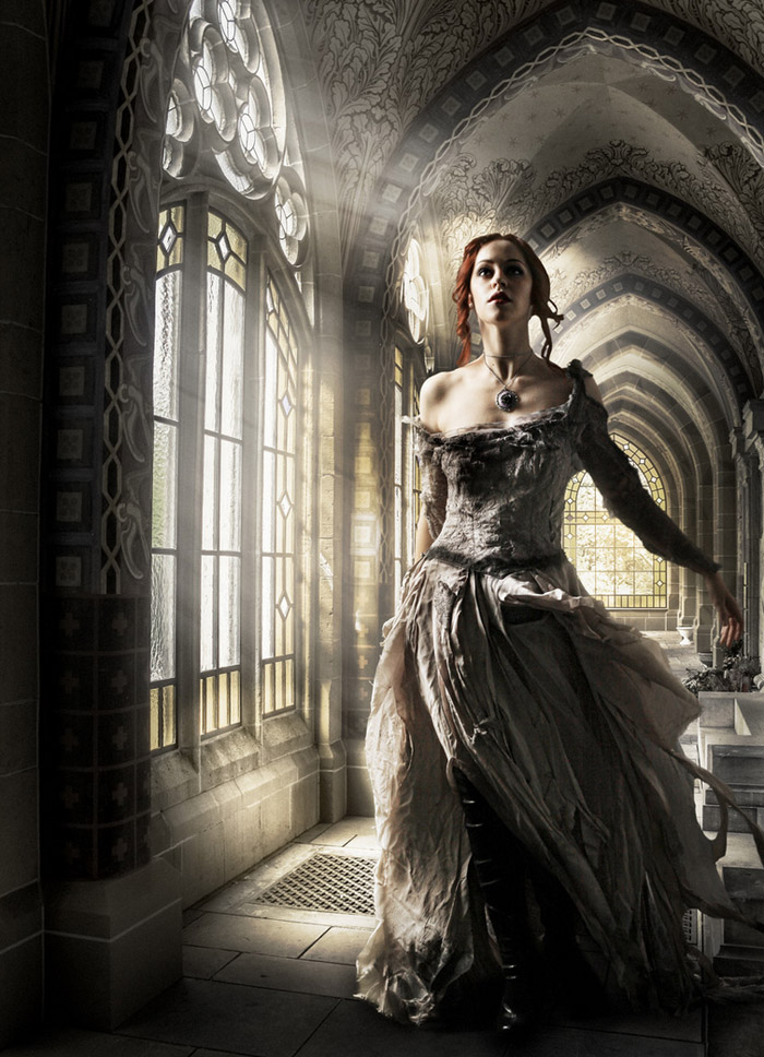
I had a couple of photos in my files of historic buildings that inspired me for a new composite image. The model shot–with her historic clothing–would work well and would tell a story. I don’t do model photography, and I don’t have any historic gowns in my closet, so I use resources such as deviantart for free stock images. Nearly all of the model shots that I use come from there.
Jessica in the “Historic Hallway” was my first major composite, completed in 2013. The hallway, was a unique discovery in a local cemetery. I liked how the light entered the hallway through the stained windows, so I bracketed 5 exposures in order to more fully capture the dynamics of light and shadows.
Bracketing Tip
I use an aftermarket firmware called CHDK which allows me to bracket up to nine frames automatically. There are others available for Canon DSLR’s, like Magic Lantern. I bracket a lof of my pictures because it is so easy to do. I can decide later which version gives me the best exposure, or I can turn the brackets into an HDR. In most cases, I shoot all my images handheld. I don’t like to tote my tripod around unless it’s absolutely necessary.
To make a composite photograph believable, several technical factors have to be considered, such as clean and crisp selections, lights and shadows, and coloring. I use stock images of models, so I can’t control the perspective or the focal length of the shot. These aspects are usually not a major problem, but extremes are hard to fix.
Selections Tip
Cleanly selecting out a model is much more elaborate process than replacing a sky. Most of the time I only use the tools inside Photoshop, like the Quick Selection tool. When doing this, you’ll notice color fringing around the subject. Be careful as this is extremely important to remove. Any fringing will immediately make your composite look like a composite. I suggest that you proceed in small, careful steps refining the selection based on the image’s edges.
After you have a clean selection without fringes, use a small radius blur and darken the midtones to be rid of any tough spots. The blurring will help the transition of the subject’s outer edge and will blend it with the background.
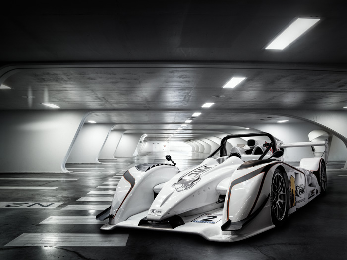
The shadows on the ground added to the believability of this image. There are two, one near the body, and one that appears farther off. I usually use a small sized brush with a hard edge (80%) for the close, detailed shadows. I’ll soften the brush tip and increase the brush size when I paint in shadows that are farther away. This helps them blend in with the floor.
For geometric selections, such as machinery, architecture, or vehicles, use the Pen tool to create a path. This gives you full control over the selection, and you can go back for fine detailed adjustments later. The Pen tool makes easy work of machined shapes.
Color Adjustments
After retouching the model into the background, adding shadows, dodging and burning, I use Exposure for the final color adjustment. A global color adjustment to the final composite is a huge advantage. It harmonizes the colors of the different images in the piece. Photos from different cameras, taken on different days with different color temperatures, need this final touch to bring them together.
My secret weapon for color matching is to use the Average filter in Photoshop. This will produce a representative color for the background image. The layer filled with this color, set to the Color blend mode at a low opacity, will allow you to mask out trouble spots.
Grain
Another benefit of Exposure is its beautiful grain. Again, most of the images in a composite are completely different at the start, and anything you can do to bring them together is worthwhile. The images may already contain grain, so adding a little extra will help unify the image, as well as blend in any selections.
I also like to add dust and scratches, and the other texture overlays that Exposure can offer. I like to accentuate the vintage look, which fits nicely with historic scenes.
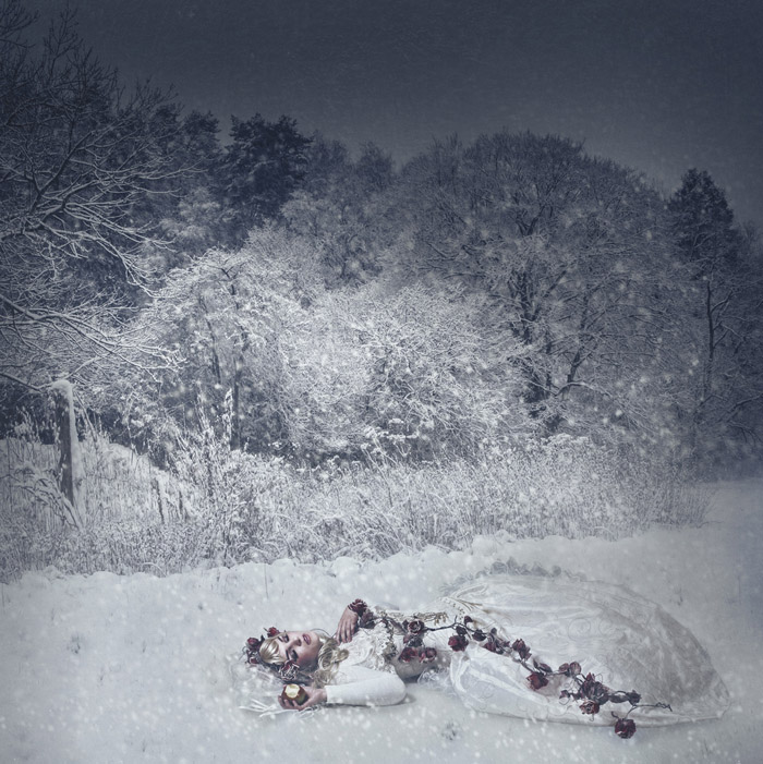
Vignettes in Exposure are awesome! Especially when In contrast to a plain round vignette, which I think looks too obvious for a composite. Exposure’s vignettes allow you to add distortions and shape the vignette to better fit with your image.
Below are a few links for free stock model images:
faestock.deviantart.com | jumeria-nox.deviantart.com | kuoma-stock.deviantart.com
—
See more of Frank’s work on 500px, 500px Art, G+, and Twitter. If you’d like to purchase a print, some of his photos are available, here.
Try Exposure Today


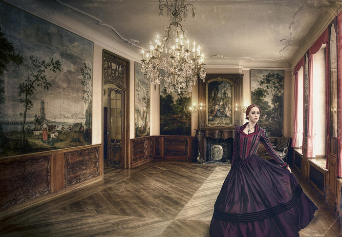
[…] Photo composites are a great way to express your creativity and vision as an artist. You can craft images that otherwise cannot be accomplished. Many people shoot landscapes or architecture, which make fantastic backgrounds of a scene. But not everyone has access to models and fine garb. Therefore, using free stock images of models is a viable alternative. A good resource is e.g. http://www.deviantart.com. Whenever using free stock images, you should mention the source and carefully read the terms of use. Since the model has typically been shot in a different environment than you used to photograph your background, one of the occuring problems is to match the color and light, which is essential to make the final composite believable. For more ony my composites, also read my recent article that I wrote for Alien Skin Software: Exposure for Photo Composites […]
Enjoyed this article too Frank.
Keep Shooting!
P.S. – you have graduated from hobbyist. Let’s count you as a Photographer and Retoucher
Roy Fritz
tschüss
[…] Für mehr Informationen über meine Foto-Composites möchte ich gerne auf ein kürzlich von mir erschienenen Interview hinweisen, das ich für die Softwarefirma Alien Skin geschrieben habe, die Plugins anbietet: Exposure for Photo Composites […]
[…] Exposure for Photo Composites with Frank Bramkamp […]