Trying Something New
While I’ve been shooting nearly 10 years, I didn’t really take an immediate interest in street photography until the last couple of years. At the time, I mostly just shot portraits, landscapes, and the occasional concert and wedding. Grabbing a camera and hitting the streets wasn’t initially on the radar for me, personally. Once I picked up a Fujifilm X-Pro2 and a 23mm 1.4, I noticed that I started carrying around a camera with me a lot more than I did with my bigger kit. This camera went with me nearly everywhere. It was then that my love of shooting on the streets began.
After I had gotten my X-Pro2, I would then get up early on a weekend morning and go on a photo walk downtown. The more I shot, the more I realized I was drawn to deep shadows falling on bright lights. I also developed a love for reflections, silhouettes, and neon signs. These quickly became my favorite subjects. In addition, the more I got into street photography, the more I started looking at other street shooters, past and present. I really enjoyed looking at different styles and takes on scenes.
Editing Street Photos with Exposure
Onto editing. Once I’d complete my morning photo walk downtown, along with the occasional evening walk during sunset, it was time to bring the images home and immediately take a look at what I had gotten. What I noticed is that the more I edited my shots, the more I’d like a cleaner look to my color shots, but I’d gravitate towards a more gritty look for my black and white images. I wasn’t really a fan of super clean black and whites for my own personal tastes. With that, I’d try to incorporate that grit into a lot of my images if it fit the scene.
Generating Gorgeous Grit
Working with Exposure X4 makes that easy. It has a fantastic grain structure panel that allows you to add and modify the effect to your exact liking.
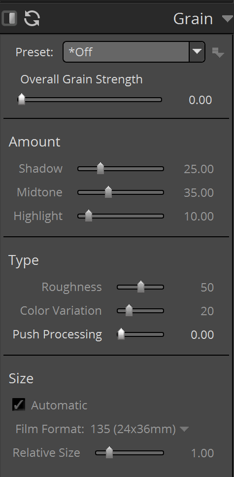
In addition to manually applying grain, there are some great presets that I like to fall back on as well. Among the many that are available, one of my favorites is the Fuji Neopan 1600 preset. Let’s take a before and after look. To me, this image was a little flat, initially.
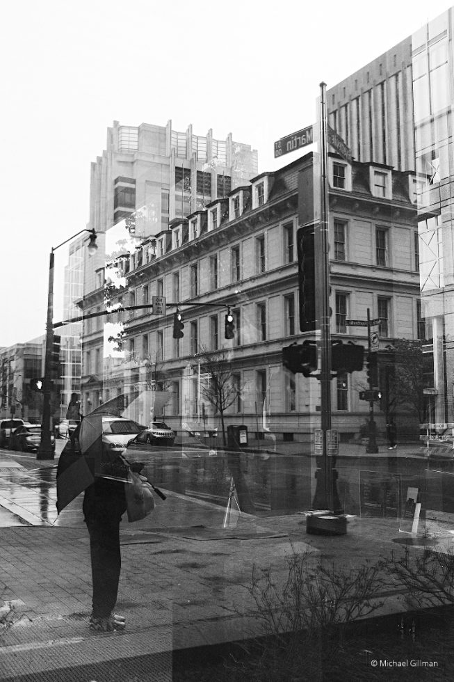
Before image
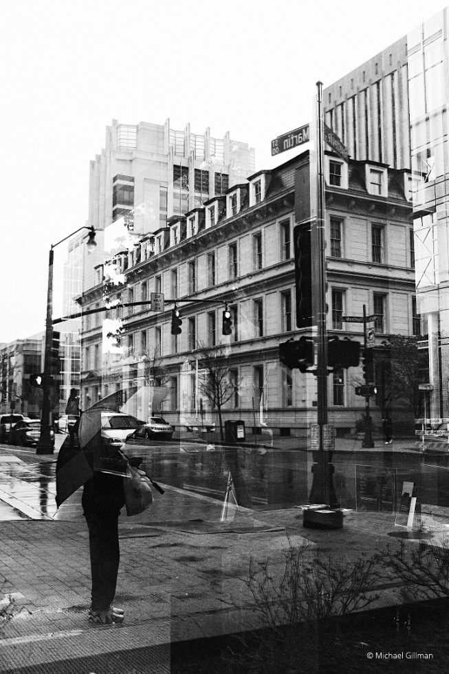
After image
I like how it adds a bit of contrast and grain to the image, making the edges of the buildings more defined, the blacks a bit more thick, and also, how it adds a bit more clarity and crispness to the image overall, giving the entire scene more presence.
Enhancing. Not Changing.
While we’re on the topic of editing, and before we move on, I’d like to note that I’m not a huge fan of a heavy edit. I know for street photos, this is sometimes a widely debated topic. As per the example above, as well as the following examples, I like to add a bit of contrast, some added grain, and some basic edits to suite the image to my tastes. I’m not a big fan of removing anything from my street photos nor of artificially adding anything to the scene. While the results that I’ve seen can look great, and there’s certainly no “right or wrong” aspect to it, it’s just nothing that I normally practice. On to the next example!
I really like this shot and the relaxed vibe it depicts. In addition, I really liked the way the light fell on the subjects. This was taken in beautiful Charleston, South Carolina. Old architecture and wine bars abound. This is a great area for candid street photography. This particular shot incorporates a lot of the elements I mentioned earlier that I gravitate towards. It has good contrast among the shadows and lights, which gives me plenty of directions to take this photo in Exposure.
Let’s take a look at the image before we apply any edits.
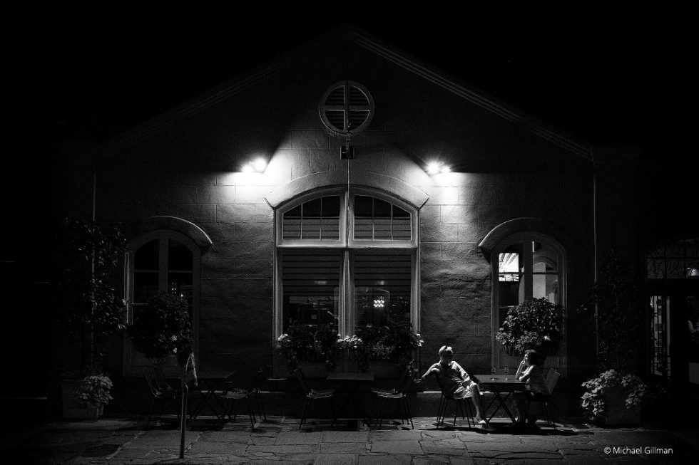
Original photo, Fuji XT-2, Converted in-camera Acros preset.
Now, let’s take a look after I’ve applied a bit of contrast, thickened up the blacks to give even more contrast but without going overboard on the whole scene, boosted the highlights to make the two people in the photo more prominent, and added a bit of clarity to give it an overall sharper look, all of which are in Exposure’s Basic panel.
To take it a step further, I added grain and a very tight crop to better display the enhancement. This time, I chose to manually add the grain as opposed to using a film preset with grain already applied. As mentioned before, I have great control over many aspects of the grain structures that can be applied.

Finished photo, grain added, increased contrast, boosted highlights, and increased clarity.
Let’s take a look at this color image before the edit. I love this image because of the reflection in the van’s rear glass. When it comes to color images, I generally like to give them a cleaner look, but I will have an exception to that rule here and there. For images that have a lot of interesting details to look at, like this one, I generally go with a light-handed edit.
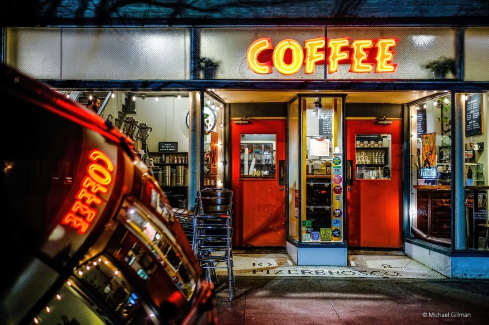
Original photo
Once again, I added contrast, lightened the blacks, and added clarity to the image. These adjustments were applied subtly just to give it a little more pop.
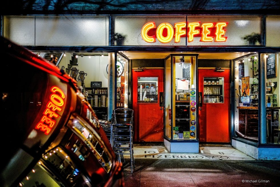
In process image, increased contrast, clarity, and lightened blacks.
This shot is full of rich colors, which are really pretty. Colors like these translate into beautiful grey tones when the photo is converted to black and white. Exposure gives me complete control over the tones of the converted image, so I can adjust the color sensitivity sliders to make specific tones brighter or darker. You can create a new look from scratch, or you can choose from one of Exposure’s presets and make customizations. I usually start with my favorite B&W Fuji Neopan 1600 film preset, so that’s what I’ll do.
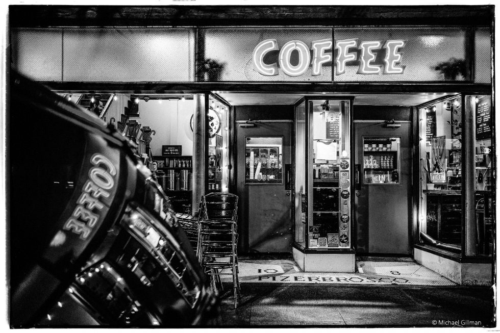
Finished photo. Fuji Neopan 1600 preset applied.
As explained in a previous example, I like the contrast the image has gained from the preset.
The blacks have been more emphasized, greater separating the highlights from the shadows. In addition, II also like the grain that was added to the image. On a side note, the B&W Fuji Neopan 1600 preset also looks great when printed large, displaying a bit of that fantastic grain in the shadow areas when viewing the print up close.
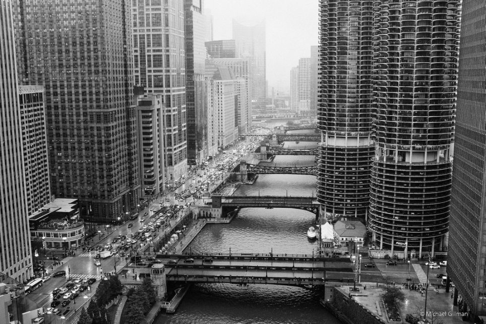
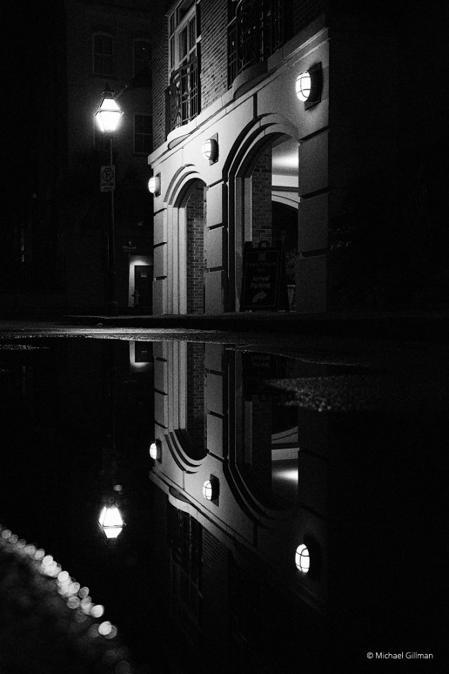
Below are images I’ve shot using similar types of edits that I’ve mentioned above. Exposure makes these edits quick and easy.
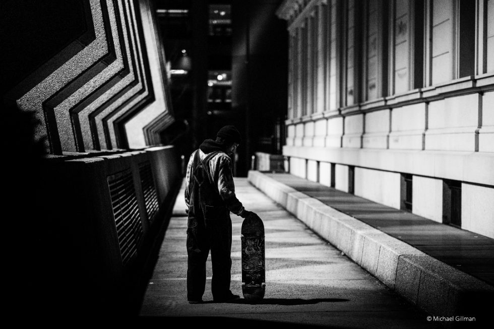
Try Exposure Today


