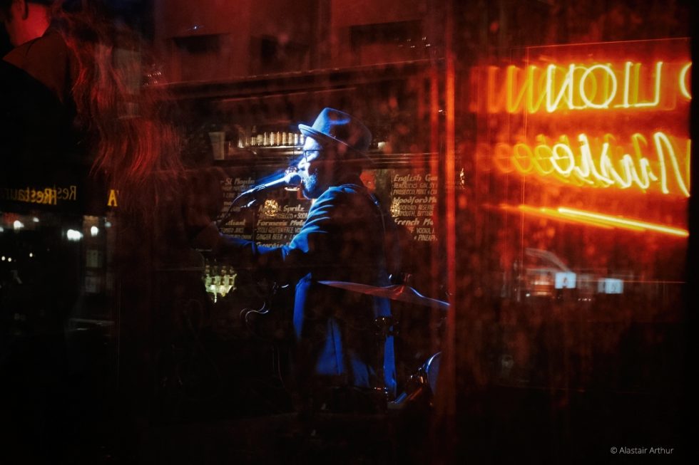
In some ways I have a love/hate relationship with image editing. I love what it can achieve, the mood it can generate or enhance, the flexibility we have now with our images, and the power of the latest software to make the process as intuitive as possible. But as a street and documentary photographer, I also want to maintain a certain authenticity. I often (though not always) want the processing to be subtle, to support the image rather than change it. I know the temptations of going too far, trying to make the image more interesting or more dramatic than it really is, and I know I’ve fallen into that trap more than a few times.
My own approach to editing my street photography has been adapted from an excellent process I heard a few years ago from David DuChemin, the humanitarian photographer. David talked about using the following steps and to me it’s an excellent summary of a logical, intentional sequence to follow:
- Define the intention
- Set the canvas
- Minimize distractions
- Maximize the mood
- Draw the eye
- Ready the output
I don’t always follow this strictly and have made my own adaptations to it over time, but if I’m getting lost in an edit then I might remind myself of these steps. Especially the first one I think is critically important, to remember what I’m trying to say through the image. That should govern and guide the whole editing process, especially if, for example, I need the image to have a consistency with others for a project or a client. I use Exposure X4 to achieve each of these six steps in the process and I’ll cover in this article the various features in Exposure that I find most essential.
Once the intention is clear, my next consideration is really the question of removal: what can be removed (if I want to simplify the image) or what needs to be removed to improve it. (Sometimes I might just play around with the image or experiment a little first, but generally I don’t want to spend time editing elements of an image that I might not keep.) Most significantly is whether and how to crop the image, and also whether to remove or reduce any bright spots or distractions that grab the eye. I tend to stick to the standard formats (3:2, 7:5, square, or sometimes 16:9) for printing purposes, so I select the Aspect Ratio first in Exposure before applying the crop.
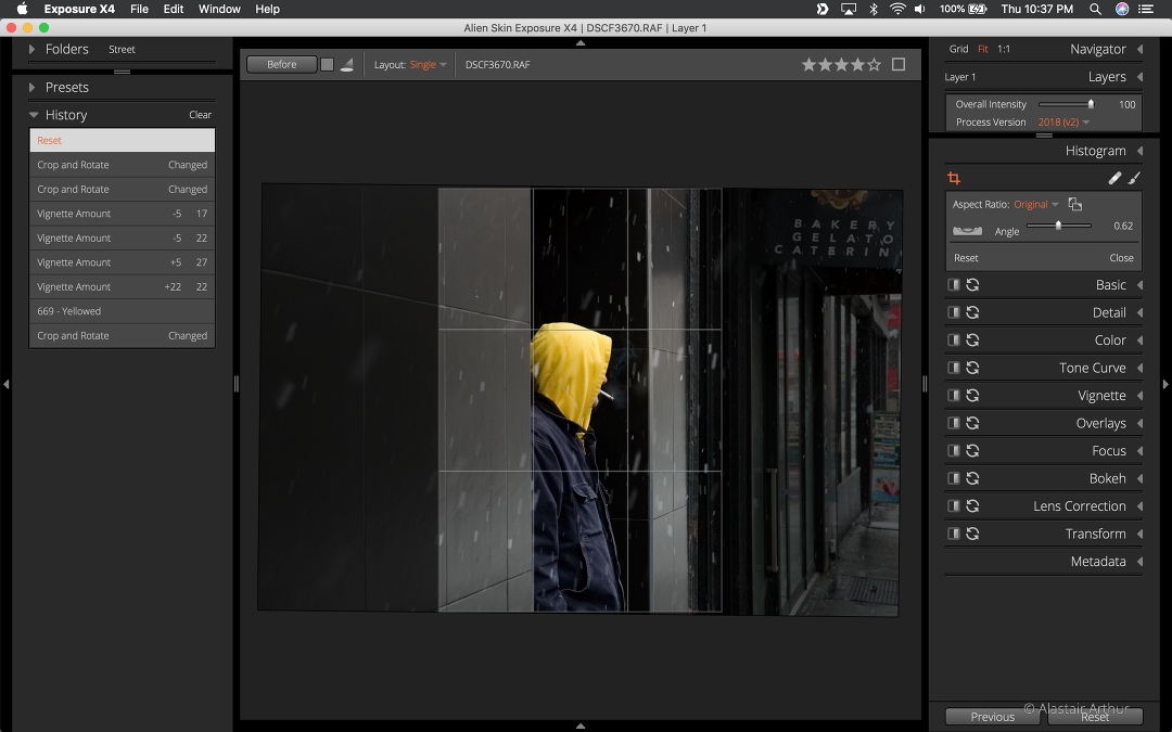
Using the crop tool to isolate the subject in the frame.
I became less concerned about straightening after studying Garry Winogrand’s work, although I was happy to see the new Transform tools that were added in Exposure X4 for the few occasions I might want to adjust the perspective. Street photography doesn’t have to be exact or precise though. Sometimes it’s the imperfections that add to the feel and emotion of an image rather than distracting from it. That’s not an excuse to get sloppy or lazy, assuming that an image is perfect in-camera, but a consideration I try to keep in mind as I work through the process, a check that I’m actually enhancing the image rather than sanitizing it. Occasionally straightening an image can remove that raw, authentic element, or simply spoil the composition.
Color work for me is the most difficult challenge in editing an image. I like to use presets or film simulations as a starting point. I use Fujifilm cameras (currently the X-T3) with their excellent built-in film simulations but I shoot almost exclusively in RAW. Fortunately, Exposure X4 provides those same simulations to be applied to the converted RAW file. Depending on the image, I may use a Fujifilm film simulation such as Classic Chrome or Acros, one of the many other presets provided by Exposure X4, or a preset of my own. I generally default to color for New York street images rather than black & white, unless I find the color particularly distracting. I might know straight away which preset I want to use, but often try a few. I don’t use layers very frequently in Exposure but I love having the option, especially here where I can separate the preset from the other changes, and control the two independently.
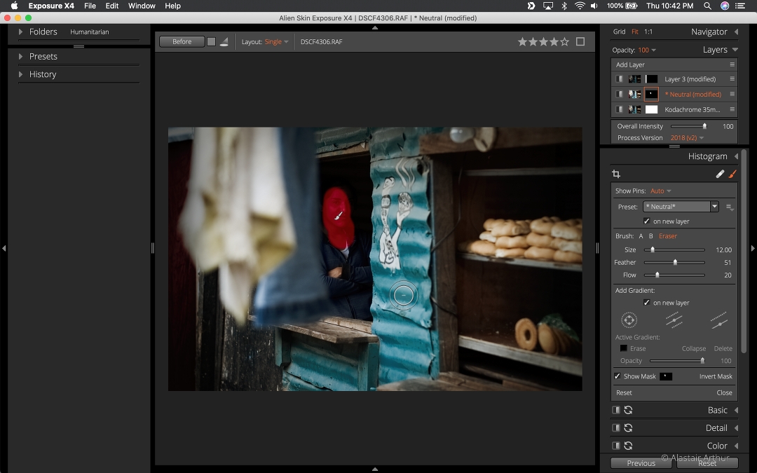
Using multiple layers, and the brush tool to brighten a small area.
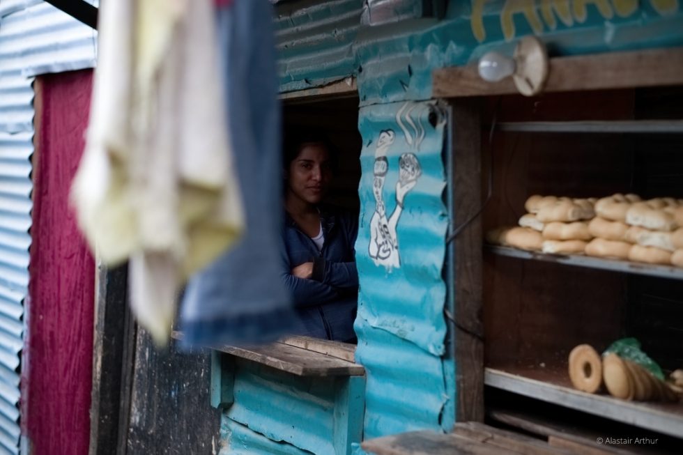
Before
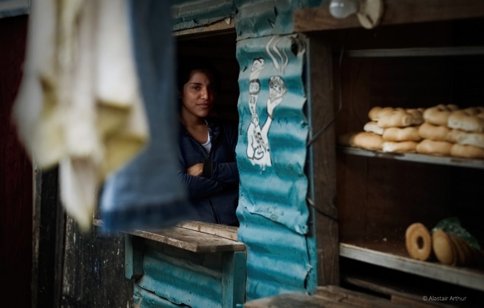
After version. Edited with Kodachrome 35mm preset with a dodge layer to brighten the subject’s face and a burn layer to darken the red door on the left of the frame.
I like to boost contrast in most images, more so in black and white than color, but most of my color images have the contrast increased, too. Some of that comes from my favored presets, but I’ll usually adjust it further manually. Often, I’m aiming to emphasize the relationship between the light and shadows, and sometimes it’s another case of seeking to simplify the images, for example by making any details in the shadows less noticeable without removing them completely. I usually underexpose my images in-camera anyway because I prefer a darker mood, and prefer the flexibility that gives me in editing.
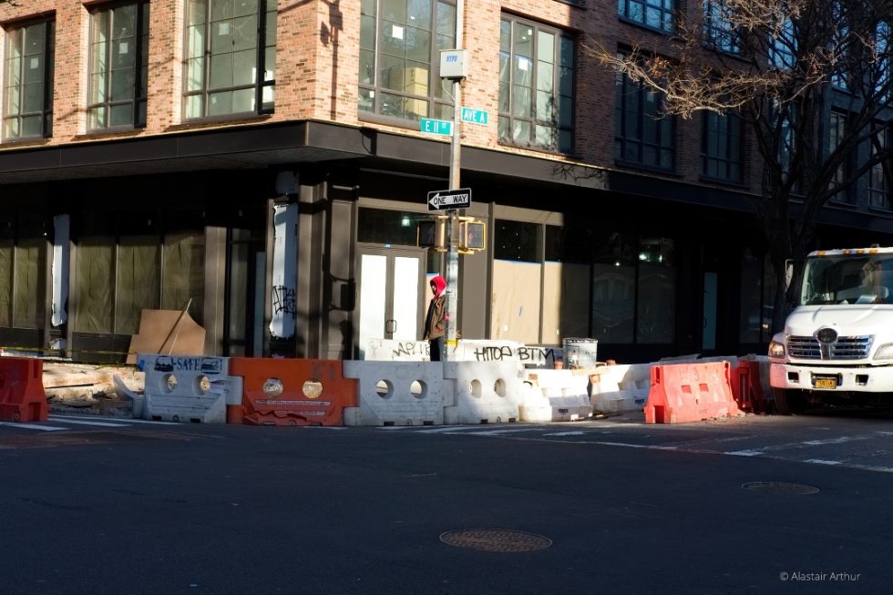
Before
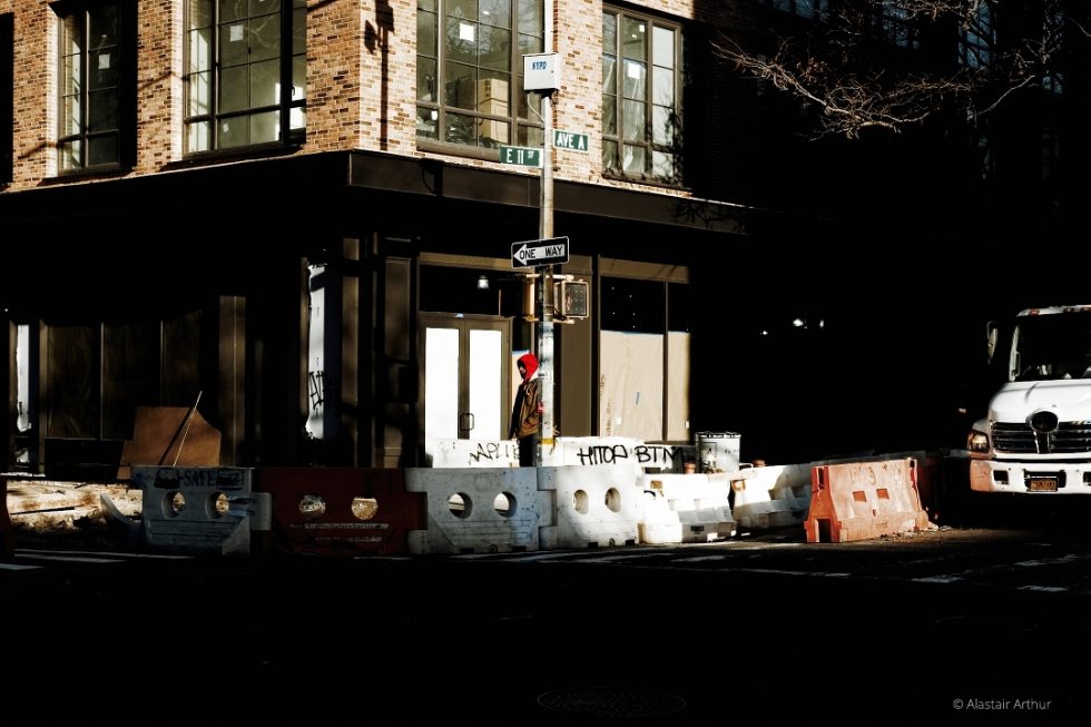
After version. Edited with Kodachrome 35mm preset, with increased contrast, lowered blacks and saturation. The central figure’s red hood was highlighted with a simple mask.
Another adjustment I will always consider for pretty much any image is the vignette. If I want the viewer’s attention to focus toward the center of the image, a vignette is an obvious choice. Maybe that comes partly from my background as a portrait photographer. A good friend once said that a vignette should be as strong as possible without being noticeable. I like that approach, that you want to move a viewer’s eye into the image without them consciously noticing the image being darker at the edges. Many of my images are about a sense of isolation or introspection, of individuals in a much wider context while still being the center, the singular subject, so drawing the eye in a wider space is important.
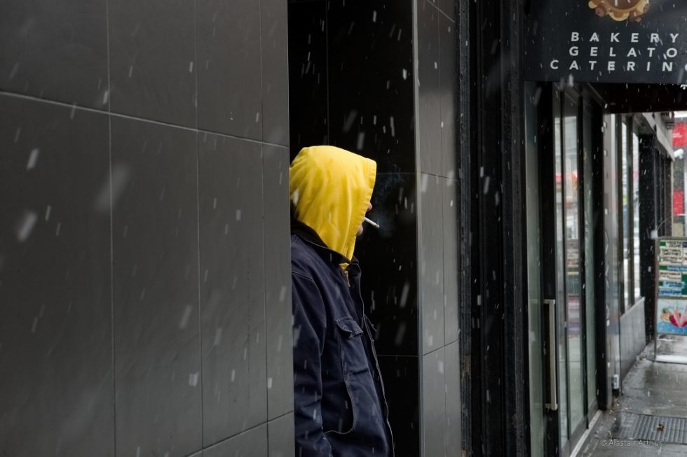
Before
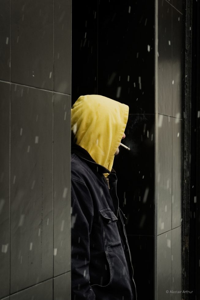
After version. Cropped and edited with Exposure’s Polaroid 669 – Yellowed preset and a subtle, soft vignette.
If someone says they like the processing of an image, then I’ll probably check to see if I’ve overdone it. I don’t want the image to be about the processing, I want it to be about the content, about the street, and about the people. But there’s no denying that skillful editing in a package as rich in features as Exposure X4 can enhance the feeling and emotion, and the emotive reaction that the image creates. To take what caught my eye in the first place, what I felt about a scene, what caused me to take the picture, and to get that across to someone else.
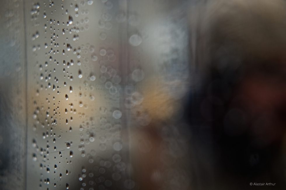
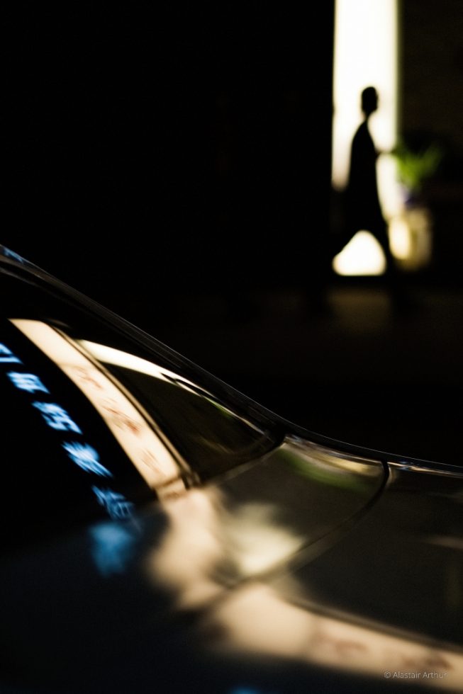
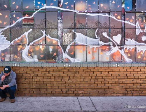
The following are a few other edits that I also created in Exposure X4.
Check out part two in this series on creating emotive street photography in Exposure, written by Chicago, IL photographer Evan Garris.
Try Exposure Today


Nice brief, succinct article. Thank you for including the before and after to demonstrate your work. I am coming back to Exposure and articles like this help me to see the utility of this software in my workflow.
Thanks for commenting, Stephen!