Frank Doorhof continues his discussion on using colors and tinting in photography. This article is the second in a two part series. Part one is here.
—
The Instagram crowd will routinely take mediocre images, pass them through a psychedelic kaleidoscope, and post them online for the world to see. I’m not bashing Instagramers; I just approach photography in a different way. I don’t randomly add colors to a shot in hope that it will make it better. First, I formulate a plan.
I want my images to exude a particular mood and feel. Color is important for accomplishing this. In my opinion, less is more. If no one can point a finger as to what makes the image so captivating, that’s great! I only want people to be triggered by the color, not overwhelmed by it. I prefer to use color like it’s a scalpel while others use it like a bulldozer.
Computer-generated coloring effects, like the ones found in Instagram or Alt Photo, are based on cross-processing or low fidelity analogue photography. This kind of stuff was a lot of fun to experiment with in the lab, but it came at the price of time and money. Now I don’t flush hundreds of dollars in chemicals down the drain. I use Exposure. It makes playing with film stocks and using developing quirks fast, easy, and it smells better too.
The above mentioned aspects of photography coincide with my previous article, Color and Soul. If you haven’t shot with film before, these articles may not seem as important to you. I assure you, they are. Film shooters readily admit that digital capture leaves a little bit to be desired.
I’m thrilled with digital, don’t take me wrong. I can’t remember the last time I’ve dealt with the hassles of shooting with film such as light leaks, chemistry clean-up, or misunderstandings with film lab technicians. I do not miss these aspects of film photography!
Hollywood magic is a practical example of the importance of using colors. For instance, think about standing inside a concrete bunker underneath hundreds of feet of water. What color is the lighting inside the room? If you’re watching a motion picture, it’s blue, guaranteed. Is this accurate? No. The lighting should be exactly the same color as if it’s on the surface. The blue tint is added to evoke a sense of temperature, separation, and solitude.
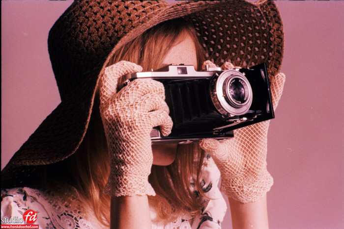
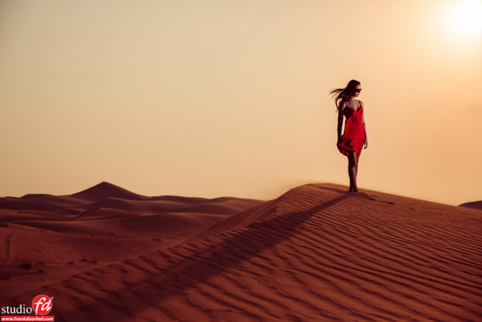
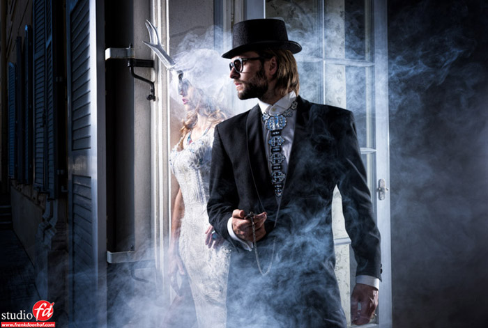
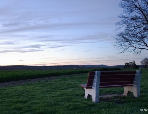
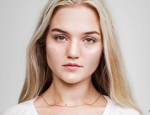
In these blog posts, you have seen some examples of images that I tinted. Some treatments are very subtle but still “pop” and some are heavily tinted in order to relay the emotion I wanted them to carry. I encourage you to take some time and experiment. In the old days, you had to use film to do this, but now there are quicker and easier.
One final tip —don’t overdo it! It’s easy to add borders and damage, but don’t go overboard. When you are tinting, it should be the last step. Don’t try to make an image go from bad to wow, make it go from wow to WOW.
—
Frank Doorhof is a Kelby Training Instructor. He hosts photography workshops and he speaks at events like Photoshop World in Las Vegas.
Thanks, Frank!
Try Exposure Today



Interesting article, I’ve always thought some of the best colour pix are the ones with very little colour in. Obsessively though, I would have had to straighten up that last pic of the girl and the lawnmower, isn’t it a bit on the slant.. or does that add to it’s ‘jauntyness’?
[…] videos up on KelbyTraining.com, He tours the world with his classes and seminars, he’s an amazing retoucher, a member of X-Rite’s Coloratti, he does some amazing things with light and has one of the best […]