As always, I’m happy to announce the winner of our Alien Skin Photo of the Quarter competition. This one was for the fourth quarter of 2014. A great big hug goes to each of you for sharing your work with us over the last few months. Congratulations to everyone — there is so much talent out there. There were literally thousands of beautiful shots shared during the competition. I am, however, super bummed that no one sent me protein bars as a bribe. #noloveforjimmy
The Exposure and Snap Art user groups on Facebook continue to grow by leaps and bounds. Our awesome prizes may have something to do with the storm of photo-sharing. Over $2,000 in prizes would definitely catch my attention. So would bacon, but that goes without saying.
Okay peeps, this is where it gets real. Not only do you get to hear from me as well as the super good-looking Sir Joe Payne, Esq., but we’ve kicked it up another notch. We chatted with a few of our favorite photographer peeps out there to bring you a little something extra just for playing. The images below have made it through round after round of comments from some of the best in the industry.
Don’t be scurrd! Portfolio reviews are part of the process to better your craft. Plus, these folks are so sweet that I’m afraid I’ll go into diabetic shock. Meaning I’ll throw out salty comments so it’s more palatable for those of you who appreciate cold-hearted, jerky feedback. That may be a stretch, but you get the idea. There’s always room for improvement.
What we did
Below is a selection of the most liked shots from each photographer who shared in the user groups on Facebook. Remember that your involvement is what makes this contest so much fun, so if you’re not liking, there’s no time like the present to get involved. We went through ALL of the images submitted from October 1 through Dec 31, 2014 and judged the top 10 images by likes accordingly to select a winner. Here is a list of the top 10 based on likes tabulated on January 1st 2015. (Hangover morning)
1 – 150 likes | Christina Ramsey
2 – 134 likes | Carol Griffith-Roberts
3 – 127 likes | Fiona Blackburn Suarez
4 – 101 likes | Carol Griffith-Roberts
5 – 99 likes | Christina Ramsey
6 – 97 likes | Monica Dooley
7 – 92 likes | Nikki Harrison
8 – 87 likes | Nikki Harrison
9 – 86 likes | Jim Pollard
10 – 79 likes | Christina Ramsey
Well done to you all!
As you can see, there were three photographers that had multiple shots in the top 10, congrats to Christina, Carol and Nikki!! For the purposes of this blog post and the accompanying image critique, though, we selected the most liked representation for each photographer based on likes in order to get a much variety as possible in the content. I guess you could say that the photos below are the top picks of the top pics of the top photogs.
Without further ado, here they are. (Drum roll)
–Craig MacPhee–
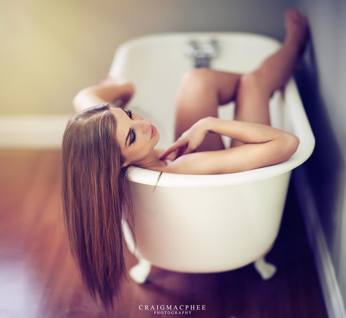
Parker J Pfister
This image is just ok for me. A bit boring. The stray hair near her shoulder could maybe be removed. It just lacks interest and meaning for me. Sorry.
Tony Sweet
Excellent as is!
Randy Kepple
This is a tough one. I give the photographer credit for the idea, but feel it should have been worked more to really capture what the photographer was seeing in their minds eye.
The lighting is nice and it feels very natural. The things that I feel could have been done better are all the little details that it believable. My instinct is that this was forced. Obviously, it was posed and set up, but it looks like it went too far and became awkward.
The bit of hair by itself on the rim of the tub is distracting. It should have been moved at the time of capture, or retouched afterward. The model’s hair is beautiful.
Every woman wants to appear long and curvy. This pose feels bunched and stocky. Perhaps it’s the tilt-shift or narrow focus, but it does not flatter this beautiful model. The lines in her neck are distracting and the hand touching her neck should have been more curved. The arm along the left of the tub is also awkward.
My thought is that perhaps this pose should have been flipped, so the model is facing the light and not the wall. That would have created much better light on her face and filled the empty column on the left side of the frame. Perhaps a slight angle to the tub as well so that it’s more diagonal across the frame and not vertical.
Another thought is putting water in the tub. That’s something that tells the story here. Why would a woman be sitting, bunched up in an empty tub?
John Barclay
Love the softness of this image and the use of the models hair leading the eye nicely into the frame.
Zach Sutton
Beautiful gradient of light and color along the background draws the eyes in and to the subject. The overall image is heavy on the emotion while keeping things fairly simple. Really like this image.
Jimmy Beech
Like the idea of this shot! I would have personally taken it in a different direction, but it is a great idea. The lighting has a very natural feel, which helps the shot out a lot. This screams “It’s been a long, hard day and I just want a moment of peace and quiet!” Thumbs up for the concept! I don’t think this shot would be as successful if the lighting were different. Natural is the way to go, in my opinion.
When I think about the possibilities of this happening naturally, I get confused–which happens all of the time, so bare with me. Hate to be the guy that states the obvious, but a clawfoot tub in the corner of a room is a nightmare for pooling water on that gorgeous floor. There’s also the water itself. Her hair being completely dry is okay, like she just slipped in the tub, but there isn’t much supporting the gesture, so I’m a little bit at a loss. If she’s going to be in the tub wearing her birthday suit, there has to be a reason. Aside from that it looks cool and she’s really pretty. ;-)
Joe Payne
This is a nice image – good pose and nice light, but aside from the lack of water, stray hair, etc. the crop just looks a bit too tight for me. Composition-wise, the subject should probably be totally centred for this to work a bit better in the square format too. Either that or step back to place her fully in the right hand side of the frame.
–Monica Dooley–
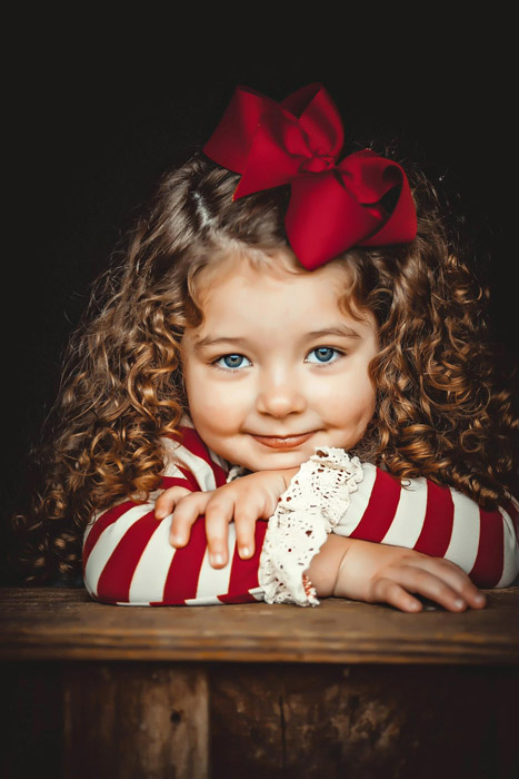
Parker J Pfister
Cute as a button. How can you dislike this image? Is it exciting and breaking the interest line? No, but it’s really cute.
Tony Sweet
Really excellent, but crop up to the table, cropping out the material under the table, which does not contribute to the image.
Randy Kepple
What’s not to like about this beautiful portrait? It’s perfectly lit. From the highlights in her hair to the dimples in her face to those beautiful blue eyes. A classic child’s portrait that will be treasured a lifetime.
John Barclay
The little girl is precious. Love the nice tight framing with the background not taking away from the cute pose.
Zach Sutton
A lot of personality and great use of filters to give it an interesting flat toning, while still maintaining some of its three dimensional qualities. That said, it looks a tad over sharpened for my taste, but overall really well done.
Jimmy Beech
Whose heart wouldn’t melt if this was their own kin? It would be a precious moment for the life of the little girl in the shot. You did it justice, here. Great work.
If I’m being picky–my forte–there are a few things that I’d change here and there. Personally, I’m a fan of separation from the background, so I’d put something behind the subject to help make her pop. The bow seems a little flat, almost like it was stuck on. A little dodging and burning would help push that back out of the way. The ornate wrist thingies blend together, which makes them appear as a single wrap, rather than individual frillies. May try to kick that around a touch. Right now, at a split-second glance, I see the bow and the wrists, then the eyes. I’d try to give the eyes top billing.
I may have shot this horizontal. The wood in the foreground isn’t the most exciting thing I’ve seen all day, so I’d play with the composition a little bit and minimize that. Overall, it’s amazing.
Joe Payne
Lovely image with a nice use of Exposure’s vintage colour toning – kind of reminds me of a photo of Shirley Temple from way back when. Only nitpick/suggestion would be to look at the crop of the hair and the elbow on the right-hand side of the frame. Also maybe switch to a 4×5 crop and lose some of the excess wood at the bottom of the frame.
–Clint Hudson–
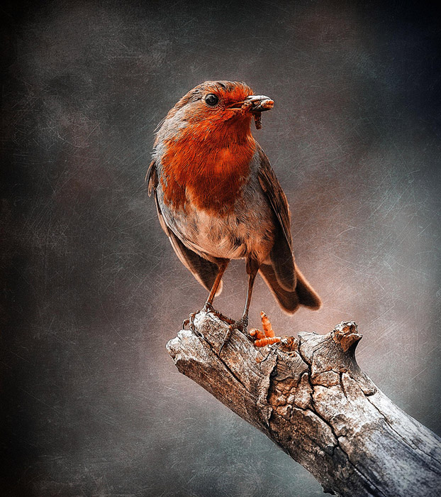
Parker J Pfister
Love the tones of this image. A great artistic approach to bird photography.
Tony Sweet
Excellent. The only thing I would do would be to move the bird further to the left so that the bird is looking more into the frame, rather than being dead center.
Randy Kepple
I’m typically not a fan of wildlife photos, as my experience is in shooting people. But this is perfectly executed. The long lens works perfectly to isolate the bird from the background. The turn of the head, the composition on the limb are simply perfect. It almost looks like a painting.
Post production is nicely done. The texture works well with this image. The lighting, warm tones and vignetting all work to frame this moment beautifully.
John Barclay
A nice use of texture in the background adding to the feel of this lovely image.
Zach Sutton
Great use of complementary colors to bring the bird into the frame with striking results. The texture however, feels a little distracting, and pulls me away from the subject. Great composition and colors though.
Jimmy Beech
Lorve how you handled this. I’m not a bird expert unless you’re talking about the finger, but this makes me want to take a closer look at the little flyers next time I see one. Love the contrast in the feathers. Really happy with the composition, too. Follow the log with your eye, the knot in the wood, the wings, the bird’s gaze, everything is lining up great. I would like to see a harsher vignette on the right side to bring the eye back down to the log. That’s all I see, though. Great stuff!
Joe Payne
Robins are great little birds, aren’t they? This is a corker of an image and I really like the toning and texture. Well done!
–Nikki Harrison–
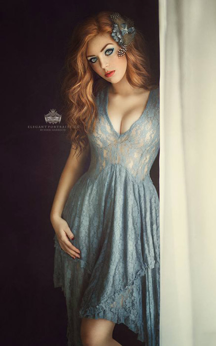
Parker J Pfister
Beautiful girl beautiful light and styling. The hand position looks a bit awkward for me. Is it exciting and breaking the interest line? No, but pretty.
Tony Sweet
Outstanding image. Move the logo!
Randy Kepple
This is a beautiful portrait. The pose, the choice of clothing, the composition, lighting, hair and makeup. Nice to see a portrait so well done. The slight bend in the knee really helps give her body shape. The only criticism is the hand. It’s nice that it’s bent (the old rule of portraiture is if it bends, bend it!), but for some reason it feels a little contrived. Perhaps moving it to her hip to help soften that a bit and also reinforce the shape of the models body. I have a feeling this model does not take a bad photo, but this is simply a classic portrait. Very nice!
John Barclay
This lovely lady is beautiful! Again, I love the simplicity of this composition which lets the viewer focus on the subject with out distraction.
Zach Sutton
Great subject with very striking features. The composition and lighting is soft and nice, however the brightest part of the images appears to be her midsection, which draws the eyes in moreso than her face.
Jimmy Beech
Like this a lot. It’s very Disney princess meets real world Barbie. The super retouched, porcelain skin look suggests a CG rendering over strictly a photo. It’s a neat-looking effect.
Couple of little things. The left curtain is lazer straight. Could’ve hung that way naturally, but it’s rigidity strikes me as fake. Also, the jawline looks very sharp, like the neckline darkened in post using a hard-edged mask. It’s not super noticeable, but if there was a little tweaking done there, you may want to tone it down a little bit. The face appears to jump off of the screen. It’s not a bad thing, just makes me do a double-take.
Joe Payne
I really like the model, the light and the pose, but the curtain is a major distraction for me; it’s very bright and pulls my eye away from the subject without adding anything to the story. The fact it crops her at the shoulder and there is no trace of her arm or hand is also a bit jarring for me. If she were using it to draw the curtain back or something, that would add some narrative to the image.
–Fiona Blackburn Suarez–
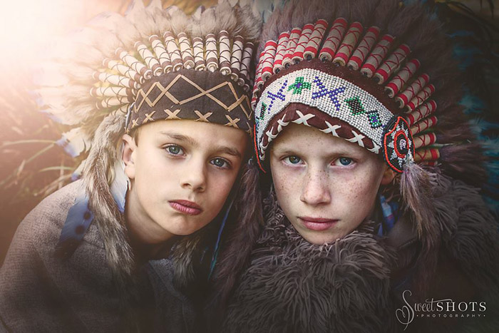
Parker J Pfister
Beautiful image that grabs your attention. Great impact, colors and tones. Personally would love to see the same expression out of both kids. The one on the left looks like they’re trying too hard. Maybe look through the edits? Great image though.
Tony Sweet
Randy Kepple
This is a great portrait of these two boys that they will treasure the rest of their lives. It conjures up all sorts of stories of childhood and imagination. The lighting with the flare is well done and the catchlights in the eyes all look very natural. Nice vignetting to draw the viewer into the boys faces.
It feels like the boy on the right is closer to the camera. I’d like to see the boy on the left come forward a bit. It may simply be the headdress coming off his forehead. That’s being hyper critical.
The color grading is not consistent across the frame. I feel the boy on the left has more yellow on his face than the boy on the right. The shadows on the boy on the right as very cool and I’d like to see them warmed up a bit to match the other boy.
Great portrait of these two boys.
John Barclay
The headdress on each child adds so much to this portrait.
Zach Sutton
Excellent toning and work within Alien Skin Exposure to bring out the muted tones while maintaining the three dimensional qualities of the image.
Jimmy Beech
There’s a lot to say about this one. The wearing of Native American headdress’ have hurt plenty of feelings, regardless of who is wearing it. Colorado, my home state, has a strong influence from Native American Indians, so I’m a little bit extra sensitive to their traditions. That said–I know you weren’t purposely trying to upset anyone, so I’m totally not offended by this. I don’t think I would try to sell prints of it in the midwest, if you know what I mean. ;-)
The handling looks good in the shot. The vignette is a little dark in the foreground. Maybe lighten that up a touch. The catch lights in the eyes seem to jump sides. The boy on the right has catchlights on the right of his eyes, the boy on the left’s are on the left. Not sure what’s going on there. Other than those little things, I think this is a solid image to be proud of. Good work.
Joe Payne
This is a great image with a lot of visual impact. I like the way the toning and the leading lines of the headdresses draw your eyes to the subjects’s faces. That being said, the flare looks a little strong and I’m not sure if it actually adds anything to the image. Cool shot though. The controversy this image stirred was very interesting to me. I grew up in England and played cowboys and indians all the time!
–Wanda Malfara–
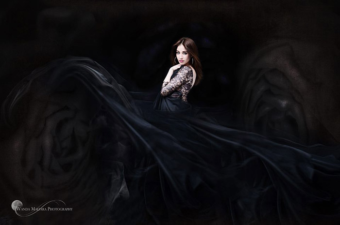
Parker J Pfister
Very eye catching image with lots of impact and drama. The subtle shadows are beautiful. Her gut area looks a bit large. Maternity image? If not then a bit more profile hip turn. Just my 2 pennies. Other that that this is beautiful!
Tony Sweet
Love the detail in the dark area. Dress well distributed throughout the frame. Excellent image.
Randy Kepple
Very stylized and dramatic portrait. The cool tones really add to the blacks in her dress and the color of her hair. Not sure what I’m looking at, but it’s interesting and dramatic.
Not a fan of putting the model directly in the middle. The circular patterns on the left and right help to balance the model being in the middle of the frame, but I’d prefer having the model slighting more to the right or the left. This creates a circular flow that moves your eye around the photo more than it does by dividing the photo in two by placing the model in the middle.
I also feel that the hand is too strong. Such an elegant and flowing image, but the hand feels very strong. Having her drop her shoulder facing the camera to show more of her neck and dropping the hand to make it more elegant and flowing would have dramatically increased the impact of this image.
Great job of creating a powerful and impactful portrait using dark tones. Feels very gothic, yet elegant.
John Barclay
Love how she stands out from the dark background and dress. Makes her pop off the screen!
Zach Sutton
Great use of movement and contrast to bring the subject into attention. I like the image, however, it may be too dark, and with not enough tonal range in the blacks and greys.
Jimmy Beech
This was one of my faves from the lot. There’s so much to complement. I’ll sum it all up in a single comment. If I wore a dress, this would be it. ;-P
I’m a little taken back by the circular dodging on the right and left sides. To me, it looks like these were a bit overdone in Lightroom. I can’t tell if I’m really seeing parts of the dress, of if that’s aggressive manipulation in post. I don’t mind that it’s center justified–which I usually am not a fan of–because the offset flow almost makes an infinity symbol. Aside from a few tweaks, this is a good’n.
Joe Payne
I really like this image. The toning is fantastic and the lighting is perfectly handled. I think the rose-like effect of the dress would look better in print than on the screen. Small nitpick: given that the eye tends to read left to right, the watermark is a bit distracting and would probably be better placed on the right-hand side.
–Carol Griffith-Roberts–
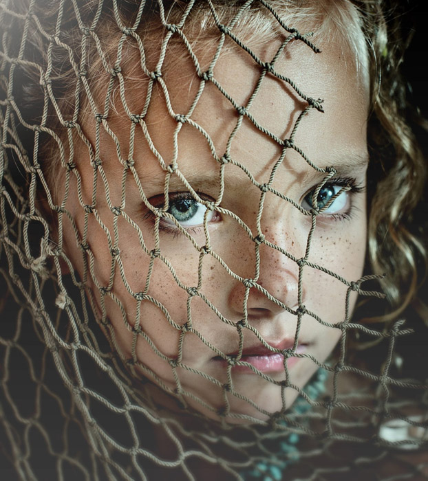
Parker J Pfister
Beautiful image beautiful eyes. Focus goes right to the eyes. Well done.
Tony Sweet
Excellent sharpness and I like how the center of each eye is unobstructed. However, the flare at the upper left is distracting and I would like to see more of her neck. Her face appears to be hanging in mid air.
Randy Kepple
This photo reminds me of the National Geographic photographer’s photo of the Afghan girl with the blue eyes (Steve McCurry). The eyes definitely draw you in and keep your attention. Outside of that, it really comes down to subjective criticism. To me, the most important aspect of any portrait is the point of view and authenticity. This photo is well done on both counts.
Technically, I don’t like the cyan color grading. I would prefer a more warm tone to the midtowns in the child’s face. The upper left corner is distracting. My sense is the lens flare was added in post production editing, as the light is clearly coming from the right.
I find the missing netting on the right of the image distracting. Especially the hard shadow above the nose near the eye. Changing the tilt of the head to the right would have made this image much more powerful and a slightly lower angle would have given it more impact.
John Barclay
Great eyes! The net adds a nice touch, too.
Zach Sutton
Gorgeous mood and striking eyes on the subject for this. The netting adds an interesting element to the photograph, and the depth of field is well done and draws the eyes to the subject. Great execution.
Jimmy Beech
Yep, this is very well done. I like the color combo in the image. The blue/green of the eyes are echoed in the neckline. Freckles are super cute, and they read strong here.
The lower net and the chin aren’t as crisp as the forehead, which is a little jarring. It’s cropped very tight as well. I would like to see another version with a wider crop or a version with some blurring on the forehead area. I think that may emphasize the eyes even more. Right now, I really can’t tell if this is a male or female because of the tight crop. The long hair lock on the right suggests that it’s a girl, but the hairline is short.
Joe Payne
This is a nice image, but the crop is a bit too tight for me – her eyes are too centered and her head looks a bit lost in space. The subject’s expression is a little blah for my tastes. The netting is interesting but I don’t think it really has any context in the image and could perhaps have been used a bit better. Right now, it makes me ask why it’s there, which could be a good thing. All in all, I feel a bit detached from this one though.
–Sharron Johnson–
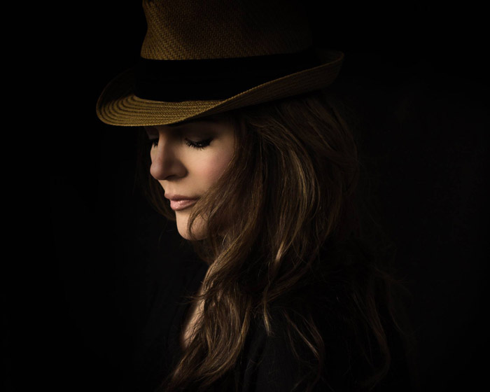
Parker J Pfister
Nice lighting and tones in this one. I would like to see the head turned to her left just a bit so the nose falls on her cheek and not extending past the cheek. Just me maybe, but I would like to see a bit more smooth line to the face.
Tony Sweet
Excellent feel, but crop in from the right to create a square format. Too much negative space and the subject is facing out of the frame.
Randy Kepple
Beautiful portrait. Nothing better than the contrast of a beautiful woman wearing a fedora. The lighting is well executed. Not too bright on the hat and the shadow from the brim of the hat is well placed. Nice light on her cheeks.
The nose looks like it was darkened. I’d like to see this done more subtlety. The chin is a bit bright. Evening out the highlights across the plane of her face would really take this to another level.
Not a fan to placing the model in the center of the image. In this image, it creates a column. The left and right add nothing to the image. By simply moving the model to the left, it would dramatically change the feel and strength of this photo.
Not sure if I’m seeing her hand or chest below her chin? I’d like to see a very subtle outline of her body (fill light) to separate her from the black background. It’s dramatic, but also looks like a floating head. Good to be careful with this in the future.
Finally, the hair going across her mouth. This should have been caught at the time of exposure. Taking a finger and moving it back to show more of her chin would dramatically change this portrait.
John Barclay
I’m really drawn to this kind of portrait. Love the shapes that are being created in this image by her hat, hair and facial features. Another example of less is more with the background and processing.
Zach Sutton
The fade to black adds a lot of drama to the photo, and give the whole photograph an interesting mood. That said, a lot of detail in her shoulders are lost in the black, and she starts to look like a floating head.
Jimmy Beech
Boom. All I can say. This turned out great.
As far as feedback, tiny nit-picks are all I see. There’s a little bit of weirdness on the edge of the hair, under her chin. Looks like a quick masking job that wasn’t cleaned up. Also, the ball of the nose breaking the cheek line emphasizes the nose more than the face, so I’d have her turn a touch to bring that in. The nose is a little dark, too. I’d bring that up to match the other highlights. The rest of the shot is very well handled. I even like Justin Timberlake’s hat! Awesome stuff!
Joe Payne
Nicely done with the lighting and toning. In this case, though, the centrally placed subject doesn’t work with all the negative space on each side. Moving her over to the far right of the frame would make this a lot more powerful.
–Gregory Mason–
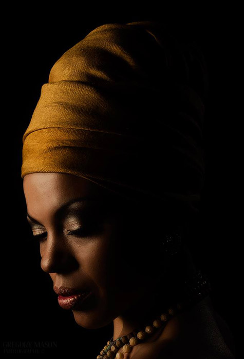
Parker J Pfister
Nice lighting and tones in this one. I would like to see the head turned to her left just a bit so the nose falls on her cheek and not extending past the cheek. Just me maybe but I would like to see a bit more smooth line to the face.
Tony Sweet
Love of the feel of this, but consider that the composition is too far to the left, leaving little room for her face, at the expense of a bit too much black shadow space behind her.
Randy Kepple
Such a beautiful and powerful portrait. An instant classic. Beautifully lit in a classic style and wonderful skin tones and texture. The way it fills the frame and the composition are strong. Well executed.
The only criticism is the neck. Not sure if I’m seeing a lighting or post production artifact on her neck? It’s distracting me from this elegant portrait. And there are white dots in the dark areas, that I assume are part of her head? Should have retouched that out. Next time, perhaps add a very subtle fill to give us the shape of her head. But the negative space is nice and that’s a minor critique. Beautiful portrait!
John Barclay
A beautiful model and wonderful use of light.
Zach Sutton
Dramatic image and the yellow of her headdress compliments her skin tone and the mood nicely. That said, the black falloff is quick, and detail is lost on her neckline.
Jimmy Beech
Very pretty portrait. Love the detail in the skin and the lip. This is a good shot. A very good shot.
Would have liked to see a little more shape to the back of her head because of the wrap, but it’s not a deal breaker for me. There are a few specular highlights on the necklace that could use a little attention. I would turn her more profile, or less. The nose breaks the outside edge of the face, which makes it appear larger than it is. Also, the eyelash and eyebrow are lost in with the shadows. Wouldn’t mind seeing a version with a light on the background just to help the shape read more clear.
Joe Payne
This is a very nice portrait from the standpoint of the lighting and toning. Again, the crop is a bit too tight for me and I feel the image loses interest as a result. It would have been nice to see more of her torso and the necklace. Some would say that, given the subject’s nose has broken the line of her cheek, it would work better to have her move her head back toward the camera slightly – either that or go full profile. This is not a huge deal for me, but if the image were entered for a print competition it would lose marks in that area.
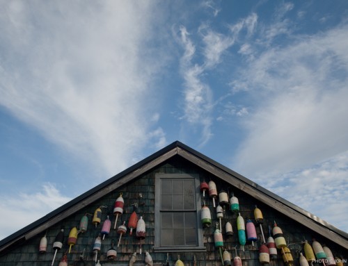
–Christina Ramsey–
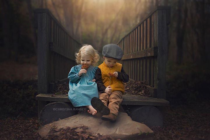
Parker J Pfister
This is a beautiful image. It has lovely composition and tones. And, of course, cute kids. Well done.
Tony Sweet
Great! Flawless and packed with emotion and excellent execution!
Randy Kepple
John Barclay
A magnificent photograph! This has it all, great subject and a moody situation to place them in. Great job on the processing to draw the eye to the subject. Excellent work!
Zach Sutton
Cute kids! Wish I could see their faces, but they’re adorable.
Jimmy Beech
I’ll start by saying that this is a really good picture. The colors are beautiful, I like the dark mood, and the subject pops out with a mean right-cross. You’ve nailed the shot. It’s really good.
I have a few issues with it, though. This image is hard for me to buy. In my mind, it’s a completely unrealistic scene. Sure the kids are adorable. The setting looks dreary and fascinating, and I could envision that the kids would find time to sit in such a location. Flowers? Nah, they wouldn’t do that. Shoeless? Oh yes! Even better, they would probably just be wearing socks–ruined, stained, scuzzy socks. Right now, they’re spotless. Where’s the grime? The sterile nature of the shot makes it feel like a movie set, which detracts from its storytelling power. All of this is just my opinion, of course.
Technical touches: I’m not a fan of the blur in the background. There are a few areas that are muddy near where the bridge visually merges with the trees and in the foreground. Was this a composite? Something is a little off. I would also brighten the front face of the bridge (the one facing the camera) a little bit. This would help it read more clear.
Joe Payne
This image was a massive hit when it was posted in the user group and racked up a huge amount of likes very quickly. And what is there not to like? Cute kids in a nice location with great light and nice post processing. I like the leading lines and framing provided by the bridge and the tones of the kids really pop. That being said, the little boy’s face is a tad dark and gets a bit lost in the image – maybe dodge that in a bit? For my tastes, the background and foreground look a bit too bright, especially with the strong vignette on the sides. The light effect in the background looks a tad overcooked and, consequently, fake, so I would maybe dial that down a bit. The rock in the foreground could be burned down a tad too so it doesn’t end so abruptly. I like the detail of the leaves there but the fact they are cut off is a bit distracting. This is a great image though.
*** Winning Photo ***
–Jim Pollard–
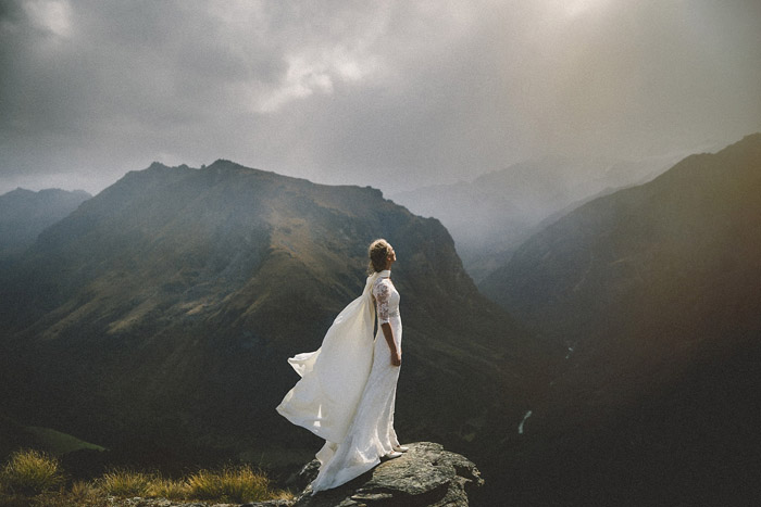
Parker J Pfister
Gorgeous image here. Love everything about this image, even the face on the far hillside. Letting her cape separate from the arch of her back just a bit is perfect. Really well done!
Tony Sweet
Excellent feel, but dead center composition with woman looking out of the frame. Compose further to the left.
Randy Kepple
Very interesting portrait. The lighting and setting are so dramatic. Well composed and very powerful. The lighting and the setting and pose all work together. Very majestic.
I’m not a fan of putting the subject dead center in a composition. Especially when they are facing to the right. I think it would have been more powerful to place the model slightly to the left. Also cropping the sky a bit to make the image more panoramic would have added a lot to this image. Wishing I could see just a bit more of her face, but the mystery adds to the image.
John Barclay
Woah!
Zach Sutton
Fantastic scenery with an image that appears to have taken a lot of work to execute it so well. The sky provides an interesting mood and draws the viewer in nicely.
Jimmy Beech
This feels like film photography at it’s finest. I’m absolutely blown away. *mouth gaping open*
It’s a little tough to make out the detail in the valley on the right of the shot, but I’m stretching to imply that I care about that. Would love to see this in a wide format shot, if the right edge of the image was extended to show more of the expanse, I think it would give me goosebumps.
Joe Payne
This is a fab image. It breaks a lot of rules in terms of the central composition and flat toning of the landscape, but, with the majestic location, light and pose, it pulls it off and really is a fantastic shot. I agree with Jimmy that the valley is perhaps a little too dark and it may have added a bit of visual interest to lighten that up a bit. That being said, the eye is drawn right to the subject in this case so it still works very well. Brilliantly done.
—
Congratulations, Jim Pollard! We will be in contact with you soon regarding your winnings. In closing, I’d like to thank all of our judges and give them mad props for being so awesome and again, thank all of you that shared images and for those who voted and commented.
Parker J Pfister | Facebook ~ Tony Sweet | Facebook ~ Randy Kepple | Facebook ~ John Barclay | Facebook ~ Zach Sutton | Facebook
Try Exposure Today